Main Features
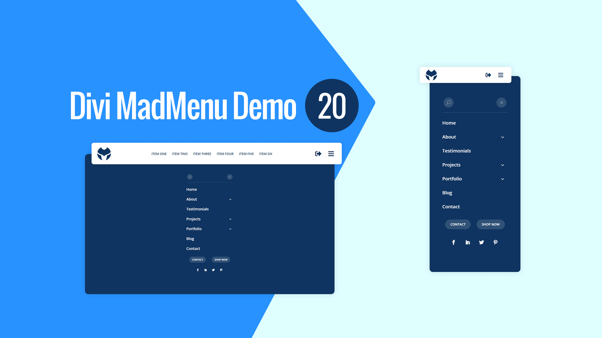
Fullscreen Menu
The menu is fullscreen on all devices.
Fullwidth Header Bar
The desktop menu header bar is fullwidth.
Fixed Header
Fixed header is enabled on all devices.
Centered Horizontal Menu
Centered horizontal menu used on desktop.
Hamburger Menu
Hamburger menu enabled on desktop, toggles the fullscreen menu.
Login/Logout Button
Login/Logout button placed on the right side of the menu bar next to the hamburger menu button.
Responsive Design
The header template is designed with responsiveness in mind, it looks great on any screen width.
Search
Search button placed above the menu items in the fullscreen menu.
Menu Close Button
Menu close button placed above the menu items.
Collapsed Submenus
The submenus of the fullscreen menu are collapsed and can be revealed by clicking the parent menu item/arrow.
Vertically Scrollable Menu
The menu is vertically scrollable, if the menu has lots of menu items users can scroll it vertically up and down.
CTA Buttons
Two CTA buttons added below the menu items in the fullscreen menu.
Social Icons
Social icons placed beneath the CTA buttons in the fullscreen menu.

