Main Features
Custom Menu Breakpoint
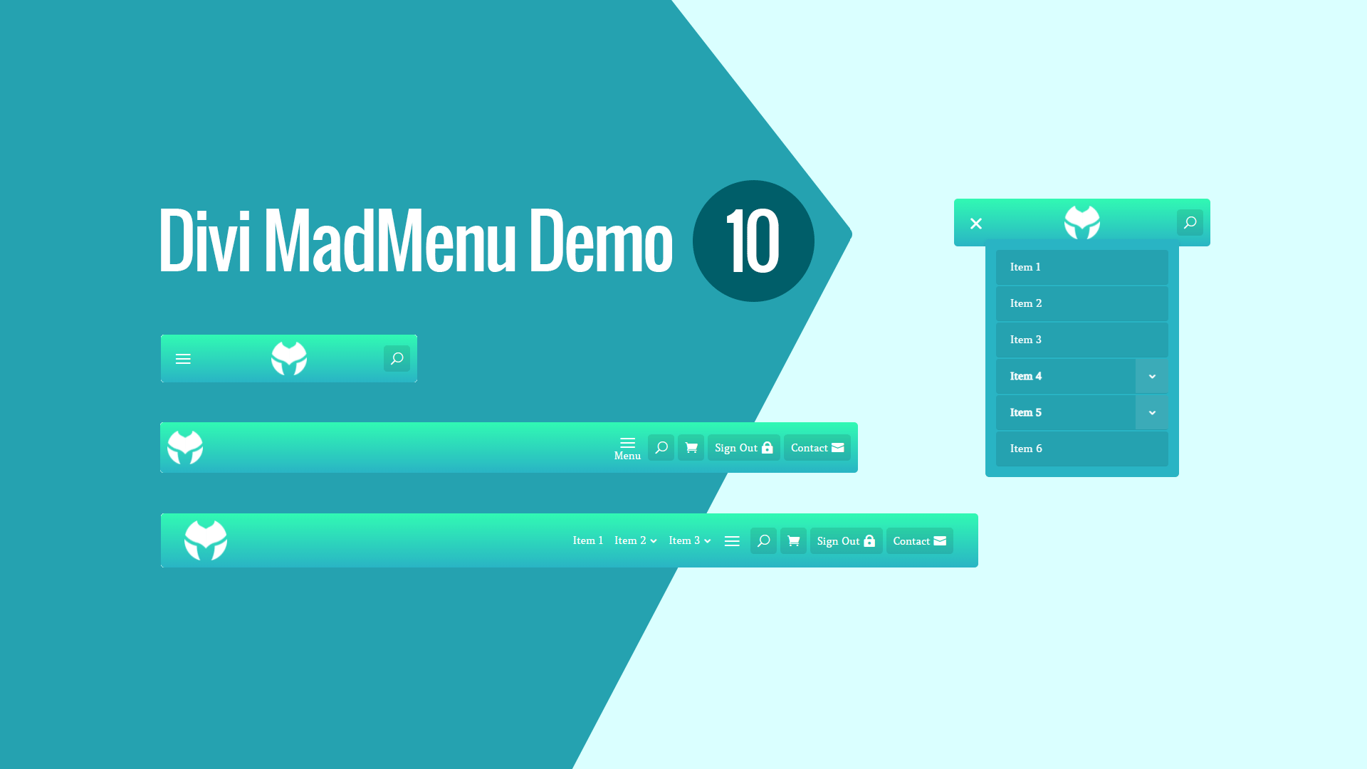
The mobile menu is enabled on desktop by applying a custom menu breakpoint.
Elements Responsive Visibility
The header elements are displayed depending on the device, not all elements are shown on all devices.
Elements Responsive Ordering
The mobile menu (hamburger menu) and logo are ordered differently on Phone.
Responsive design
The menu template is designed with responsiveness in mind, it looks great on any screen width (though it depends on the number of the menu items in the menu used for desktop).
Collapsed Mobile Submenus
The mobile submenus are collapsed and can be toggled by clicking the parent menu item.
Accordion mode enabled
Menu CTA button
The desktop and tablet menus have the CTA button enabled(the Contact button).
Sign In/Sign Out Button
The Sign In button allows the signed out user to sign in(you need to link this button to the page with the sign in form).
The same button becomes the Sign Out button when the user is signed in allowing the user to sign out.
No Custom Code Used!
This demo layout does not use any custom code. It can be fully customized using the Divi MadMenu settings (and other Divi Builder elements if any used) like any other Divi layout.

