Main Features
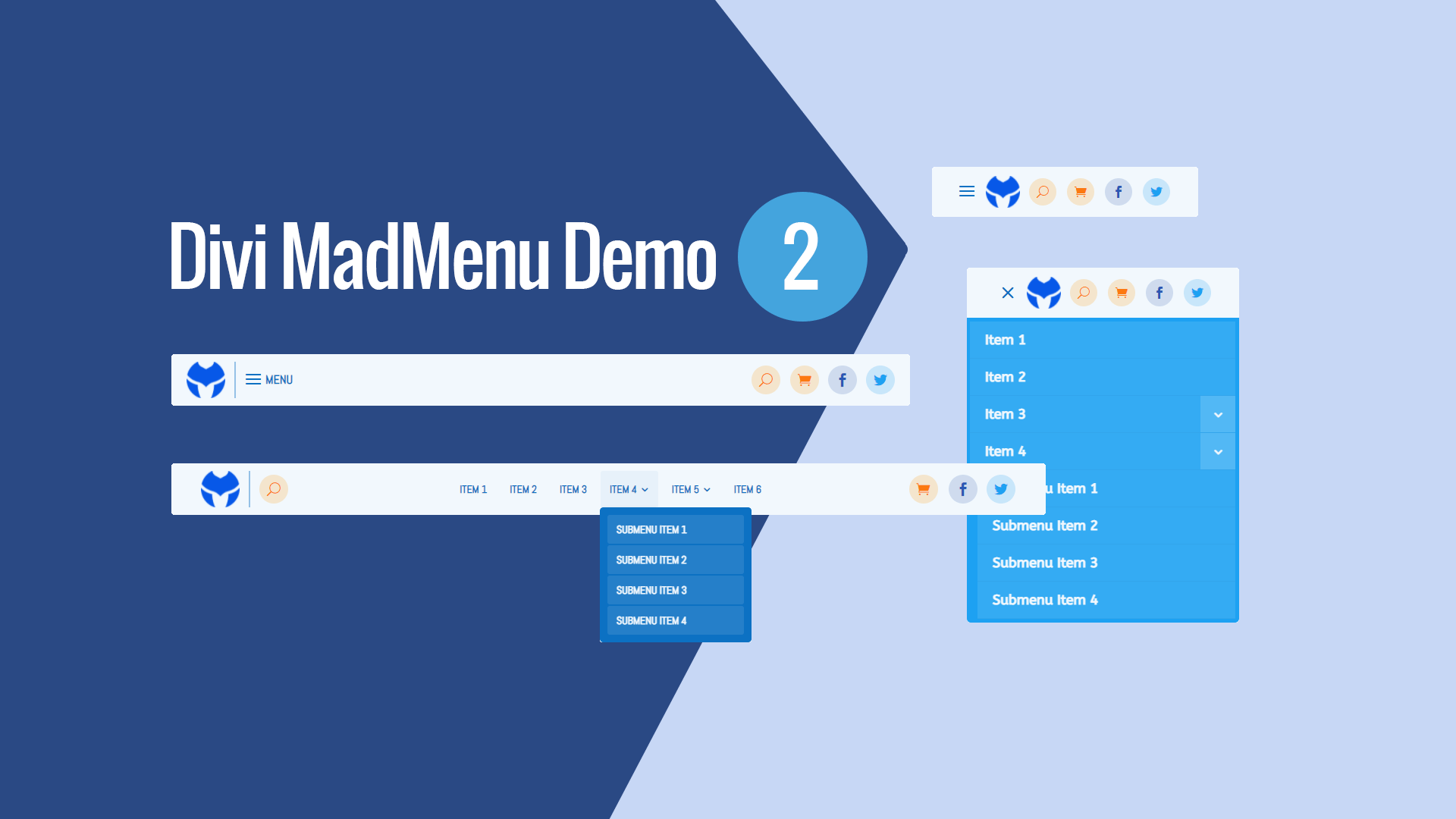
Centered Desktop Menu
The desktop menu items are centered, with the rest of the header elements aligned to left and right sides on desktop.
Social Icons
Button elements used as social media icons.
Search and Cart Enabled
The Search and Cart elements are both enabled.
Responsive Design
The menu template is designed with responsiveness in mind, it looks great on any screen width (though it depends on the number of the menu items in the menu used for desktop).
Mobile Menu Toggle Label Enabled
The mobile menu toggle(hamburger icon) is set the Menu label on Tablet.
Collapsed Mobile Submenus
The mobile submenus are collapsed and can be toggled by clicking the parent menu item.
Accordion mode enabled
Fullwidth Dropdown Menu On Phone
Mobile dropdown menu is full width on Phone.
No Custom Code Used!
This demo layout does not use any custom code. It can be fully customized using the Divi MadMenu settings (and other Divi Builder elements if any used) like any other Divi layout.

