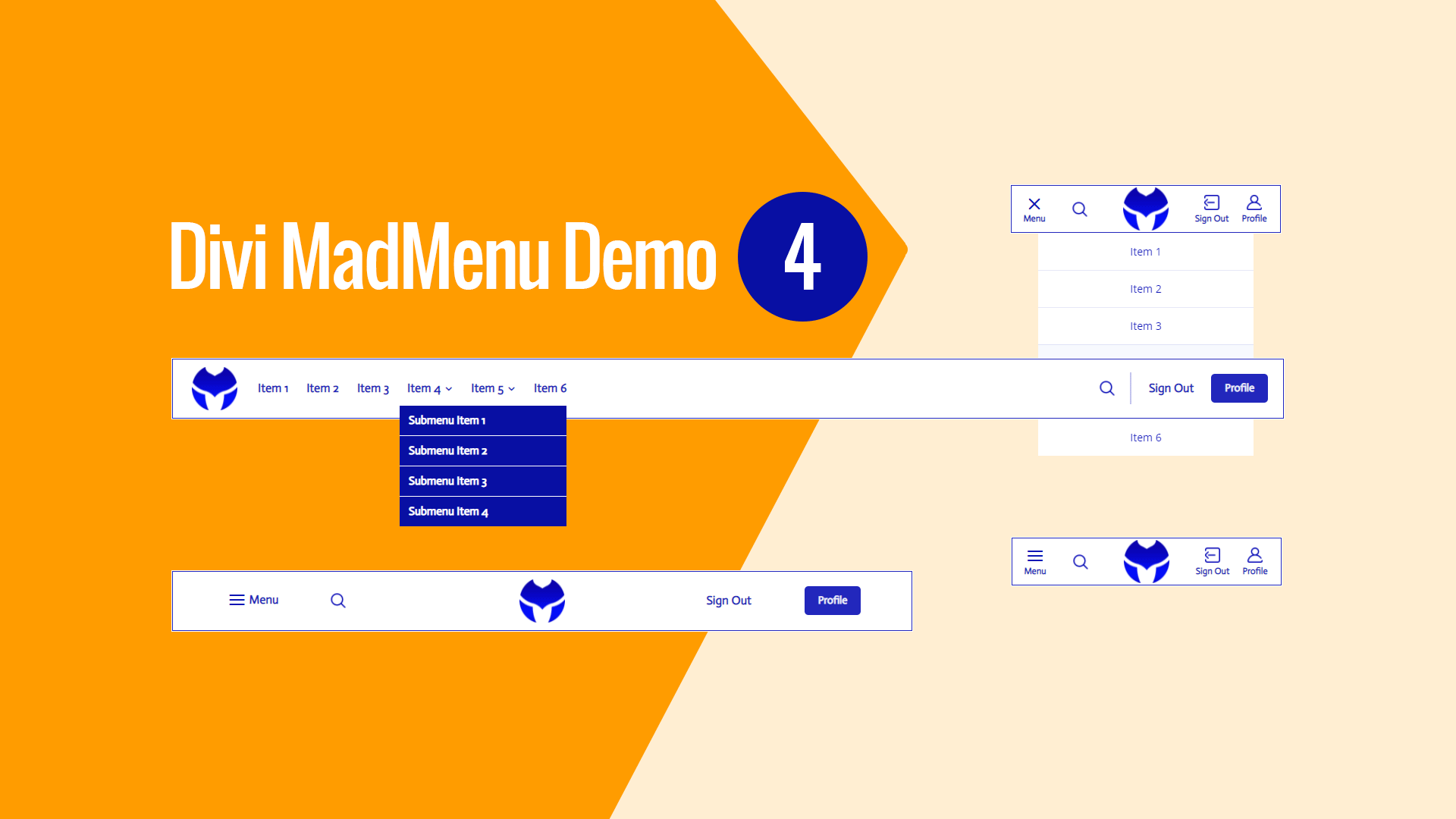
Main Features
Fullwidth Header
The header spans the entire screen width.
Elements Responsive Ordering
Header elements ordered differently on mobile devices.
Search Enabled
Search is enabled on all devices.
Responsive Design
The menu template is designed with responsiveness in mind, it looks great on any screen width.
Custom Image Icons Used
Custom image icons used for the header elements.
Mobile Menu Toggle Label Enabled
The mobile menu toggle(hamburger icon) is set the Menu label.
Sign Up/Profile Button
The Sign Up button allows the site visitor to create an account (you need to link this button to the page with the registration form).
The same button becomes the Profile button for the logged in user which you can link to the user profile page.
Sign In/Sign Out Button
The Sign In button allows the logged out user to log in(you need to link this button to the page with the log in form).
The same button becomes the Sign Out button when the user is logged in allowing the user to log out.
Collapsed Mobile Submenus
The mobile submenus are collapsed and can be toggled by clicking the parent menu item.
Accordion Mode Enabled
The Accordion Mode is enabled for the mobile submenus allowing to have only one expanded submenu at a time.
No Custom Code Used!
This demo layout does not use any custom code. It can be fully customized using the Divi MadMenu settings (and other Divi Builder elements if any used) like any other Divi layout.

