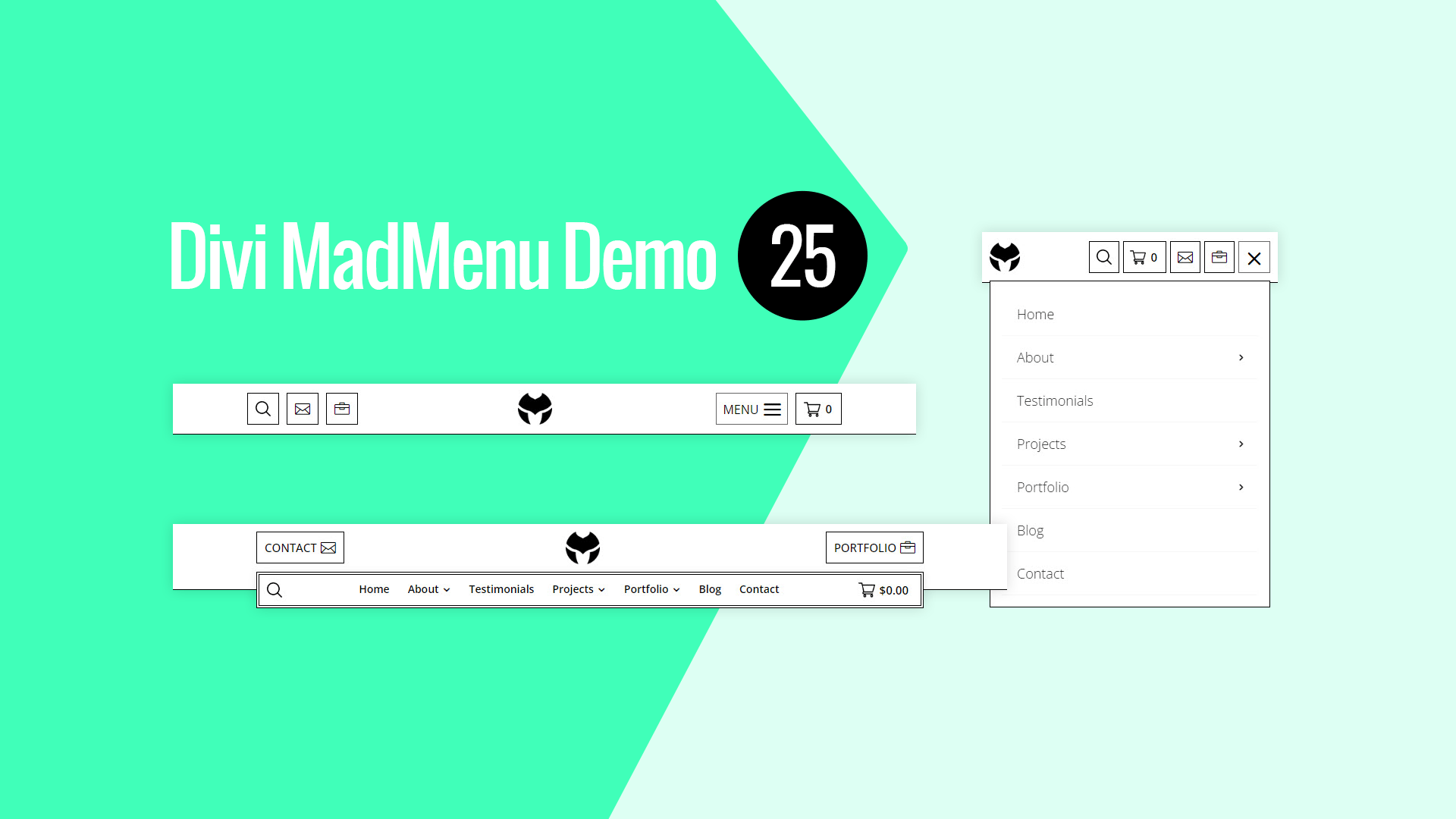
Divi MadMenu Header Template 25 – Horizontal Header
Main Features
Horizontal Menu
The header layout is horizontal with two-rows structure.
Fixed Header
Fixed header is enabled on all devices.
Overlapping Menu
Horizontal menu overlaps the header bar bottom edge on desktop.
Logo Alignment
Logo is centered on desktop and tablet, and left aligned on phone devices.
Two CTA Buttons
Two CTA buttons available aligned differently on different devices.
Search
Search enabled both on desktop and mobile.
Cart
Shopping cart icon with cart subtotal displayed on desktop and cart items count displayed on mobile.
Collapsed Mobile Menu Submenus
The mobile menu submenus are collapsed and can be revealed by clicking the parent menu item/arrow.
Slide-In Submenus
The Slide-In submenus style used for the collapsed mobile menu submenus.
Close Mobile Menu On Outside Click
Mobile menu closes when users click anywhere on the page outside the menu.
Responsive Design
The header template is designed with responsiveness in mind, it looks great on any screen.

