How To Set The Divi MadMenu Elements Column Width
One of the features that make Divi MadMenu so flexible when it comes to creating reponsive header layouts is the ability to control the header elements column widths.
In this tutorial I will show how to set the Divi MadMenu elements column widths and control the elements alignment using this feature.
For demonstration we will use one of the demo header layouts that are available with Divi MadMenu.
This header layout has all seven elements enabled: the Logo, Desktop Menu, Mobile Menu, Search, Cart, Button One and Button Two.
It has the Search, Cart and two Button elements on the left while the Logo and Mobile Menu elements are aligned to the right.
The Desktop Menu element is in the middle with the menu items centered.
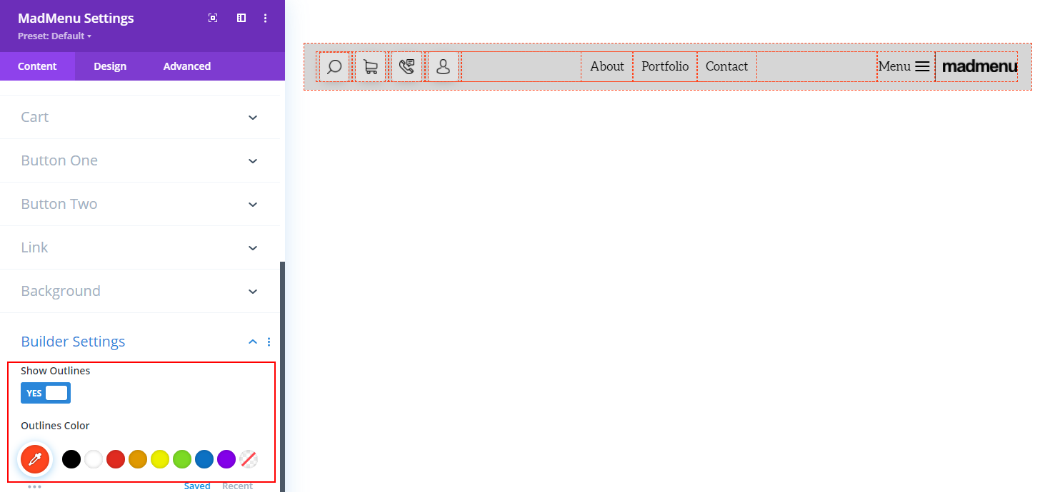
To see how all these elements are aligned and how much space each occupies let’s enable the outlines in the MadMenu Settings->Content->Builder Settings->Show Outlines.
The outlines are enabled not only for the columns but for the elements’ content as well to help with the contents vertical and horizontal alignment.
But in this tutorial we will be focusing on the columns width settings only.
So, here are the columns:
In this tutorial we will explore the Divi MadMenu column width settings by learning how to properly align an element’s content in the middle of the header (in this case it’s the desktop menu items).
While the rest of the elements will be pushed to the left and right sides of the header.
Elements Column Width Settings
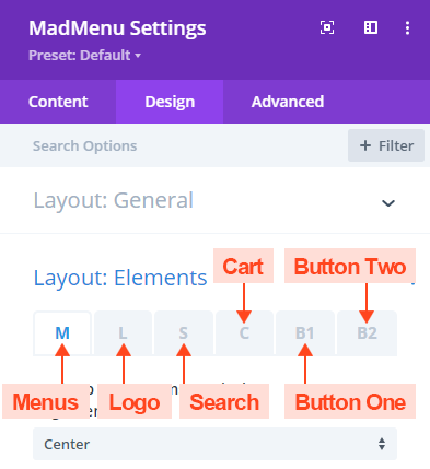
The column width can be set in the Design -> Layout:Elements section for each element individually.
The settings are located in separate tabs each labeled according to the element’s name .
Each of the tabs contains the layout settings for the corresponding header element except for the M (the Menus) tab which contains the layout settings of both the Desktop Menu and the Mobile Menu elements.
Elements Alignment
Let’s see how easily this can be achieved using the column width settings.
Initially, when none of the elements are set a specific column width value the header layout looks like this:
By default all the elements are aligned to the left leaving an unallocated space to the right hand side of the elements.
We can change the elements alignment using the Elements Alignment setting in the Design->Layout:General section.
For example, we can center them by selecting the Center option.
This centers the elements but still leaves emty spaces to the left and right sides of the header.
Whereas we need only the Desktop Menu centered and the other elements pushed to the left and right edges.
Setting the Column Widths
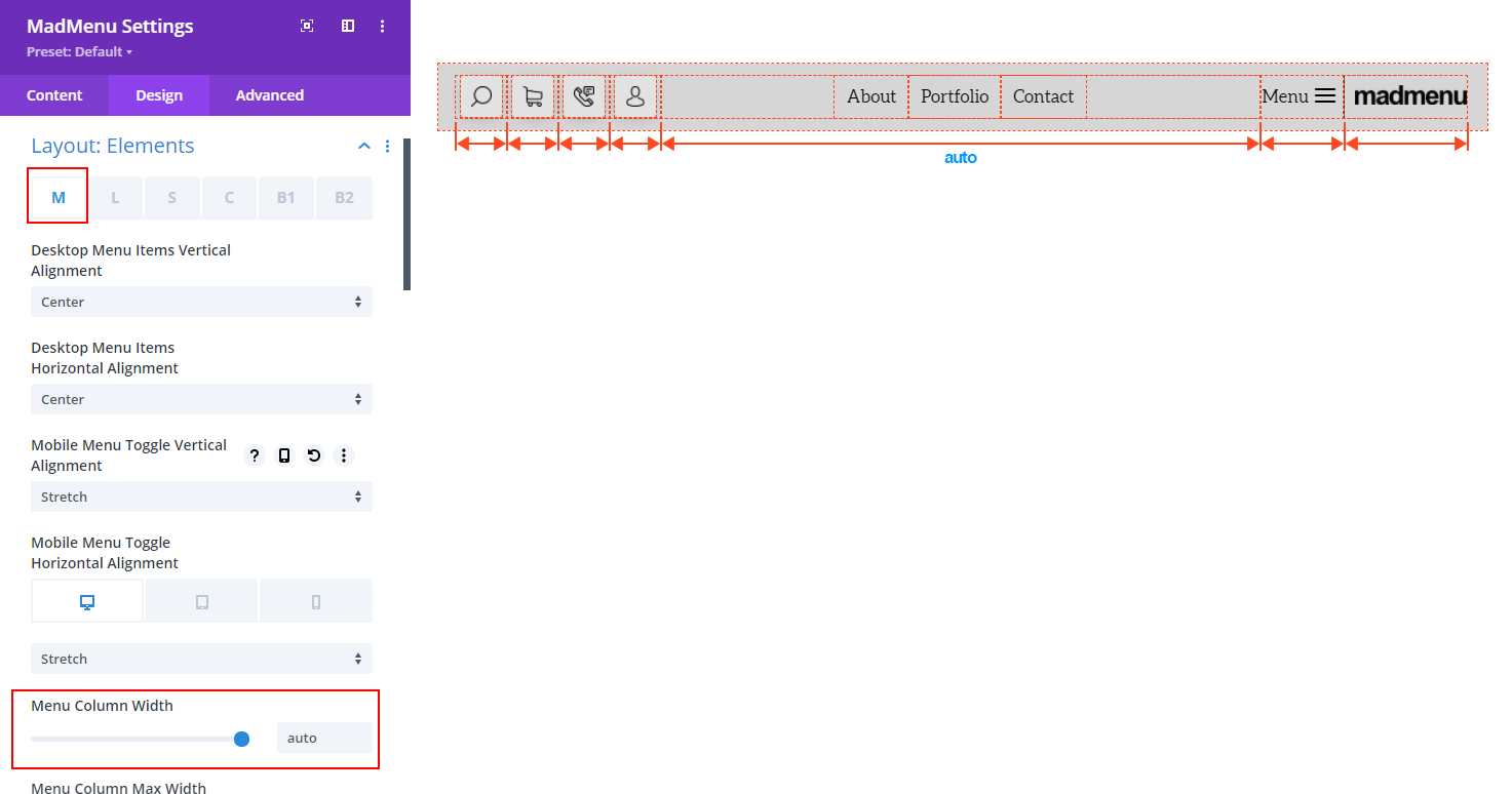
The auto value makes the column of the element occupy all the unallocated space pushing all other elements to the sides.
To do that we need to go to the Design->Layout:Elements->M tab (Menus) and set the Menu Column Width setting value to auto.
By default the desktop menu items are aligned to center, so, now the desktop menu seems to be centered.
However, that’s not necessarily true because the widths of the header contents on the left and right sides maybe different causing the Desktop Menu element move closer to one of the sides.
To make sure that the desktop menu is perfectly centered we need to set the column widths of the elements on the left and right sides so that their combined widths match each other.
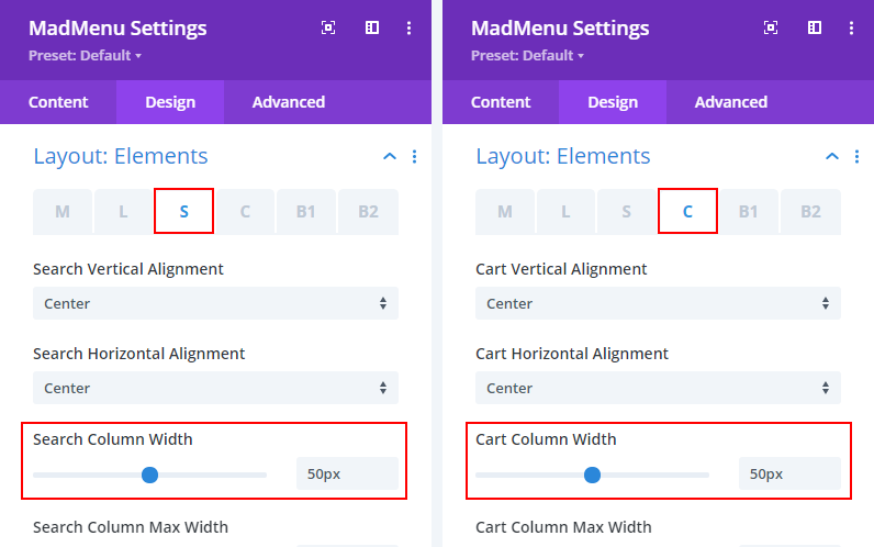
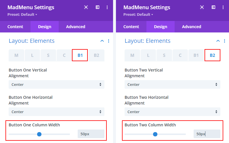
So, let’s set the columns widths of the elements on the left side to 50px each, which makes 200px in total.
These are the Search, Cart, Button One and Button Two elements columns.
As we already know, the column width of the Mobile Menu and the Logo elements are set in the Design->Layout:Elements section in the M and L tabs respectively.
So, let’s set the Mobile Menu element’s column width to 85px and the Logo column to 115px (again 200px in total).
The header layout structure looks like this now:
Now that the header contents width on the left and on the right sides match we can be sure that the Desktop Menu element is centered properly.
Summary
In this tutrial we have seen how to set the header elements column width and use this feature to align the Divi MadMenu elements.
In order to place the element in the middle of the header we need to make sure that the combined width of the elements columns on the left equals to that of the elements on the right.
And the element in the middle needs to have the column width set to auto with the contents centered.
This diagram demonstrates it all:
This is just an example of how you can use the columns widths to align the header elements.
It is suitable for this particular header design but may not be suitable for other designs.
Because it all depends on the content that you want to include in the header when creating it with Divi MadMenu plugin(size of the logo, number of the main menu items, CTA buttons text, etc.).
Hope you find this tutorial helpful. Feel free to share your thoughts and suggestions in the comments section below.







Great tutorial, and awesome plugin. Thanks
nice! by the way, i added a row before the madmenu module, but it always shows after the madmenu, how to fix that?
Hi Alex.
Thanks for your question. Did you enable the Fixed positioning for the Divi MadMenu header? The fixed header will overlap the page content if you select the Top(Overlap Content) option.
Please submit a support request if you need any further help with that. Thanks.