10 Dropdown Animations for Divi Submenu
Last update: 17.09.2021 – added support for the Menu Module.
Divi theme has some cool dropdown animations built in and you can easily select the desired one in the Theme Customizer settings(for the default header) and in the Menu Module settings.
In this tutorial I would like to expand this list of dropdown animations by sharing with you 10 more effects.
I have been experimenting with different menu animations and found some really cool ones. These are pure CSS animations and work well with Divi after I’ve applied some adjustments to the original CSS.
The only problem is that the backwards animation does not work due to the fact that Divi adds et-dropdown-removing CSS class to the dropdown menu on mouse leave which hides dropdown menu by applying display:none; rule which is not animatable, that’s why the submenu disappears immediately.
Anyway, these animations look nice, check out the live demo.
To enable these animations for the default header of Divi theme you will need to copy the CSS snippets and paste them into Divi -> Theme Options -> General -> Custom CSS or into the child theme style.css file.
However, if you want to use the Menu module to create you website header then I’d recommend you to use the Code module to add the CSS to the header template so that this CSS gets loaded only on the pages which this header template is assigned to (remember to wrap the CSS with the style tag when adding it into the Code module).
And if you want these effects to apply to a certain Menu module only then you should assign it a CSS class in the Menu Settings -> Advanced -> CSS ID & Classes -> CSS Class and use it in the CSS selectors to target that specific Menu module.
For example, I’ve used the dvcs_submenu_effects CSS class in the CSS below, you can use the same class or replace it with any other class you like.
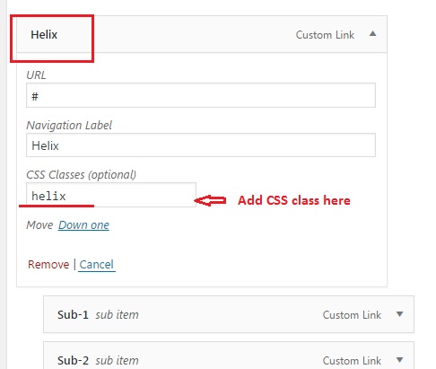
Then add the CSS class indicated for each effect below to the parent menu item(s) of your menu in Appearance -> Menus -> Your Menu like this:
Prepare submenu for applying animations
/* Prepare the submenu for applying animations */
#top-menu-nav ul.sub-menu,
.dvcs_submenu_effects .et-menu-nav ul.sub-menu {
    overflow: hidden;
    border-top: 0;
    border-radius: 3px;
    background-color: transparent !important;
    padding: 0px !important;
    -webkit-box-shadow: none !important;
    box-shadow: none !important;
}

#top-menu-nav ul#top-menu > li:hover ul.sub-menu,
#top-menu-nav ul#top-menu > li:focus ul.sub-menu,
.dvcs_submenu_effects .et-menu-nav ul.et-menu > li:hover ul.sub-menu,
.dvcs_submenu_effects .et-menu-nav ul.et-menu > li:focus ul.sub-menu {
    max-height: 2000px ;
}

#top-menu-nav #top-menu li li a,
.dvcs_submenu_effects .et-menu-nav .et-menu li li a {
    width: 240px !important;
    color: #ffffff !important; /* submenu item link color */
}

#top-menu-nav #top-menu li li,
.dvcs_submenu_effects .et-menu-nav .et-menu li li {
    padding: 0px !important;
    background-color: #0b15c4 !important; /* submenu item background color */
}
CSS common to all animation effects
Add this CSS to set transition rules used by all animations. Here it’s assumed that your menu has submenus with up to 8 (eight) items, however, if there are more than eight items then you can add additional CSS rules following the same pattern.
/*
 * Menu Effects: A collection of CSS3 menu effects (degrades gracefully in IE8).
 *
 * Don't hesitate to create new effects and remove the ones you don't need.
 *
 * latest version and complete README available on Github:
 * https://github.com/louisremi/menu-effects
 *
 * Copyright 2012 @louis_remi
 * Licensed under the MIT license.
 */

/* Progressive Animations
 * ==================================================================
 * This is a lot of redundant code but the result is worth it
 * This should be edited for menus with more or much less than 8 items
 */

/* forward */
#top-menu-nav ul#top-menu > li:hover ul.sub-menu li:nth-child(1),
.dvcs_submenu_effects .et-menu-nav ul.et-menu > li:hover ul.sub-menu li:nth-child(1) {
    -webkit-transition-delay: 0s;
    -o-transition-delay: 0s;
    transition-delay: 0s;
}

#top-menu-nav ul#top-menu > li:hover ul.sub-menu li:nth-child(2),
.dvcs_submenu_effects .et-menu-nav ul.et-menu > li:hover ul.sub-menu li:nth-child(2) {
    -webkit-transition-delay: 66ms;
    -o-transition-delay: 66ms;
    transition-delay: 66ms;
}

#top-menu-nav ul#top-menu > li:hover ul.sub-menu li:nth-child(3),
.dvcs_submenu_effects .et-menu-nav ul.et-menu > li:hover ul.sub-menu li:nth-child(3) {
    -webkit-transition-delay: 133ms;
    -o-transition-delay: 133ms;
    transition-delay: 133ms;
}

#top-menu-nav ul#top-menu > li:hover ul.sub-menu li:nth-child(4),
.dvcs_submenu_effects .et-menu-nav ul.et-menu > li:hover ul.sub-menu li:nth-child(4) {
    -webkit-transition-delay: 200ms;
    -o-transition-delay: 200ms;
    transition-delay: 200ms;
}

#top-menu-nav ul#top-menu > li:hover ul.sub-menu li:nth-child(5),
.dvcs_submenu_effects .et-menu-nav ul.et-menu > li:hover ul.sub-menu li:nth-child(5) {
    -webkit-transition-delay: 266ms;
    -o-transition-delay: 266ms;
    transition-delay: 266ms;
}

#top-menu-nav ul#top-menu > li:hover ul.sub-menu li:nth-child(6),
.dvcs_submenu_effects .et-menu-nav ul.et-menu > li:hover ul.sub-menu li:nth-child(6) {
    -webkit-transition-delay: 333ms;
    -o-transition-delay: 333ms;
    transition-delay: 333ms;
}

#top-menu-nav ul#top-menu > li:hover ul.sub-menu li:nth-child(7),
.dvcs_submenu_effects .et-menu-nav ul.et-menu > li:hover ul.sub-menu li:nth-child(7) {
    -webkit-transition-delay: 400ms;
    -o-transition-delay: 400ms;
    transition-delay: 400ms;
}

#top-menu-nav ul#top-menu > li:hover ul.sub-menu li:nth-child(8),
.dvcs_submenu_effects .et-menu-nav ul.et-menu > li:hover ul.sub-menu li:nth-child(8) {
    -webkit-transition-delay: 466ms;
    -o-transition-delay: 466ms;
    transition-delay: 466ms;
}

/* Default */
#top-menu-nav ul.sub-menu li,
.dvcs_submenu_effects .et-menu-nav ul.sub-menu li {
    margin: 0px !important;
    opacity: 0;
    -webkit-transition: opacity .4s, -webkit-transform .6s, max-height .6s;
    -o-transition: opacity .4s, -o-transform .6s, max-height .6s;
    transition: opacity .4s, transform .6s, max-height .6s;
}

#top-menu-nav ul#top-menu > li:hover ul.sub-menu li,
#top-menu-nav ul#top-menu > li:focus ul.sub-menu li,
.dvcs_submenu_effects .et-menu-nav ul.et-menu > li:hover ul.sub-menu li,
.dvcs_submenu_effects .et-menu-nav ul.et-menu > li:focus ul.sub-menu li {
    opacity: 1;
    -webkit-transform: none;
    -ms-transform: none;
    transform: none;
}
Animations CSS Snippets

Helix Effect
CSS Class: helix
/* Helix Effect */
#top-menu-nav li.helix ul.sub-menu,
.dvcs_submenu_effects .et-menu-nav li.helix ul.sub-menu {
    -webkit-perspective: 400px;
    -ms-perspective: 400px;
    -o-perspective: 400px;
    perspective: 400px;
}

#top-menu-nav li.helix ul.sub-menu li,
.dvcs_submenu_effects .et-menu-nav li.helix ul.sub-menu li {
    -webkit-transform: rotateY(90deg);
    -ms-transform: rotateY(90deg);
    transform: rotateY(90deg);
}
/* END Helix Effect */
Wave Effect
CSS Class: wave
/* Wave Effect */
#top-menu-nav li.wave ul.sub-menu li,
.dvcs_submenu_effects .et-menu-nav li.wave ul.sub-menu li {
    -webkit-transform-origin: 0% 0%;
    -ms-transform-origin: 0% 0%;
    transform-origin: 0% 0%;
    -webkit-transform: skewY(-90deg);
    -ms-transform: skewY(-90deg);
    transform: skewY(-90deg);
}
/* END Wave Effect */
Fan Effect
CSS Class: fan
/* Fan Effect */
#top-menu-nav li.fan ul.sub-menu li,
.dvcs_submenu_effects .et-menu-nav li.fan ul.sub-menu li {
    -webkit-transform-origin: 0% 0%;
    -ms-transform-origin: 0% 0%;
    transform-origin: 0% 0%;
    -webkit-transform: rotate(90deg);
    -ms-transform: rotate(90deg);
    transform: rotate(90deg);
}
/* END Fan Effect */
Papercut Effect
CSS Class: papercut
/* Papercut Effect */
#top-menu-nav li.papercut ul.sub-menu,
.dvcs_submenu_effects .et-menu-nav li.papercut ul.sub-menu {
    -webkit-perspective: 600px;
    -ms-perspective: 600px;
    -o-perspective: 600px;
    perspective: 600px;
    -webkit-perspective-origin: 0% 0%;
    -ms-perspective-origin: 0% 0%;
    -o-perspective-origin: 0% 0%;
    perspective-origin: 0% 0%;
}

#top-menu-nav li.papercut ul.sub-menu li,
.dvcs_submenu_effects .et-menu-nav li.papercut ul.sub-menu li {
    -webkit-transform-origin: 0% 0%;
    -ms-transform-origin: 0% 0%;
    transform-origin: 0% 0%;
    -webkit-transform: skewY(30deg);
    -ms-transform: skewY(30deg);
    transform: skewY(30deg);
}
/* END Papercut Effect */
Fly Effect
CSS Class: fly
/* Fly Effect */
#top-menu-nav li.fly ul.sub-menu,
.dvcs_submenu_effects .et-menu-nav li.fly ul.sub-menu {
    -webkit-perspective: 400px;
    -ms-perspective: 400px;
    -o-perspective: 400px;
    perspective: 400px;
}

#top-menu-nav li.fly ul.sub-menu li,
.dvcs_submenu_effects .et-menu-nav li.fly ul.sub-menu li {
    -webkit-transform-origin: 50% 50% -50px;
    -ms-transform-origin: 50% 50% -50px;
    transform-origin: 50% 50% -50px;
    -webkit-transform: rotateX( -180deg );
    -ms-transform: rotateX( -180deg );
    transform: rotateX( -180deg );
}
/* END Fly Effect */
Blind Effect
CSS Class: blind
/* Blind Effect */
#top-menu-nav li.blind ul.sub-menu li,
.dvcs_submenu_effects .et-menu-nav li.blind ul.sub-menu li {
    max-height: 0;
}

#top-menu-nav li.blind:hover ul.sub-menu li,
#top-menu-nav li.blind:focus ul.sub-menu li,
.dvcs_submenu_effects .et-menu-nav li.blind:hover ul.sub-menu li,
.dvcs_submenu_effects .et-menu-nav li.blind:focus ul.sub-menu li {
    /* This should be changed to the normal height of list-items */
    max-height: 40px;
}
/* END Blind Effect */
Venitian Effect
CSS Class: venitian
/* Venitian Effect */
#top-menu-nav li.venitian ul.sub-menu li,
.dvcs_submenu_effects .et-menu-nav li.venitian ul.sub-menu li {
    -webkit-transform-origin: 50% 0;
    -ms-transform-origin: 50% 0;
    transform-origin: 50% 0;
    -webkit-transform: scale(1,0);
    -ms-transform: scale(1,0);
    transform: scale(1,0);
}
/* END Venitian Effect */
Jaws Effect
CSS Class: jaws
/* Jaws Effect */
#top-menu-nav li.jaws ul.sub-menu li,
.dvcs_submenu_effects .et-menu-nav li.jaws ul.sub-menu li {
    -webkit-transform-origin: 50% -100px;
    -ms-transform-origin: 50% -100px;
    transform-origin: 50% -100px;
}

#top-menu-nav li.jaws ul.sub-menu li:nth-child(odd),
.dvcs_submenu_effects .et-menu-nav li.jaws ul.sub-menu li:nth-child(odd) {
    -webkit-transform: rotate(90deg);
    -ms-transform: rotate(90deg);
    transform: rotate(90deg);
}

#top-menu-nav li.jaws ul.sub-menu li:nth-child(even),
.dvcs_submenu_effects .et-menu-nav li.jaws ul.sub-menu li:nth-child(even) {
    -webkit-transform: rotate(-90deg);
    -ms-transform: rotate(-90deg);
    transform: rotate(-90deg);
}
/* END Jaws Effect */
Fence Effect
CSS Class: fence
/* Fence Effect */
#top-menu-nav li.fence ul.sub-menu,
.dvcs_submenu_effects .et-menu-nav li.fence ul.sub-menu {
    -webkit-perspective: 600px;
    -ms-perspective: 600px;
    -o-perspective: 600px;
    perspective: 600px;
}

#top-menu-nav li.fence ul.sub-menu li:nth-child(odd),
.dvcs_submenu_effects .et-menu-nav li.fence ul.sub-menu li:nth-child(odd) {
    -webkit-transform-origin: 0 50%;
    -ms-transform-origin: 0 50%;
    transform-origin: 0 50%;
    -webkit-transform: rotateY(90deg);
    -ms-transform: rotateY(90deg);
    transform: rotateY(90deg);
}

#top-menu-nav li.fence ul.sub-menu li:nth-child(even),
.dvcs_submenu_effects .et-menu-nav li.fence ul.sub-menu li:nth-child(even) {
    -webkit-transform-origin: 100% 50%;
    -ms-transform-origin: 100% 50%;
    transform-origin: 100% 50%;
    -webkit-transform: rotateY(-90deg);
    -ms-transform: rotateY(-90deg);
    transform: rotateY(-90deg);
}
/* END Fence Effect */
Zipper Effect
CSS Class: zipper
/* Zipper Effect */
#top-menu-nav li.zipper ul.sub-menu li:nth-child(odd),
.dvcs_submenu_effects .et-menu-nav li.zipper ul.sub-menu li:nth-child(odd) {
    -webkit-transform: translateX(-100%);
    -ms-transform: translateX(-100%);
    transform: translateX(-100%);
}

#top-menu-nav li.zipper ul.sub-menu li:nth-child(even),
.dvcs_submenu_effects .et-menu-nav li.zipper ul.sub-menu li:nth-child(even) {
    -webkit-transform: translateX(100%);
    -ms-transform: translateX(100%);
    transform: translateX(100%);
}
/* END Zipper Effect */
Never-mind, I figured it out.
Thanks for the awesome tutorial
Hi Amit. Glad to know you’ve figured it out :) .
How can I remove the blue line under the navigation or change the color so it matches the drop-down effect?
Thanks in advance
Danke für die Info ich habe den MMC vor einiger Zeit schon gekauft :-) schön wäre es wenn man diese animationen dem MMC hinzufügen könnte
Regards Dina
“Thanks for the info I bought the MMC some time ago :) it would be nice if you could add these animations to the MMC” – this is what I understood from your message in German, hope it is correct :).
Well, I have already added 10 other animations to MMC plugin, although those are for the main dropdown menu but not the submenus. But I will look into it and see what I can do about this.
Btw, thank you for using the MMC plugin :) .
Hello
After insert the css the animation works nice on desktop on the mobil phone all links open list :-( kann i closed an open by klick on the menu above
Hi Dina.
These animations are for desktop only since hover effects/animations do not make sense on mobile. They probably could be implemented for mobile too but not as hover animations but would take effect on tapping the parent menu item. Need to test this.
But if you want just to collapse submenu on mobile then you can check out this tutorial on ET blog -> Divi Mobile Menu Hack: Collapsing Nested Menu Items, or if you would like to solve it using a plugin then you can check out the Mobile Menu Customizer plugin which has the option for collapsing submenu items.
This is an excellent and exceptional tutorial! Thank you very much for your labor of love.
Hi William. Thanks for your comment, much appreciated :)
Hi there! Great tutorial! I was wondering, is it possible to use these effects when displaying the main menu using Divi’s Full-Width Menu Module as well? I applied the CSS classes to the top-level menu items in the WP menus section, but they don’t seem to be doing anything. Does something different need to be done in order to use them with the full-width menu? I also tried applying the class (helix, in this case) in the Advanced tab of the menu module settings but that didn’t work either.
Thanks again for the great stuff! :-)
Hi Bobby, thanks for your comment. Yes, it is possible to apply these animations to Fullwidth Menu, you’ll need to make the following changes to the CSS though:
#top-menu-navid with the.fullwidth-menu-navclass#top-menuid with the.fullwidth-menuclass#top-menu-nav li.helix ul.sub-menu { ... }.et_pb_fullwidth_menu.helix .fullwidth-menu-nav li ul.sub-menu { ... }Sorry for the late reply, hope this will be helpful, I tested it and it works fine. Feel free to contact me if you have any questions, I’ll be glad to help.
the boxes on this page don’t open. (with the code in)
I landed on this site maybe a few months ago now, nice to see you’ve been adding some cool things. I’ll probably use the water effect button even though it’s a bit wacky lol. But very nice.
Hi Nicholas, thanks for letting me know about the issue, now the accordion with code snippets is working fine, I’ve fixed it. I’m glad to know that you like what I’ve been posting till now, I try to post cool stuff on a regular basis, so feel free to visit my blog from time to time :).
I do not even know how I ended up here, but I thought
this post was great. I do not know who you are but certainly you’re going to a
famous blogger if you aren’t already ;) Cheers!
I don’t know who you are neither, but thank you for your kind words ;)
Hey! I missed this! That’s really amazing, thank you!
I wonder if I can use it with the mega-menu class. What do you think?
Hey, Samson. Sure, they will work with the mega menu too, although the effects might look slightly different. Just add the
mega-menuCSS class and any of these effects’ CSS classes to the menu item having dropdown menu items and see what it’s going to look like.Hello Ivan
I’m new here just from today and loving your stuff. I was thinking is it possible to have different effect depending on time of day? For example, if am it would be Helix Effect and if pm it would be Fence Effect. I think this could be interesting :-)
Thanks
Adam
Hello Adam. It could be done using JS, first you need to check for the visitor’s local time and then toggle the dropdown menu animation effects CSS classes depending on whether it is
amorpm.Thanks again Ivan for taking time out of your busy schedule to give me some clue in regards to what may be happening with my site. Wish you were my Divi supporter, as I did not get that response/help. My site codes were mysteriously deleted and even after entering some again the other day after importing a grid layout, it was once again deleted after update and then after my site has been really out of whack. Not sure what’s going on. I was able to download the bracket, but honestly I have no clue how to know where to find the error because I did not see anything highlighted after I added the file where the code error for the ‘}’ you mentioned. I guess I will have to go to my university to get a lesson or two for this as I have no clue. Just learning as I go. Thanks again for your awesome work. Looking forward to more tutorials. Hope you have a wonderful day.
I am always trying to help as much as I can and it’s ok that you’re facing such problems, all of us have gone through that :) If you want to learn how to use brackets just google for tutorials, I am sure there are some good ones out there (e.g. here or here). Also there is a bunch of large Facebook groups devoted to Divi, and the members are very helpful there, I’d suggest you to join these groups if you haven’t done it yet and ask for help whenever you need, it is an amazing community. Thanks for your kind words, I really appreciate that and wish you good luck.
Hi Ivan,
Thank you for sharing this tutorial. I have not been able to get this effect to work. I added both steps 1, 2 & 3 codes to css panel in theme options. Then I setup a custom link using the info listed. However, I am not sure but did not see the effect take place. I had another primary menu list but changes it to the helix to see the effect. Should I just add the class to my already primary menu setup? I am not sure what I am doing wrong but I am just not seeing the effect. Thanks in advance for your help.
Hi D! Thanks for asking. Yes, you have to add the effect class to the primary menu item that has submenu items and make sure that all the CSS code is copied properly. If you still don’t get the result please share your url, I’ll look into the issue.
Hi Ivan,
I am still having problems and my site is currently messed up but you can still see. It’s reformation2016.com
Thanks for your prompt response to my query and for trying to assist me.
Always welcome ;) So, I checked your CSS code and found the issue. Please find this line in your CSS:
.social_media_custom_1, .social_media_custom_2, .social_media_custom_3, .social_media_custom_4 {..., you forgot to close it with a ‘}’ which is breaking all CSS code below that line. I closed it in Chrome Developer Tools and the helix effect worked. Also you did not close your commented code with a ‘*/’. Be careful next time, these little things can cause you a lot of headache :)
Thank you so much Ivan, I really appreciate it. I closed with the “}” as suggested and it worked. Now, I am new to CSS codes and was not able to find the commented code you mentioned to place the “*/”. I have been having a headache trying to figure out why some of my other codes did not work and my site being messed up. Is it possible for you to guide me as to how to find the are to close it? Thanks in advance.
Well, looks like you uncommented that code, it was going right after the CSS rule that you closed with a closing curly brace (‘}’), but this time you have 2 closing curly braces there, remove one of them. Always before pasting your CSS into Divi Custom CSS field or your child theme style.css file check it with a code editor, e.g. Brackets which is good and free, it has syntax highliting which allows you to detect easily such issues as unclosed ‘}’ or commented code. Hope this is helpful.
Hi, the menu itens doesn’t have that css class option anymore, how can i apply this effect on thw new divi?
Hi, Gabriel. You can easily enable CSS Classes field for menu items, just go to Appearance > Menus then click “Screen Options” at the very top of the page and check “CSS Classes” checkbox.
Thank for share… love it…!
Thank you for your generosity!
Thanks Ivan! Great animations!!!
Hi Steven. Glad you like it. More great stuff is coming soon ;)
Thank you so much Ivan for this great work!
I just wanted to let someone know that I appreciate this gift and will use it to make great designs. Thank you very much for your labor.
Hey Dean! Thanks for your comment. Sure, you are free to use these snippets in your projects, and I would really like to see your designs with these effects :)