11 Hover Effects for Divi Button Module
In this post I’d like to share some CSS snippets for applying nice hover effects to Divi Button module. These are really simple to implement but cool effects, check out the demos and read the quick implementation guidline below.
Demo
Disable the button icon
Normally these effects should work fine with any button styling except for the case when the icon is set to be shown only on hover, it behaves weird so I’d prefer to disable the button icon completely like it is shown in the image below.
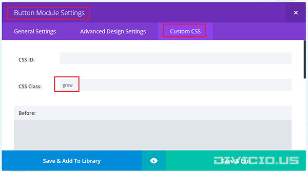
Adding the CSS class
Add the CSS class provided for each effect to Button Module Settings -> Custom CSS -> CSS Class field like it is indicated in the image below.
Applying the CSS
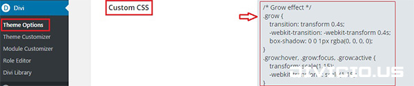
Copy the hover effects CSS snippets below and add them into Divi -> Theme Options -> General -> Custom CSS field.
CSS snippets for button hover effects
Copy the CSS snippets below and add them into Divi -> Theme Options -> General -> Custom CSS field. Save everything and enjoy!

Grow Effect
CSS Class: grow
/*** Grow Effect ***/
.et_pb_button.grow {
    -webkit-transition: -webkit-transform 0.4s;
    -o-transition: transform 0.4s;
    transition: transform 0.4s, -webkit-transform 0.4s;
    -webkit-box-shadow: 0 0 1px rgba(0, 0, 0, 0);
    box-shadow: 0 0 1px rgba(0, 0, 0, 0);
}
.et_pb_button.grow:hover,
.et_pb_button.grow:focus,
.et_pb_button.grow:active {
    -webkit-transform: scale(1.15);
    -ms-transform: scale(1.15);
    transform: scale(1.15);
}
/*** END Grow Effect ***/
Shrink Effect
CSS Class: shrink
/*** Shrink Effect ***/
.et_pb_button.shrink {
    -webkit-transition: -webkit-transform 0.4s;
    -o-transition: transform 0.4s;
    transition: transform 0.4s, -webkit-transform 0.4s;
}
.et_pb_button.shrink:hover,
.et_pb_button.shrink:focus,
.et_pb_button.shrink:active {
    -webkit-transform: scale(0.85);
    -ms-transform: scale(0.85);
    transform: scale(0.85);
}
/*** END Shrink Effect ***/
Rotate Right Effect
CSS Class: rotate-right
/*** Rotate Right Effect ***/
.et_pb_button.rotate-right{
    -webkit-transition: -webkit-transform 0.3s;
    -o-transition: transform 0.3s;
    transition: transform 0.3s, -webkit-transform 0.3s;
    -webkit-box-shadow: 0 0 1px rgba(0, 0, 0, 0);
    box-shadow: 0 0 1px rgba(0, 0, 0, 0); /* Firefox fix for pixelated edges during transform effects*/
}
.et_pb_button.rotate-right:hover,
.et_pb_button.rotate-right:focus,
.et_pb_button.rotate-right:active {
    -webkit-transform: rotate(4deg);
    -ms-transform: rotate(4deg);
    transform: rotate(4deg);
}
/*** END Rotate Right Effect ***/
Rotate Left Effect
CSS Class: rotate-left
/*** Rotate Left Effect ***/
.et_pb_button.rotate-left{
    -webkit-transition: -webkit-transform 0.3s;
    -o-transition: transform 0.3s;
    transition: transform 0.3s, -webkit-transform 0.3s;
    -webkit-box-shadow: 0 0 1px rgba(0, 0, 0, 0);
    box-shadow: 0 0 1px rgba(0, 0, 0, 0); /* Firefox fix for pixelated edges during transform effects*/
}
.et_pb_button.rotate-left:hover,
.et_pb_button.rotate-left:focus,
.et_pb_button.rotate-left:active {
    -webkit-transform: rotate(-4deg);
    -ms-transform: rotate(-4deg);
    transform: rotate(-4deg);
}
/*** END Rotate Left Effect ***/
Wobble Timed Effect
CSS Class: wobble-timed
/*** Wobble Timed Effect ***/
.et_pb_button.wobble-timed:hover,
.et_pb_button.wobble-timed:focus,
.et_pb_button.wobble-timed:active {
    -webkit-animation: wobble-timed 0.2s 3 linear;/* loops 3 times, but you are free to change it to whatever you like */
    animation: wobble-timed 0.2s 3 linear;
    -webkit-box-shadow: 0 0 1px rgba(0, 0, 0, 0);
    box-shadow: 0 0 1px rgba(0, 0, 0, 0);
}

@keyframes wobble-timed {
    50% {
        -webkit-transform: translateX(3px) rotate(2deg);
        transform: translateX(3px) rotate(2deg);
    }

    100% {
        -webkit-transform: translateX(-3px) rotate(-2deg);
        transform: translateX(-3px) rotate(-2deg);
    }
}

@-webkit-keyframes wobble-timed {
    50% {
        -webkit-transform: translateX(3px) rotate(2deg);
    }

    100% {
        -webkit-transform: translateX(-3px) rotate(-2deg);
    }
}
/*** END Wobble Timed Effect ***/
Wobble Infinite Effect
CSS Class: wobble-inf
/*** Wobble Infinite Effect ***/
.et_pb_button.wobble-inf:hover,
.et_pb_button.wobble-inf:focus,
.et_pb_button.wobble-inf:active {
    -webkit-animation: wobble-loop infinite 0.2s linear;
    animation: wobble-loop infinite 0.2s linear;
    -webkit-box-shadow: 0 0 1px rgba(0, 0, 0, 0);
    box-shadow: 0 0 1px rgba(0, 0, 0, 0); /* Firefox fix for pixelated edges during transform effects*/
}

@keyframes wobble-loop {
    50% {
        -webkit-transform: translateX(3px) rotate(2deg);
        transform: translateX(3px) rotate(2deg);
    }

    100% {
        -webkit-transform: translateX(-3px) rotate(-2deg);
        transform: translateX(-3px) rotate(-2deg);
    }
}

@-webkit-keyframes wobble-loop {
    50% {
        -webkit-transform: translateX(3px) rotate(2deg);
    }

    100% {
        -webkit-transform: translateX(-3px) rotate(-2deg);
    }
}
/*** END Wobble Infinite Effect ***/
Float Up Effect
CSS Class: float-up
/*** Float Up Effect ***/
.et_pb_button.float-up {
    -webkit-transition: transform 0.25s;
    -o-transition: transform 0.25s;
    transition: transform 0.25s;
    -webkit-box-shadow: 0 0 1px rgba(0, 0, 0, 0);
    box-shadow: 0 0 1px rgba(0, 0, 0, 0); /* Firefox fix for pixelated edges during transform effects*/
}
.et_pb_button.float-up:hover,
.et_pb_button.float-up:focus,
.et_pb_button.float-up:active {
    -webkit-transform: translateY(-6px);
    -ms-transform: translateY(-6px);
    transform: translateY(-6px);
}
/*** END Float Up Effect ***/
Float Down Effect
CSS Class: float-down
/*** Float Down Effect ***/
.et_pb_button.float-down {
    -webkit-transition: transform 0.25s;
    -o-transition: transform 0.25s;
    transition: transform 0.25s;
    -webkit-box-shadow: 0 0 1px rgba(0, 0, 0, 0);
    box-shadow: 0 0 1px rgba(0, 0, 0, 0); /* Firefox fix for pixelated edges during transform effects*/
}
.et_pb_button.float-down:hover,
.et_pb_button.float-down:focus,
.et_pb_button.float-down:active {
    -webkit-transform: translateY(6px);
    -ms-transform: translateY(6px);
    transform: translateY(6px);
}
/*** END Float Down Effect ***/
Float Up Effect with Shadow
CSS Class: float-up-alt
/*** Float Up Effect with Shadow ***/
.et_pb_button.float-up-alt {
    -webkit-transition: all 0.25s;
    -o-transition: all 0.25s;
    transition: all 0.25s;
    -webkit-box-shadow: 0 0 1px rgba(0, 0, 0, 0);
    box-shadow: 0 0 1px rgba(0, 0, 0, 0); /* Firefox fix for pixelated edges during transform effects*/
}
.et_pb_button.float-up-alt:hover,
.et_pb_button.float-up-alt:focus,
.et_pb_button.float-up-alt:active {
    -webkit-transform: translateY(-6px);
    -ms-transform: translateY(-6px);
    transform: translateY(-6px);
    -webkit-box-shadow: 0px 4px 4px #606060;
    box-shadow: 0px 4px 4px #606060;
}
/*** END Float Up Effect with Shadow ***/
Float Down Effect with Shadow
CSS Class: float-down-alt
/*** Float Down Effect with Shadow ***/
.et_pb_button.float-down-alt {
    -webkit-transition: all 0.25s;
    -o-transition: all 0.25s;
    transition: all 0.25s;
    -webkit-box-shadow: 0 0 1px rgba(0, 0, 0, 0);
    box-shadow: 0 0 1px rgba(0, 0, 0, 0); /* Firefox fix for pixelated edges during transform effects*/
}
.et_pb_button.float-down-alt:hover,
.et_pb_button.float-down-alt:focus,
.et_pb_button.float-down-alt:active {
    -webkit-transform: translateY(6px);
    -ms-transform: translateY(6px);
    transform: translateY(6px);
    -webkit-box-shadow: 0px -4px 4px #606060;
    box-shadow: 0px -4px 4px #606060;
}
/*** END Float Down Effect with Shadow ***/
Spin Effect
CSS Class: spin
/*** Spin Effect ***/
.et_pb_button.spin{
    -webkit-transition: -webkit-transform 0.4s;
    -o-transition: transform 0.4s;
    transition: transform 0.4s, -webkit-transform 0.4s;
    -webkit-box-shadow: 0 0 1px rgba(0, 0, 0, 0);
    box-shadow: 0 0 1px rgba(0, 0, 0, 0); /* Firefox fix for pixelated edges during transform effects*/
}
.et_pb_button.spin:hover,
.et_pb_button.spin:focus,
.et_pb_button.spin:active{
    -webkit-transform: rotate(360deg);
    -ms-transform: rotate(360deg);
    transform: rotate(360deg);
}
/*** END Spin Effect ***/
Hope you’ll find these snippets useful. Feel free to share your thoughts and suggestions below and don’t forget to share this post with your friends! ;) Cheers!

Thanks alot Ivan this really made my day! would you know how to add a shadow with the grow class and make the shadow appear only on hover along with the grow function? Thanks you’re awesome!
Hi Alex.
Thanks for your comment. Sure, it is pretty easy to add shadow on hover, here is the modified CSS for the Grow effect:
/* Grow effect */
.grow {-webkit-transition: all 0.4s;
transition: all 0.4s;
-webkit-box-shadow: 0 0 1px rgba(0, 0, 0, 0);
box-shadow: 0 0 1px rgba(0, 0, 0, 0);
}
.grow:hover {
-webkit-box-shadow: 0 10px 20px -2px rgba(0,0,0,0.4);
box-shadow: 0 10px 20px -2px rgba(0,0,0,0.4);
}
.grow:hover, .grow:focus, .grow:active {
-webkit-transform: scale(1.15);
transform: scale(1.15);
}
/* end Grow effect */
Hope this helps.
can you please give a snippet for underline on hover from left to right or right to left
Well… I need to look into that. Most probably it is gonna be a separate post.
And here is the post with underlines (and not only) on hover, check it out -> 17 Line Hover Effects for Divi Button Module
This is really very cool! I like when you explain how to do this in 2-3 steps.
Thank you very much!
Thanks Maks, glad to know you like it :)
AMAZING! Thank you! bookmarked! :)
Thanks Brian! :)
Lovely – a neat addition to anyone’s Divi armoury.
Thank you, these wiork great.
Thanks Enrico, I’m glad you find these snippets useful.
Thank you very much for these snippets. Much appreciated!
You’re welcome Leif. Thanks for your feedback.