Create Mobile Menus Using Divi Builder Layouts and the MMC Plugin
This feature allows you to add any layouts created in Divi Builder to the mobile menu whether it is a section with a single module or a complete mobile menu layout entirely designed in Divi Builder.
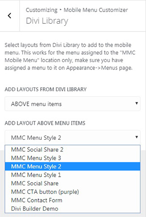
You can create a mobile menu using a Divi layout only or combine the layouts with the traditional menu as well by adding layouts above, below or both above and below the menu items.
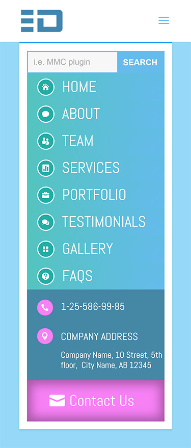
So, here is the mobile menu we are going to create:
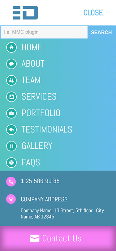
Menu layout structure

The second row contains a single Button module which is the Contact Us CTA button. The only custom CSS used for this layout is a single line in the Button module Advanced Settings which sets the min-width of the button to 100%.
This menu layout has been saved to Divi Library and we are going to add it to the mobile menu from there.
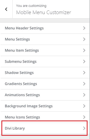
Adding the layout to mobile menu
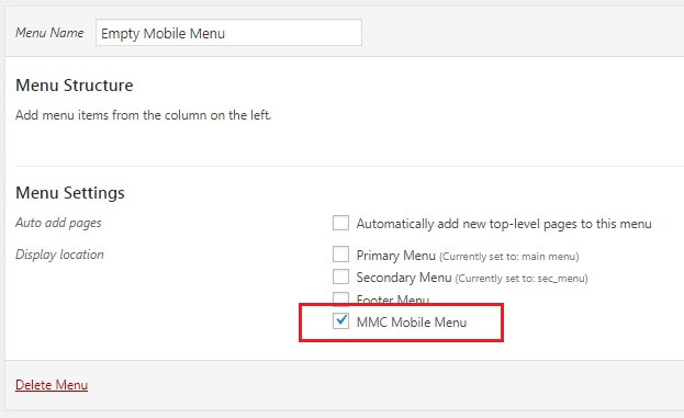
So, first we need to assign a menu to the MMC Mobile Menu location othervise it won’t work. And since we are creating a mobile menu using the Divi layout only, we need to assign an empty menu which has no menu items in it.
To do this navigate to Appearance->Menus and create and assign the empty menu.
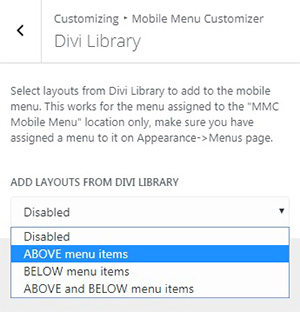
Since we are creating a mobile menu using the Divi layout only it doesn’t matter for us which option to select, any of them enables the Divi Layouts support. The position of layout(s) matters if you create a menu by combining the native menu with the layouts from Divi Library.
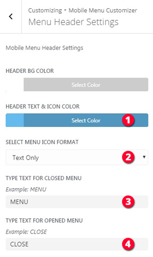
Final tweaks
- HEADER TEXT & ICON COLOR – #65bbed
- SELECT MENU ICON FORMAT – Text Only
- TYPE TEXT FOR CLOSED MENU – MENU
- TYPE TEXT FOR OPENED MENU – CLOSE
You might want to play with the header text size as well.
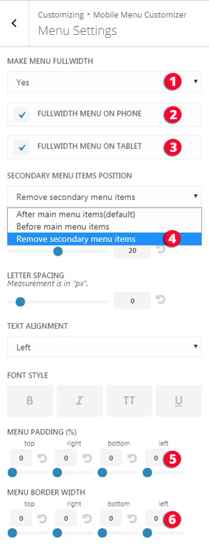
Luckily, MMC plugin allows you to do all of the above just in a few clicks. Go to Mobile Menu Customizer->Menu Settings section and set the followings:
- MAKE MENU FULLWIDTH – YES
- FULLWIDTH MENU ON PHONE – Checked
- FULLWIDTH MENU ON TABLET – Checked
- SECONDARY MENU ITEMS POSITION – Remove secondary menu items
- MENU PADDING – 0 (zero)
- MENU BORDER – 0 (zero)
How to create a layout in the Divi Builder for mobile menu?
Would it be possible to add Polylang language switcher in the header bar next to the hamburger icon?
Hi Greg,
corrent version of the plugin(v2.6.6) does not have such a feature, unfortunately.
Hi
How I get MMC?
Hello Halim,
you can purchase it in our store here
Hi Ivan,
I´m trying to modify my Divi Mobile Menu (Fullwidth Menu) with the MMC Plugin. It doesn´t seem to work with the Divi-Fullwidth Menu. Does it only work with the Divi “Standard” Menu?
Thanks for the help!
Johannes
Hi Johannes,
the MMC plugin supports Divi native header but not the Fullwidth Menu module. So, I am afraid it can’t be used to customize menus created using the Fullwidth Menu module.
Hi Ivan,
Would it be possible for you to share this layout as a starting point for creating a similar menu structure?
Thanks!
Hi Braden,
please contact me and I’ll send this layout to you asap.
I’ve just downloaded the mobile menu plugin but I can’t find anything that tells me how or where to install it. Any clues?
Hi John,
you can install the MMC plugin the same way you install any other plugin via Plugins->Add New page. For more info about the plugin usage please read the documentation, you can download it in your Divicio.us account, your account has been created automatically and the username and password have been sent to your email address.
If you still need assistance please contact me, I will be happy to help.
I feel stupid, but I cannot figure this out. I think I have a MMC footer menu showing up on desktop. I’m not sure, because I am having a time figuring out how Divi knows it is a Desktop or Mobile menu (I have both modules installed). How do I stop it from doing that?
Simply confused.
Hi Carolyn.
MMC footer menu? There is no such a menu, MMC plugin allows you to assign a separate menu for mobile devices. Simply said, go to Appearance->Menus and create a menu for mobile devices and assign it to the MMC Mobile Menu location, this menu will replace the menu shown on desktop.
Hope this makes sense.