Creating a Divi MadMenu Header. Part 2: Horizontal Slide-In Menu
In the previous part (Part 1) of this tutorials series we’ve created the main menu bar of our Divi MadMenu header, and in this tutorial we’ll be creating the horizontal slide-in menu (the orange menu) which slides in from top when the user clicks the Menu button.
If you did not do the Part 1 yet I recommend you to do it first and then continue with this tutorial.
However, you can skip Part 1 if you like, just download the header template that we’ve created in Part 1 and import it into the Theme Builder so that you can follow this tutorial from where we left in the previous part.
Horizontal Slide-In Menu Structure
The horizontal slide-in menu is just a popup with the Slide-In Top animation applied to it.
To create it we’ll use a Divi MadMenu module, let’s add it into the same column which contains the main menu bar module.
Create menus for desktop and mobile devices
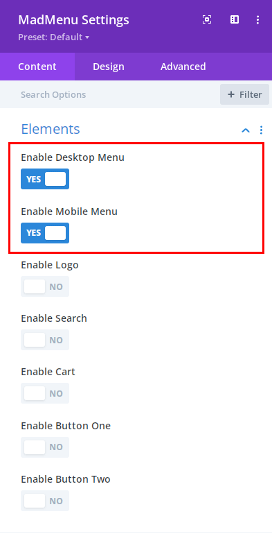
For the horizontal slide-in menu we need only the Desktop Menu and the Mobile Menu elements enabled in MadMenu Settings -> Content -> Elements.
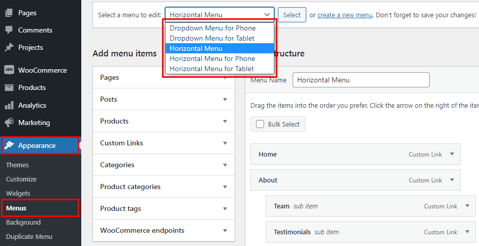
By default these menu elements display all pages currently existing on your website, so, the first thing we need to do is to create menus for all devices in Appearance -> Menus.
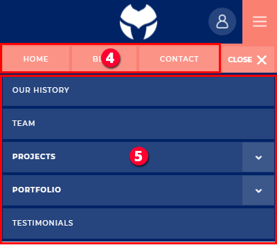
The header we are creating has the horizontal (desktop) menu enabled on all devices, and the mobile dropdown menu on Tablet and Phone.
So, we need to create 5(five) different menus in Appearence -> Menus and label them accordingly depending on which device we want to use them for.
The difference between these menus is that they have different number of menu items depending on the device they will be used for.
For example, the horizontal menu for Desktop can have more menu items than the horizontal menu for Phone devices due to more screen space available.
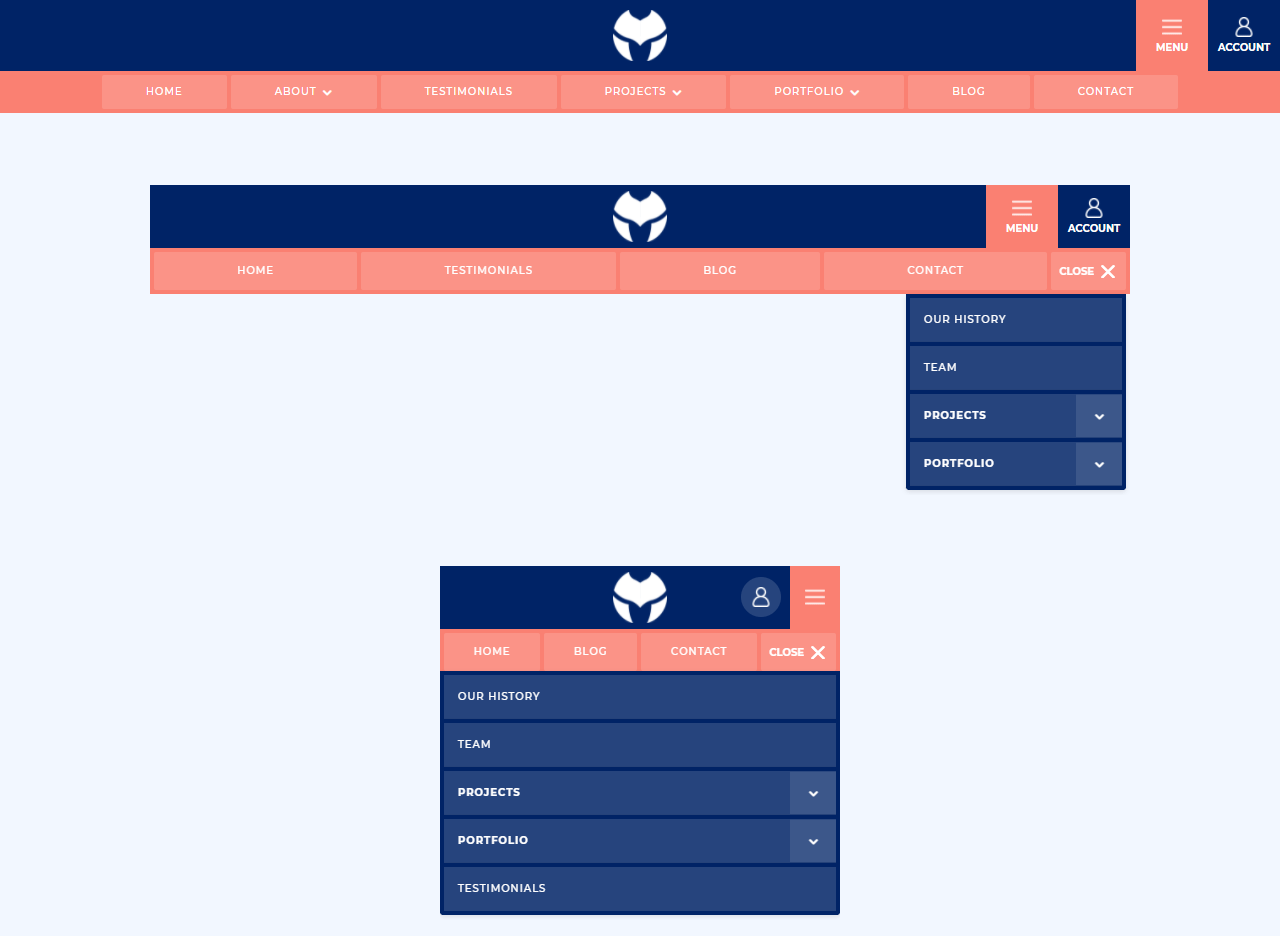
The diagram below shows which device each menu is created for:
- Horizontal Menu.
- Horizontal Menu for Tablet.
- Dropdown Menu for Tablet.
- Horizontal Menu for Phone.
- Dropdown Menu for Phone.
Set menus for each device
After we’ve created the menus in Appearance -> Menus let’s assign them to corresponding devices in Divi MadMenu module Content settings (the horizontal slide-in menu module settings).
The horizontal (desktop) menus are assigned using the Desktop Menu setting in the Content -> Desktop Menu. Just enable responsive options for it and select menus from the list for each device.
- Set the horizontal menu for Desktop.
- Set the horizontal menu for Tablet.
- Set the horizontal menu for Phone.
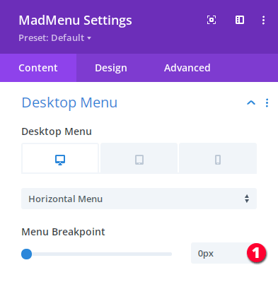
We need to make the desktop menu visible on all devices because by default the desktop menu is replaced by the mobile menu at the 980px breakpoint.
So, let’s set the desktop menu breakpoint to 0px in Content -> Desktop Menu -> Menu Breakpoint.
- Set the horizontal(desktop) menu breakpoint.
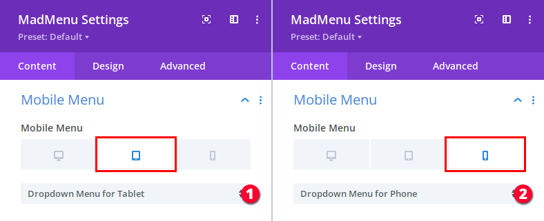
Next, set the mobile menus for Tablet and Phone in Content -> Mobile Menu -> Mobile Menu.
- Set the dropdown mobile menu for Tablet.
- Set the dropdown mobile menu for Phone.
Styling the Horizontal Slide-In Menu
Now that we are done with creating and adding the menus, let’s move on to styling both the horizontal menu and the mobile dropdown menu.
Our horizontal slide-in menu looks like this so far:
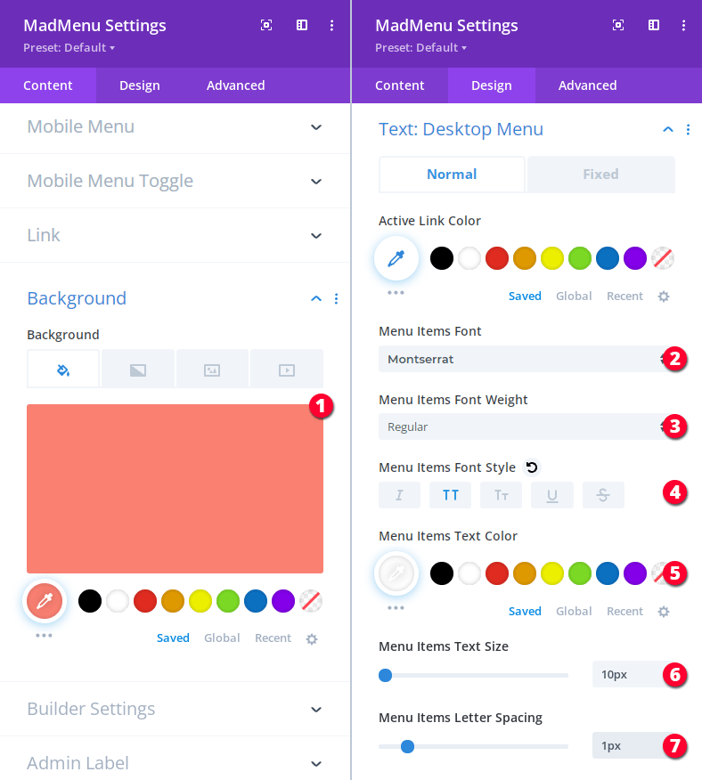
Let’s first set the MadMenu module background color in Content -> Background -> Background, and then go to Design -> Text: Desktop Menu to apply the desktop menu items text styling:
- Background: #fa8072.
- Menu Items Font: Montserrat.
- Menu Items Font weight: Regular.
- Menu Items Font style: uppercase.
- Menu Items Text color: #ffffff.
- Menu Items Text size: 10px.
- Menu Items Letter spacing: 1px.
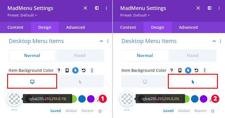
Next, let’s go to Design -> Desktop Menu Items and set the desktop menu items background color:
- Item background color: rgba(255, 255, 255, 0.15).
- Item background hover color: rgba(255, 255, 255, 0.25).
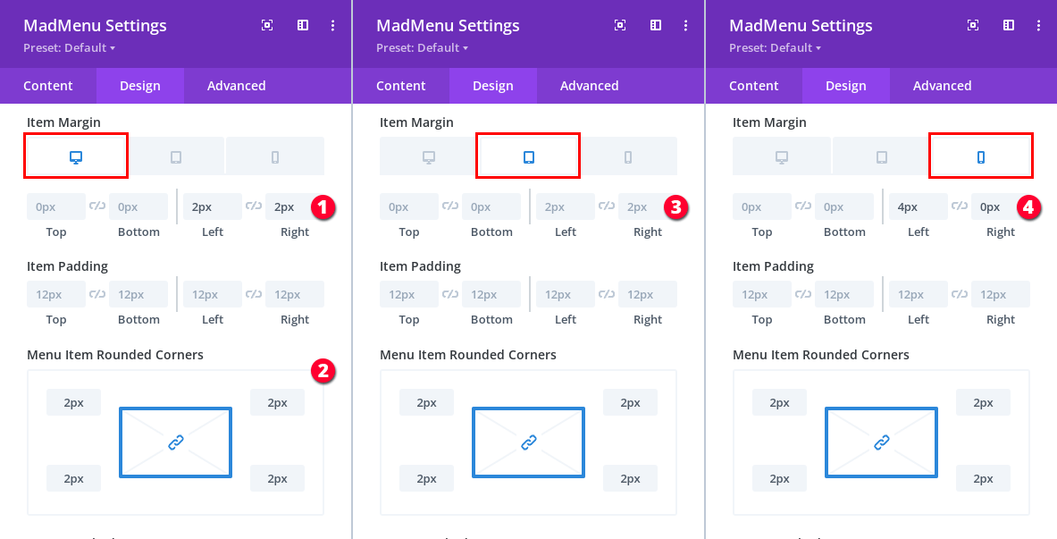
Also for the menu items we need to adjust the responsive spacing and border radius(still in the Design -> Desktop Menu Items section):
- Item margin for Desktop: 0px 0px 2px 2px.
- Item border radius: 2px.
- Item margin for Tablet: 0px 0px 2px 2px.
- Item margin for Phone: 0px 0px 4px 0px.
Desktop Submenu
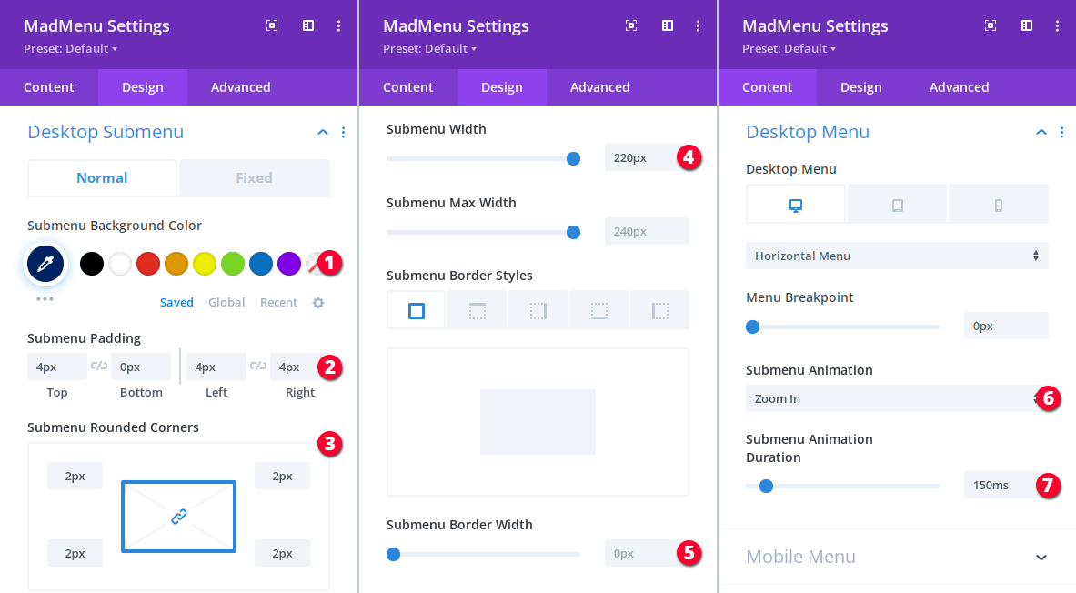
Let’s apply the desktop submenu styling in Design -> Desktop Submenu and set the submenu animation in Content -> Desktop Menu -> Submenu Animation:
- Submenu background color: #002366.
- Submenu padding: 4px 0px 4px 4px.
- Submenu border radius: 2px.
- Submenu width: 220px.
- Submenu border width: 0px.
- Submenu animation: Zoom In.
- Submenu animation duration: 150ms.
Desktop Submenu Items
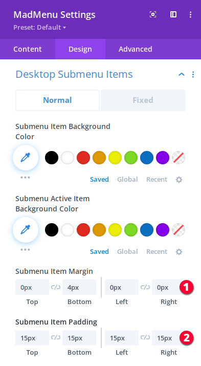
We also need to adjust the desktop submenu items spacing in Design -> Desktop Submenu Items.
- Submenu items margin: 0px 4px 0px 0px.
- Submenu items padding: 15px 15px 15px 15px.
Horizontal Slide-In Menu Setup
Now let’s make the desktop menu slide in from top from “behind” the main menu bar when the user clicks the Menu button.
To do that we’ll make use of the header popups functionality that allows adding popups to Divi MadMenu Button elements.
So, we need to assign an ID to our horizontal slide-in menu module in Advanced -> CSS ID & Classes -> CSS ID.
We’ll use the horizontalSlideInMenu ID but you can use any ID you want, just make sure it’s not used by any other element on the pages that this header will be used on.
- Assign an ID to the horizontal slide-in menu module.
Then we need to assign the same ID to the Menu button(which is a different Divi MadMenu module – the Main Menu Bar module) in Content -> Button One.
This will attach the horizontal menu to the Menu button turning it into a popup. So, the horizontal menu becomes a popup and the Menu button becomes it’s toggle.
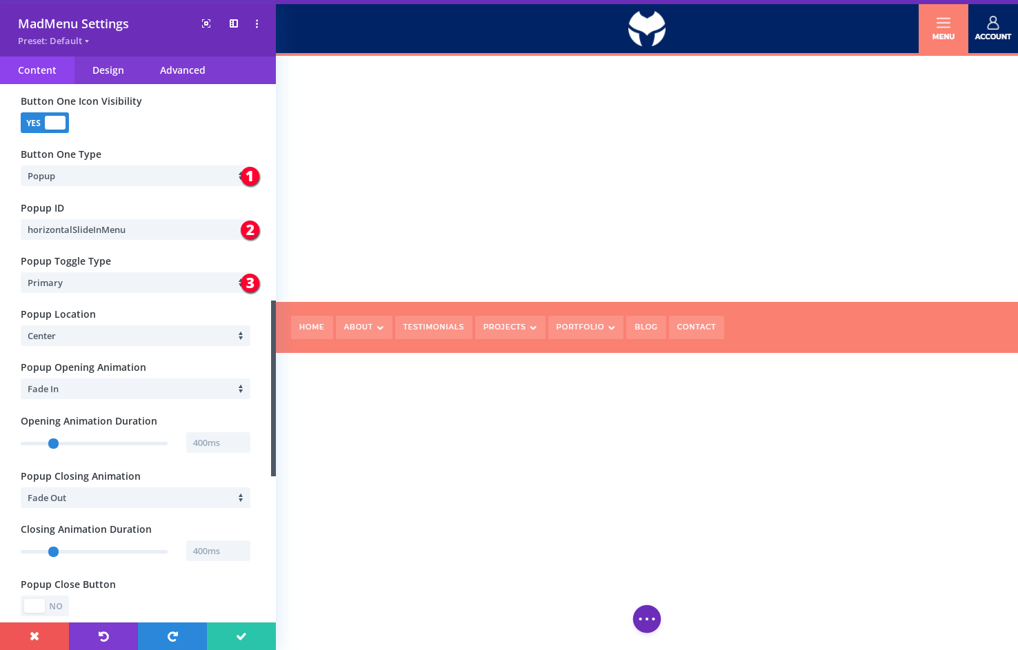
To add the ID to the Menu button and apply the popup settings open the Main Menu Bar MadMenu module settings and go to Content -> Button One section:
- Set the button type to Popup.
- Set the same popup ID: horizontalSlideInMenu.
- The Popup Toggle Type should be Primary because this is the main toggle for the horizontal slide-in menu, all additional toggles(if any) for the same popup should be Secondary.
The horizontal slide-in menu will disappear as soon as you add the same ID to the Menu button element because it will become a popup, and clicking the Menu button will make it fade in/out in the middle of the screen (because it’s the default positioning and animations of the popup).
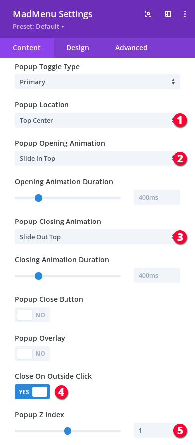
So, let’s position it at the top of the viewport and make it slide in/out instead of fade in/out:
- Set the slide-in menu(popup) location to Top Center.
- Set the slide-in menu opening animation to Slide In Top.
- Set the slide-in menu closing animation to Slide Out Top.
- Make the slide-in menu close when clicked anywhere outside of it’s boundaries.
- Move the slide-in menu “behind” the main menu bar by setting the popup z-index to 1 (remember in Part 1 we’ve set the main menu bar’s z-index to 2 in Advanced -> Position?).
Now clicking the Menu button should make the horizontal menu slide in/out but we don’t see it!
It’s actually there but is hidden behind the main menu bar. We can fix that easily by applying margin-top to the horizontal slide-in menu which should be equal to the height of the main menu bar on each device.
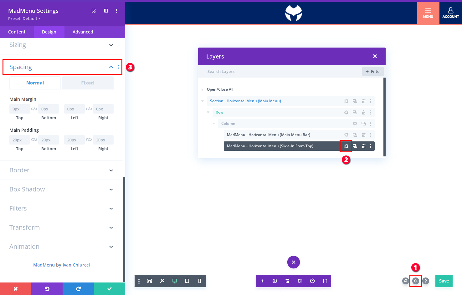
Since we cannot access the horizontal slide-in menu module’s settings normally by hovering over(because it’s hidden behind the main menu bar) we can either switch to the Wireframe mode or use the Layer view(which I find to be more convenient in this case) to access it’s settings:
- Open the Layer view.
- Find the horizontal slide-in menu module and open it’s settings pane.
- Go to the Design -> Spacing section.
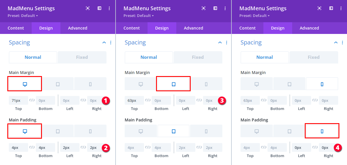
Now that we are in the Design -> Spacing section let’s apply the horizontal slide-in menu margin and padding for all devices:
- Set top margin for desktop: 71px.
- Set padding for desktop: 4px 4px 2px 2px.
- Set top margin for mobile(both Tablet and Phone): 63px.
- Set padding for Phone: 4px 4px 0px 0px.
If you try clicking the Menu button again you’ll see that the horizontal slide-in menu is working as expected, it’s not hidden behind the main menu bar anymore.
However, the menu is not centered and we also need the menu items to be stretched horizontally.
By default, the desktop menu items are centered within the Desktop Menu element column but that is not noticable unless the desktop menu column is set a width greater than the width of all the menu items combined.
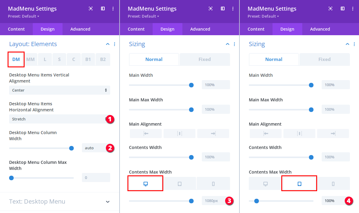
So, we need to stretch the desktop menu column, and to do that we need to set the Desktop Menu Column Width setting value to auto in Design -> Layout: Elements -> DM tab of the horizontal slide-in menu MadMenu module.
This will make the desktop menu occupy all the available space horizontally thus moving the menu items in the middle of the header.
To stretch the menu items horizontally set the Stretch option for the Desktop Menu Items Horizontal Alignment setting (again in Design -> Layout: Elements -> DM tab).
Then go to Design -> Sizing -> Content Max Width and set the horizontal slide-in menu module Contents Max Width to 100% for mobile devices and leave it at 1080px for desktop (or you can make it 100% for desktop as well if you like).
- Stretch the menu items horizontally.
- Stretch the Desktop Menu element column horizontally.
- Set the menu module content max width for Desktop.
- Set the menu module content max width for mobile.
And that’s it for the desktop menu part of the horizontal slide-in menu. Let’s move on to the mobile menu part.
Mobile Menu Toggle
We need to style the mobile menu so that it matches the overall header design. Let’s start with the Mobile Menu Toggle.
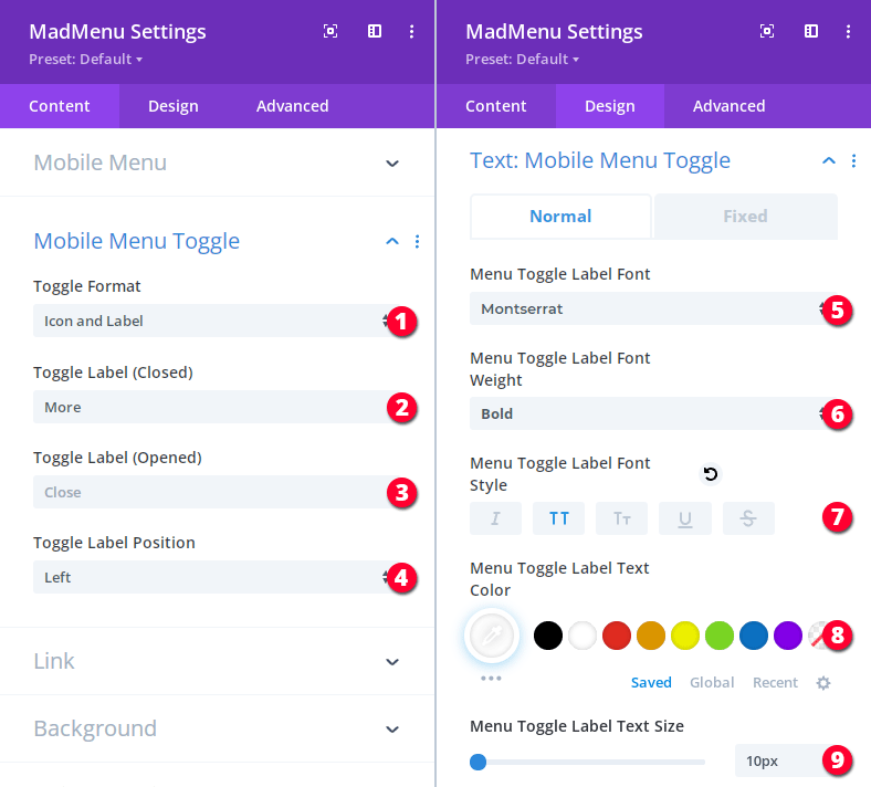
First, let’s add the mobile menu toggle content(icon and label) in Content -> Mobile Menu Toggle and apply text styling for the label in Design -> Text: Mobile Menu Toggle.
- Enable both the icon and the label.
- Add label for closed mobile menu.
- Add label for opened mobile menu.
- Select where the label will be placed, here we place it to the left of the icon.
- Menu Toggle Label Font: Montserrat.
- Menu Toggle Label Font weight: Bold.
- Menu Toggle Label Font style: uppercase.
- Menu Toggle Label Text color: #ffffff.
- Menu Toggle Label Text size: 10px.
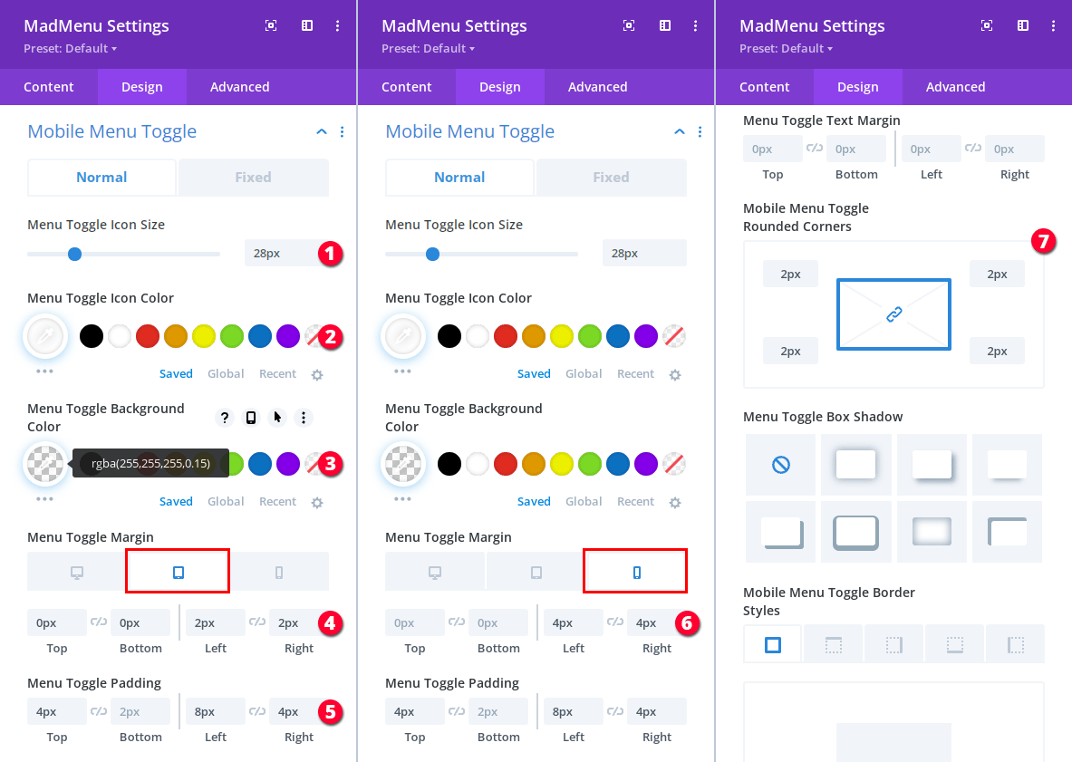
Next, let’s go to Design -> Mobile Menu Toggle section and style the mobile menu toggle so that it matches the desktop menu items styling.
- Menu toggle icon size (the hamburger icon size): 28px.
- Icon color: #ffffff.
- Background color: rgba(255, 255, 255, 0.15).
- Menu Toggle margin for Tablet: 0px 0px 2px 2px.
- Menu Toggle padding: 4px 2px 8px 4px.
- Menu Toggle margin for Phone: 0px 0px 4px 4px.
- Menu Toggle border radius: 2px.
Mobile Dropdown Menu
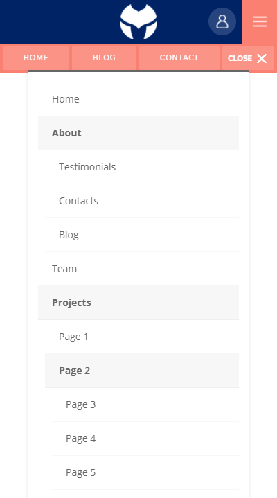
Depending on the structure of the menu that you’ve created for the mobile devices it may or may not expand beyond the viewport on mobile devices thus making some menu items not accessable at the bottom.
In this case my mobile menu has many menu items which makes part of the open menu unaccessable at the bottom and we need to fix that.
To fix that all we need to do is to collapse the submenus and also enable the accordion mode for the collapsed submenus which allows only one submenu of the same level expanded at a time. This will make the mobile menu a lot more user friendly.
Also let’s make the mobile menu close automatically when the user clicks anywhere outside of it’s boundaries.
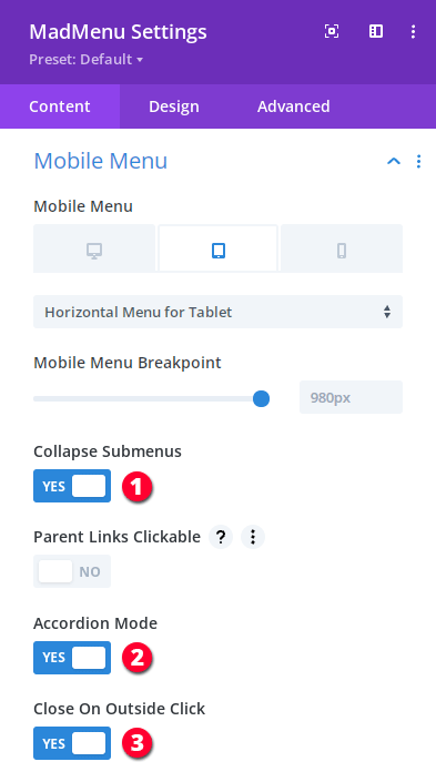
So, go to Content -> Mobile Menu section and apply the following settings:
- Collapse submenus.
- Prevent multiple open submenus.
- Make the mobile menu close on outside click.
Now let’s set the mobile dropdown placement. By default, the menu is placed in the middle of the header(the main container of the Divi MadMenu module), and it can be aligned to left, center or right independently from the mobile menu toggle’s location in the header.
However, we can also attach it to the mobile menu toggle(the hamburger icon) to make them move together when the toggle’s position is changed.
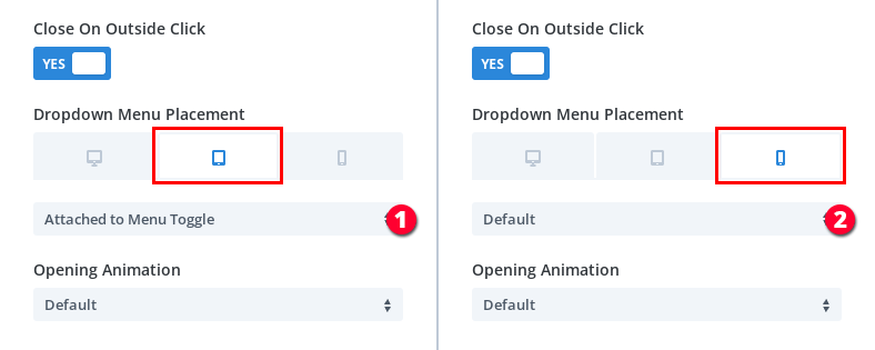
So, for Tablet we’ll attach the dropdown menu to the mobile menu toggle and align it to right, and for Phone we’ll use the Default placement to center it.
Again, in the horizontal slide-in menu module’s Content -> Mobile Menu section:
- Attach the mobile dropdown menu to the menu toggle on Tablet.
- Use the mobile dropdown menu Default placement on Phone.
Next, let’s align the dropdown menu. If the dropdown menu is attached to the menu toggle then it gets aligned relative to the menu toggle, otherwise it’s aligned relative to the module main container.
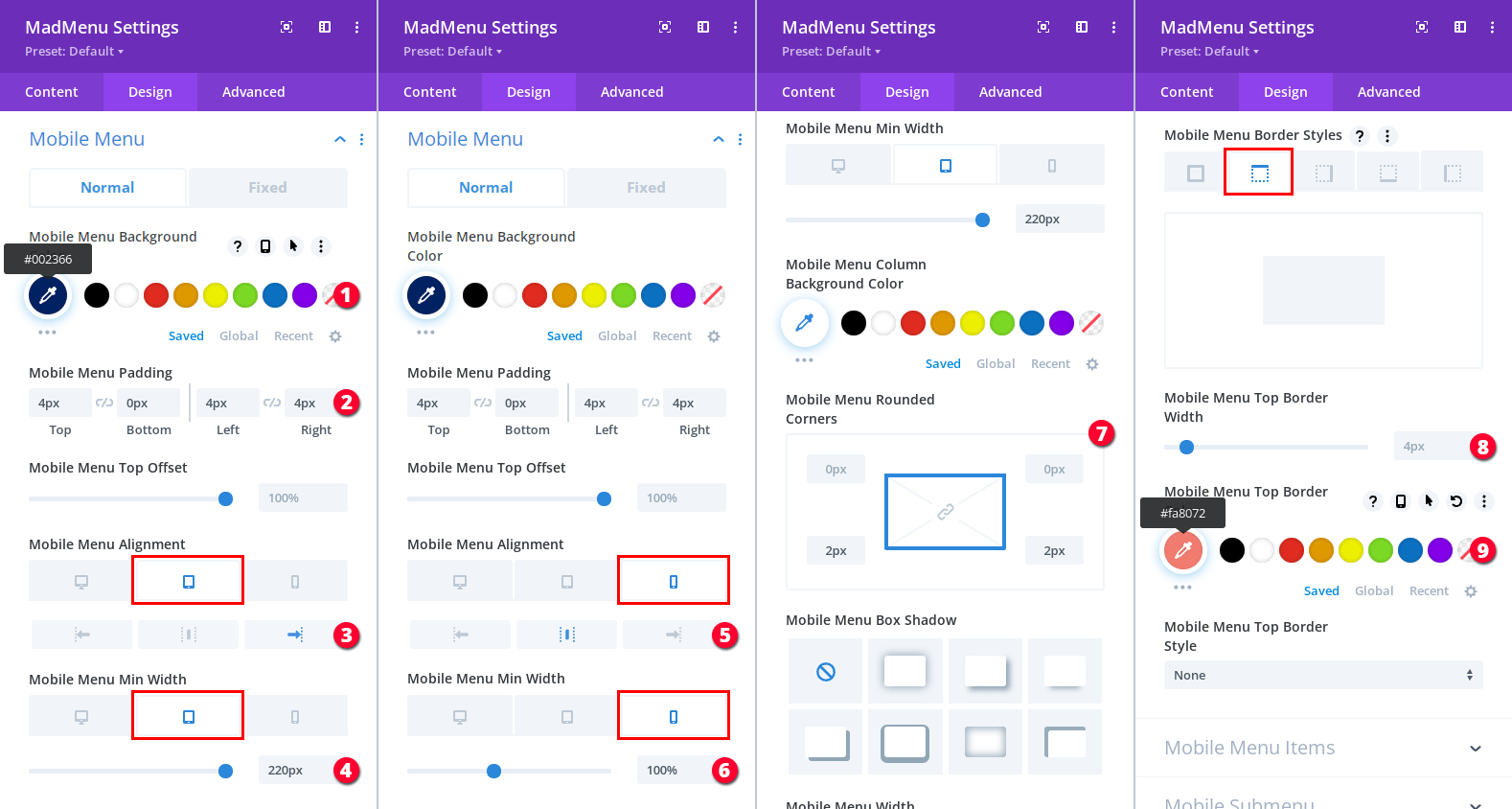
Let’s do that (and also apply other design settings for the mobile menu) in Design -> Mobile Menu section:
- Mobile menu ackground color: #002366.
- Padding: 4px 0px 4px 4px.
- Align the menu to right on Tablet.
- Mobile menu min width on Tablet: 220px.
- Center the menu on Phone.
- Mobile menu min width on Phone: 100%.
- Mobile menu border radius: 0px 0px 2px 2px.
- Mobile menu top border width: 4px.
- Mobile menu top border color: #fa8072.
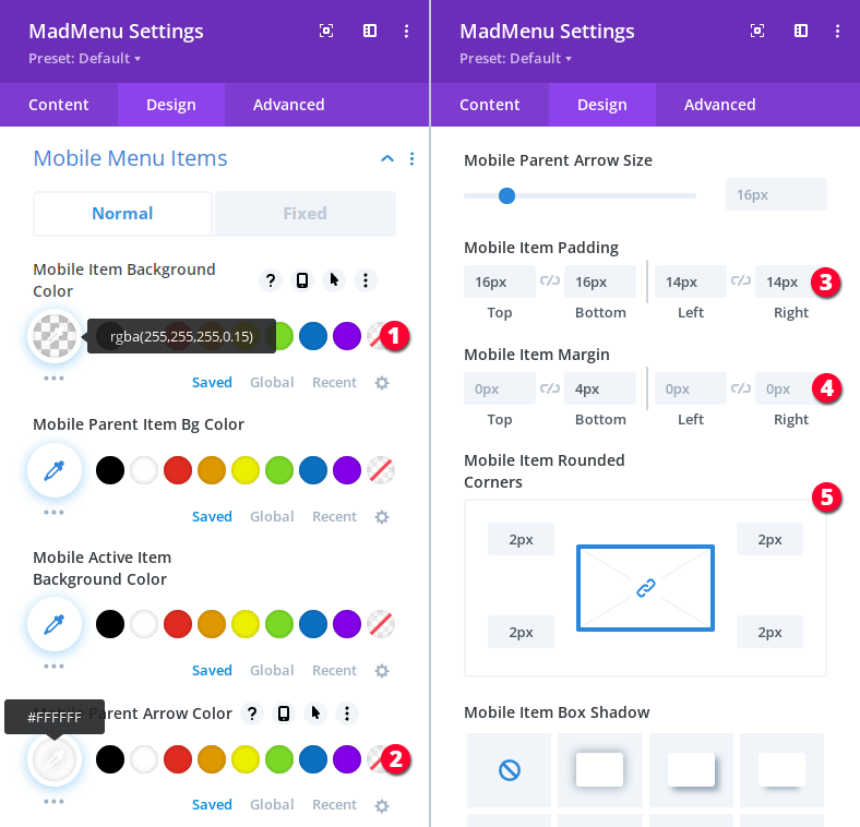
Also let’s style the mobile menu items in Design -> Mobile Menu Items section.
- Mobile menu item background color: rgba(255, 255, 255, 0.15).
- Parent item arrow color: #ffffff.
- Mobile items padding: 16px 16px 14px 14px.
- Mobile items margin: 0px 4px 0px 0px.
- Mobile items border radius: 2px.
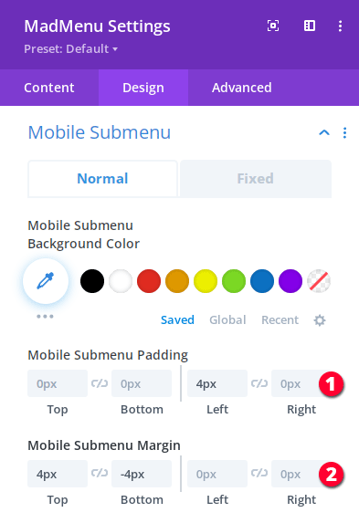
We also need to adjust the mobile submenu padding in Design -> Mobile Submenu:
- Mobile submenu padding: 0px 0px 4px 0px.
- Mobile submenu margin: 4px -4px 0px 0px.
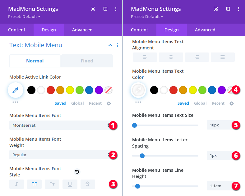
And, finally, let’s apply the mobile menu text styling in Design -> Text: Mobile Menu:
- Font: Montserrat.
- Font weight: Regular.
- Font style: uppercase.
- Text color: #ffffff.
- Text size: 10px.
- Letter spacing: 1px.
- Line height: 1.1em.
Wrapping Up
In Part 2 we’ve created the Horizontal Slide-In Menu that slides in/out when the user clicks the Menu button of the Main Menu Bar.
In the next part – Part 3 – we create the header Login Form that is displayed as a popup to logged out users, and also the User Account Menu displayed to logged in users. Both header elements are toggled by clicking the main menu bar Account button.


