How To Collapse Divi Mobile Menu Submenus And Keep Parent Links Clickable On Mobile
In this tutorial you will learn how to collapse Divi mobile menu submenus and keep parent links clickable.
Table of Contents
The Problem
The Divi Menu and the Fullwidth Menu modules started gaining more popularity among Divi users since the release of the Divi Theme Builder which allows creating headers using the Divi Builder.
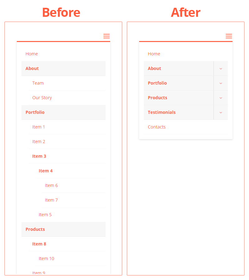
Both of these menu modules provide quite a decent functionality for creating menus but currently are still lacking an important feature: they do not allow collapsing the mobile menu submenus.
This may be a serious UX issue especially with the complex menus having multi-level submenus each having many items which makes the mobile menu very long.
So, in this post I provide two ways of solving the issue.
Both of the solutions allow to collapse the nested items and let you choose whether to disable the parent links or keep them clickable on mobile devices.
Solution 1: Using the Divi MadMenu Module
The Divi MadMenu module allows to collapse the mobile menu submenus and enable/disable the parent item links in a few clicks only, no custom coding required.


You can choose between two submenu styles – Expand and Slide.
The Expand style makes the mobile menu submenus expand/collapse vertically when you click the parent menu item/arrow, also providing the Accordion Mode option which allows having only one expanded submenu of the same level at a time.
The Slide style is available in two variations – Slide Right and Slide Left, making the submenus slide in from right and left respectively (learn more here).
Solution 2: Collapse Divi Mobile Menu Submenus Using Custom Coding
This solution involves custom coding, all the code is provided below and works for both the Menu Module and the Fullwidth Menu Module.
Adding Custom JS
To implement this feature we’ll use JS and CSS. All the code is commented out properly to help you understand what it does.
First add the JS code into the Divi Theme Options -> Integration.
<script type="text/javascript">
(function($) {
/**
* Collapse Divi mobile menu submenus.
*
* Works for both the Menu and the Fullwidth Menu modules.
* The parent item links can be either disabled or clickable.
*
* @site https://divicio.us/
*
* @param bool parentClickable Pass true to keep the parent menu item links clickable. Default: false.
*/
function dvcs_collapse_menu_module_submenus_on_mobile(parentClickable = false) {
// Mobile menu
let $menu = $('.et_pb_module .et_mobile_menu');
// Iterate the mobile menu links
$menu.find('a').each(function() {
// Menu hamburger icon
let $menu_icon = $(this).parents('.mobile_nav').find('.mobile_menu_bar');
// Remove click event handlers from the link
$(this).off('click');
// If the menu item DOESN'T HAVE submenus
if( ! $(this).siblings('.sub-menu').length ) {
// Close the mobile menu on link click
$(this).on('click', (e) => $menu_icon.trigger('click'));
} else {
// If parent items links are DISABLED
if( ! parentClickable ){
// Replace the URL with the # symbol
$(this).attr('href', '#');
// Open/close the submenu on link click
$(this).on('click', (e) => toggle_visible(e, $(this).parent()));
} else {
// Add the "clickable" class to the parent(<li> tag)
$(this).parent().addClass('clickable')
// Prepend the icon to parent
.prepend('<span class="parent_icon"></span>')
// Open/close the submenu on icon click
.find('.parent_icon').on('click', (e) => toggle_visible(e, $(this).parent()));
// Link click
$(this).on('click', function(e){
// Toggle the submenu if the link doesn't have a URL or anchor
if ( $(this).attr('href') === '#' ) {
toggle_visible(e, $(this).parent());
} else {
// Close the mobile menu
$menu_icon.trigger('click');
}
});
}
}
});
/**
* Toggles the 'visible' class on passed element.
*/
const toggle_visible = (e, elem) => {
e.preventDefault();
elem.toggleClass('visible');
}
}
$(function() {
/**
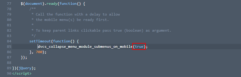
* Call the function with a delay to allow
* the mobile menu(s) be ready first.
*
* To keep parent links clickable pass true (boolean) as argument.
*/
setTimeout(function() {
dvcs_collapse_menu_module_submenus_on_mobile(true);
}, 700);
});
})(jQuery);
</script>Adding Custom CSS
Then add the following CSS into Divi Theme Options -> Custom CSS field ( or into the child theme style.css file):
/* START: Collapse Divi Menu Module Submenus and Keep Parent Items Clickable on Mobile */

/* Parent menu item */
.et_pb_module .et_mobile_menu .menu-item-has-children.clickable,
.et_pb_module .et_mobile_menu .menu-item-has-children > a {
  position: relative;
}
/* Parent menu item icon */
.et_pb_module .et_mobile_menu .menu-item-has-children:not(.clickable) > a:after,
.et_pb_module .et_mobile_menu .menu-item-has-children.clickable > span.parent_icon:after {
  font-family: "ETmodules";
  text-align: center;
  speak: none;
  font-weight: normal;
  font-variant: normal;
  text-transform: none;
  -webkit-font-smoothing: antialiased;
  font-size: 16px;
}
/* Disabled parent menu item icon positioning */
.et_pb_module .et_mobile_menu .menu-item-has-children:not(.clickable) > a:after {
  position: absolute;
  top: 13px;
  right: 10px;
}
/* Clickable parent menu item icon */
.et_pb_module .et_mobile_menu .menu-item-has-children.clickable > span.parent_icon {
  display: grid;
  grid-template-rows: 1fr;
  grid-template-columns: 1fr;
  align-items: center;
  position: absolute;
  width: 46px;
  height: 46px;
  background: rgba(0, 0, 0, 0);
  border-left: 1px solid #dcdcdc;
  right: 0;
  top: 0;
  z-index: 9;
}
/* Collapsed submenu parent menu item icon */
.et_pb_module .et_mobile_menu .menu-item-has-children:not(.clickable) > a:after,
.et_pb_module .et_mobile_menu .menu-item-has-children.clickable > span.parent_icon:after {
  content: "\33";
}
/* Expanded submenu parent menu item icon */
.et_pb_module .et_mobile_menu .menu-item-has-children:not(.clickable).visible > a:after,
.et_pb_module .et_mobile_menu .menu-item-has-children.clickable.visible > span.parent_icon:after {
  content: "\32";
}
/* Hide submenu by default */
.et_pb_module .et_mobile_menu ul.sub-menu,
.et-db #et-boc .et-l .et_pb_menu .et_mobile_menu > ul.sub-menu,
.et-db #et-boc .et-l .et_pb_fullwidth_menu .et_mobile_menu > ul.sub-menu {
  display: none !important;
  visibility: hidden !important;
}
/* Show submenu */
.et_pb_module .et_mobile_menu .visible > ul.sub-menu,
.et-db #et-boc .et-l .et_pb_menu .et_mobile_menu .visible > ul.sub-menu,
.et-db #et-boc .et-l .et_pb_fullwidth_menu .et_mobile_menu .visible > ul.sub-menu {
  display: block !important;
  visibility: visible !important;
}

/* END: Collapse Divi Menu Module Submenus and Keep Parent Items Clickable on Mobile */
Disable Parent Links
The JS script provided above allows to either disable the parent links or keep them clickable.
To disable the parent links call the dvcs_collapse_menu_module_submenus_on_mobile() function without passing any arguments (or pass false) to it. In this case clicking the parent item will only toggle the submenu.
Keep Parent Links Clickable
However, if you need to be able to toggle the submenus but at the same time the parent links still to be clickable then pass true as the argument.
In this case the parent item link will behave normally, (it can have a link or anchor, both will work) and clicking the arrow will toggle the submenu.
But if the clickable parent item does not have neither a link nor an anchor then clicking it will simply toggle the submenu.
Conclusion
That’s it, hope this will be helpful. Use this hack up untill ET adds this feature to core menu modules. If you have any questions or suggestions, feel free to leave them in the comments section below.
This code is exactly what I was looking for however it throws a console error (Uncaught TypeError: Cannot read properties of undefined (reading ‘slice’)) every time I click open subnav. Everything works as expected even with this error. I saw another commenter mention this however you didn’t reply. Any thoughts on what might be causing the error? It is clearly the javascript. You can view on my staging site.
Hi Kevin.
Looks like the issue is caused by the click event propagation that eventually makes the Divi’s core JS throw the error you’re mentioning. To fix that try adding
e.stopPropagation();into thetoggle_visible()function like so:const toggle_visible = (e, elem) => {e.stopPropagation();
e.preventDefault();
elem.toggleClass('visible');
}
Let me know if it works.
Worked like a charm. Great work and thank you!
You’re welcome, Kevin, happy to help :)
Hi Ivan!
I’ve 3 parent items with subitems. On clicking one parent, opens its subitems. What I need is that if I open second the first should automatically collapse. Can you please help!
Hello???
Can you reply???
Hi Abhinav.
Sorry for the late reply, been busy lately.
You can try triggering the
'click'event on the previously expanded submenu parent link(arrow) when you click to expand a different one of the same level. This will require modifying the JS code and you should add that logic into the following block:if( ! parentClickable ){// existing code (don't remove it)
// add your code here for when the parent links are disabled
} else {
// existing code (don't remove it)
// add your code here for when the parent links are enabled
}
In your code just select the previously expanded submenu of the same level and trigger a click event on it’s parent menu item link (or the arrow if you’ve enabled the parent links) using the jQuery
.trigger('click')method , or vanilla JS.click()method.Hope this helps.
Hi Ivan,
We were using your code to help collapse the sub menus and add a toggle arrow to parent items.
It was working for over a year, and recently we haven’t been able to click the arrows to toggle sub menus.
https://www.seacc.org/
Can you see any reason why those arrows aren’t toggling open the sub menus, instead the parent menu item links are being directed to.
Thank you!
Hi Chris.
I’ve just tested the code and it worked just fine both with the Menu Module and the Fullwidth Menu module.
If you’ve added the CSS and JS code as it’s explained in the tutorial and it’s not working then this could be a conflict with some other custom code or a plugin that has a similar feature, in such a case try removing the conflicting custom code(if any) and deactivate the conflicting plugin.
Or it is a caching issue, just make sure you clear all the cache properly and check if that helps.
Hi Chris, i’ve just checked out this sites menu, this is exactly the type of menu im looking to create.
I can’t seem to get this tutorial to work, could you send me the custom code for it?
Thanks alot,
A
Hi
This looks great, but it doesn’t seem to work with Divi Theme Builder, is that correct?
Hi Will.
This code works with the Divi Menu module, no matter if you use it in a page layout of Divi Theme Builder. Please make sure you follow the implementation instructions, and if you are still having issues please go through the comments below, maybe the same issue has already been reported before and there is already a solution provided for it. If not feel free to report it here and I’ll try to help asap.
If you’re asking about the Solution #1 (using the Divi MadMenu), of course you can use this extension with Divi Theme Builder, in fact that’s what it’s been created for :)
Thank you for this great tutorial, I’ve looked everywhere for something like this for the menu module. This works great except I have one item in the list that has no sub-menus. That item does not have the same background color as the rest in the menu so it may look like it’s not clickable. Is there a way to add similar styling there? Thanks!
Hi and thank you for the great tuto !
I had a few problem on smartphone with some Woocommerce pages but the “Eric’s solution” works perfetcly fine.
Great help!
Hello,
Your solutions works great. Except on my archive page it doesn’t work for some reason: campsolutions-staging.mars-cdn.com/vacatures/.
On the other pages it works fine.
Any idea how to fix this?
Thanks!
Kind regards
Hi Wouter.
When I click the “+” icon to expand the submenu it shows error in the Console which doesn’t seen to be related to the code from this post. Try to resolve that issue first, then check again if the submenu collapsing works.
Hi Ivan,
great Code! Just one little problem: When I click on the dropdown arrows they don’t open the sub items – instead the menu closes.
Do you know what problem this could be?
Thanks in advance!
Hi Anja.
I’ve checked your site menu and it actually works, clicking the parent menu item arrow expands the submenus as expected. Looks like it’s a caching issue on your end.
Hi, i need your help very urgently! I have to do it the way it looks on this website for mobile: https://www.mrbooks.com/ PLEASE i’m running out of time
Hi great tutorial and code. Thank you very very much. I’d been looking for this and then gave up now i finally found it
ISSUE: I have a parent menu and a submenu but then the submenu has another submenu. How do i get the 2 menu to show the third
Hi Nito.
This code collapses all submenus no matter how many submenu levels the menu has, and clicking the parent menu item expands it’s immediate submenu. So, in order to show the lower level submenu you need to click on it’s parent item. Hopefully I understood your question correctly.
Thanks so much for answering but in mobile the submenu of categorias doesn’t display the other submenus.. This is the link to the website blog.puedocrecer.com and I also checked I really have submenus added in wordpress menu options under the categorias-hijos submenu item snipboard.io/NE6U2a.jpg
The submenu items are not visible because there is this CSS hiding them on mobile:
.desktop-menu-item {display: none;
}
It hides all menu items that have the
desktop-menu-itemCSS class, so, either remove the CSS snippet or remove this CSS class from the menu items on mobile and it should work.Hope this helps.
Wow i’d totally forgotten about that code I tried last time. You’re a genius!
I have another little thing to ask 😁 how can i make each submenu font-size smaller? and also change the color
It worked! Thanks Ivan.
You’re welcome, Jesper! :)
Divi reports these two CSS lines as problems… as “unexpected tokens”
grid-template-rows: 1fr;
grid-template-columns: 1fr;
Hi, SDA.
Just ignore it, it’s a known issue with the Divi code editor not recognizing CSS GRID properly. The CSS has no issues and works as expected.
This only works on my website if I start on the homepage then click the parent menu items it will take me to that main page and if I click on the + it will drop down and all my submenu items work. But if I’m on a parent page and click on another parent page just the drop down is activated.
Hi Catarina.
The code from this tutorial works for the Menu module headers but you are using Divi theme’s native header, so, it will not have any effect on your menu.
However, I’ve inspected your site and see that you already have a different JS function added to your site that works with the native header(
setup_collapsible_submenus), so, the issue is related to that JS function.Hi Ivan,
I’ve been searching for this solution. I’ve tried it with the divi menu module and the css code seem to work but when i tried adding the js script into Divi>Integration>Add code to the of your blog and click Save Changes button it will just keep on loading and does not save the js script code. Did i perhaps miss something?
Hi Aaron,
I’ve just tested this code again and didn’t notice any issues, I can save and it works. Make sure you copy the entire code (with the script tags) and add it that way.
Hi Ivan, thanks all works fine its what i need it!
i have some strange issue, the menu works fine in all the site, but on some certain pages, that are the dynamic pages created for the Woocomerce (the category pages) the script (and menus) doesn’t work, on t he pages created with the theme builder(product pages) works.
Any idea?
thanks a lot!
Hi Elvira.
You need to use stronger CSS selectors, please read my answer to Eric’s similar question below. Hope it helps.
Hi Ivan,
Thank’s for this code.
we red your answer to eric and copy/past the nes CSS code you published, but it still dosent’t work on woocommerce pages…
Thanks for a great tutorial! It worked fine, except the expansion arrows are not showing. What did I miss?
Check if you already have a different code snippet implementing the same collapsing effect, there is probably a conflict with that code, you’ll need to remove it.
After trying 3 other options this worked PERFECTLY. Thanks so much, you saved me today. :)
You’re welcome, Amanda. Glad it helped :)
Hi Ivan!
Great tutorial, it worked for me! I only have one problem. Since my menu is quite long, it often happens to be cut short by the phone screen and can’t be scrolled down properly along the page. Is there any solution to this? I hope I explained myself, thank you.
Denis
Hi Denis.
Set a
max-heightvalue in vh units for the dropdown menu to prevent it from expanding beyond the viewport, and set it tooverflow-y: auto;, this will make it’s contents scrollable vertically.Thank you again, this worked perfectly as well! Really appreciated
Hey Ivan,
It was so great to find this solution however after using it for a month or so successfully I have noticed one small change and I can’t figure out what is causing it. Recently unopened submenus have 2 downward arrows, i.e. v v and opened menus have a downward and an upward arrow, i.e. v ^.
Any chance you can take a look?
Hi Ewan,
I don’t see any issues, there is only one arrow.
Hey Ivan,
Thanks for taking a look. I managed to resolve the issue but it was late here so didn’t manage to report back.
Yep, seemed to be a a css anomaly. I went to Divi > Theme Options > Builder > Advanced > Static CSS File Generation…and clicked the Clear button. This seemed to resolve the issue and I have since disabled Static CSS File Generation. I use a caching plugin so I had a hunch it might be a conflict between that and the divi functionality.
I do have a couple of screenshots of when I was having the problem but I’m not sure I can post them on here.
Thanks again :D
Hi Ivan
Everything seems to be working fine before however now on mobile, when I click on the sub menus, they don’t seem to be showing, would you be able to see why this is happening? Perhaps any adjustments to the CSS?
formphysiorehab.com
Hi Manit.
I’ve just tested this code with the latest version of Divi(v4.5.7 at the time of writing this comment) and it worked fine, no issues.
I see in the console you have the jQuery is not defined error for some reason, that’s why the JS script is not working.
Hello, Could You Please Post A Tutorial About How You Made Your Website’s Header (Buttons,Search Icon,Submenus) Or Give Me The Code Please?
Thanks Alot
Hi Mudassir.
Divicio.us desktop menu is designed using the Divi Desktop Menu Customizer plugin and a bit of simple custom CSS(for CTA buttons), and the mobile menu is designed using the Divi Mobile Menu Customizer plugin.
Hi, can this be adapted to work on the slide in/ full screen menu?
No, it will require a different approach.
Any insights into that approach?
As far as I know, the parent links are not removed(which is good) but only disabled and clicking the parent item toggles the submenu, and this behavior needs to be changed somehow. I didn’t try to do that myself yet, so, can’t provide any clues, unfortunately.
Good day,
Thanks for the above.
I tried it on my divi site but it didnt work.
I actually am using the class mega_menu in my menu.
Kindly advise.
Appreciated
Hi Vikas. It works with the Menu Module and the Fullwidth Menu module, it won’t work if you’re trying to apply it to Divi’ default header.
The
mega_menuclass could be the issue as well because it applies different CSS to the submenu, try removing it and see if the effect works without it.Dear Ivan,
Appreciate your prompt response.
I have to keep the mega menu on desktop.
Can I create a duplicate menu using divi menu module and then disable it on desktop, use it only on mobile. (In order to use your css and jscript).
Vice versa will disable the desktop menu on mobile.
Could you kindly guide.
Yes, it should work that way (don’t add the
mega-menuclass to the menu module enabled on mobile devices).This is amazing! Thank you for your work
Hi Ivan !
First, thank you for your work and your explaination, it helped me a lot ! It’s a very nice and beautiful touch in mobile device. Thank you again !
I have just one question, is it possible to change the colour of the background of the parent menu ? Currently, parnts menu are with a grey background, do you think is possible to change that?
Best,
Hi Theo.
Use this CSS to apply a different background color for the parent menu item:
.et_mobile_menu .menu-item-has-children > a {background-color: #000000;
}
Hi,
Cool tutorial :-)
I still use the regular Divi menu, so not the module or fullwidth menu.
What do I have to adjust to the code to make it work?
I’m not usually commenting on the code and solutions, but this ti,e it is different. I want to express my sincere gratitude to your work. This is a very useful piece of code. Thank you for your time and effort.
Thank you too, Andrey! Glad you find it useful :)
This works really great! I have been looking for this for a while and I can’t write my own code since I have no background in web designing. Thank you.
I have a question tho, how can I adjust the size (width) of the dropdown menu?
Hi Dee, please check out my reply to mhb below about changing the dropdown menu width.
After spending the past 3 days working on making this work on my own… I finally found your post and am elated! (this really should be core Divi functionality!)
One question… I may be able to figure it out, but is there an easy way to have only one submenu active at a time (i.e. opening a submenu will collapse any currently open submenus)?
Thanks again for your excellent work on this super frustrating problem.
Dustin
Hi Dustin,
you mean like an accordion, right? It is possible to do and I will update this tutorial to include such a feature asap.
+1 on this one. Thanks for the solution!
Hi Ivan
Thanks for the great piece of code! Have you found a solution for the accordion issue yet?
Best
Sebastian
Hi Sebastian,
no, didn’t have time to update the code yet, been busy working on the Divi MadMenu module(which BTW provides the Accordion Mode for the mobile menu).
First of all Thank you very very much for this trick….. It really helps me a lot….. But Sir only one thing….. Is there any way of adding a little bit transition (e.g. .3s) when opening and closing sub-menus…… Please…..
Hi Mohtsim.
Unfortunately, that’s not possible at the moment because Divi mobile menu submenus are using the
!important(they’re set todisplay: block !important;) by default which makes animating them impossible. This needs to be fixed in Divi’s core stylesheet (the!importantneeds to be removed).Hello there!
Great work, it works accept it doesn’t work on my WooCommerce archive pages (shop and category) > I already tried to disable all plug-ins or looked at my CSS. but something is blocking the function.
Maybe you know a quick answer?
Tnx!
Yes, Eric, you are right, it was not working on WooCommerce pages (and any CPT page), I’ve updated the CSS part, please delete the old CSS and use the updated one.
The reason why it was not working is that Divi uses a stronger CSS selector for setting the submenus to
display: block !importantin the CPT stylesheet(style-cpt.css) thus keeping them always expanded. I used the same selector for the CSS above and now it works fine. Thanks for the heads up. :)Thank you Ivan! I had to add the following selector to the /* Hide submenu by default */ area in the style sheet:
.et-db #et-boc .et-l .et_pb_menu .et_mobile_menu li ul.sub-menu
But now it works!
Thanks!
Dear Ivan,
Thank you very much for your work! I am experiencing a problem… My submenus on a WooCommerce site are always espanded… Do you know why? Thank you in advance!!!
Cheers,
Christoph
Hi Christoph,
please try Eric’s solution above, it should work.
I have the same problem, no menu collapse! :(
How i could resolve?
Thanks
Inspect the page using browser DevTools to check what is keeping the submenus expanded. Most probably there is a stronger selector which applies display: block; to submenus. Try Eric’s solution.
Hi Ivan,
Thanks for the code. I am facing the same problem of no menu collapse on WooCommerce category pages. I used Eric’s Solution but it is still not collapsing the menu.
Any suggestions?
Regards,
Warun
Hi Ivan,
Thanks a lot for the code. It works nicely except for woocommerce category pages.
It is interesting as it does work for empty categories.
I used Eric’s Solution and added the code in CSS but it did not have any effect on this.
Any suggestions on how to fix this?
Regards,
Warun
Hi Warun.
I inspected your category page and didn’t see the custom CSS and JS from this tutorial, try clearing all cache (Divi’s cache as well) and check again.
Hello,
I have the same problem than Eric, it’s not working on woocommerce pages. I used your custom CSS but it doesn’t change anything. I don’t know how to use Eric’s solution (I am not a dev myself). I found style sheet but then I don’t know what to do. Could you help? thanks a lot
Hi Olivia.
Try adding this CSS to your site:
.et-db #et-boc .et-l .et_pb_menu .et_mobile_menu li ul {display: none!important;
visibility: hidden!important;
}
Hope this helps.
This works perfect. Is there a way to make the dropdown menu wider ?
Try this:
/* make mobile dropdown menu wider */.et_pb_module .et_mobile_menu {
width: calc(100% + 30px);
left: -15px;
}
this CSS adds 30px to the dropdown menu width and centers it using the
leftproperty which needs to have a value equal to the half of the added amount (30px/2 = 15px) with a minus sign.Thanks. Worked perfect. Divi gives 2 errors though in these lines
grid-template-rows: 1fr;
grid-template-columns: 1fr;
Saying Unexpected token ‘1fr’
The code editor seems to not recognize the
frunit(which is a CSS Grid specific unit) but it does not break the CSS. Just ignore those warnings.This is super cool the only thing that would be even cooler is if the expand and collapse was smooth in and out. :-)
My goodness, I’ve been looking for this solution all over the place. Thank you, thank you, thank you! Any idea how to target styling for the subsequent nav levels? I have the main nav – then a toggle menu item – with another level of toggle menu items.
I was able to make it happen in the desktop view but it won’t work with the mobile nav (changed #menu-main-menu to #mobile_menu2)
Here’s the code I used for desktop:
/* First Submenu Item */#menu-main-menu li.mega-menu > ul > li > a:first-child {
font-weight: bold;
text-transform: uppercase!important;
}
/* Second Item */
#menu-main-menu li.mega-menu .sub-menu .menu-item a {
text-transform: capitalize;
}
Thanks Sandra, I’m glad it was helpful.
Try these selectors for mobile menu:
/* First Submenu Item */.et_mobile_menu li.mega-menu > ul > li > a:first-child {
font-weight: bold;
text-transform: uppercase!important;
}
/* Second Item */
.et_mobile_menu li.mega-menu ul li a {
text-transform: capitalize;
}
Yeah that didn’t work for me for some reason. It just takes on the second item styling for the first item as well, don’t understand why. Any other ideas?
I simply adapted your CSS snippet for the mobile menu. You can try this for the second item as well:
/* Second Item */.et_mobile_menu li.mega-menu .sub-menu .menu-item a {
text-transform: capitalize;
}
If still not working try to inspect the menu items using browser Dev Tools to check if some other CSS is overriding your CSS. Hope this helps.
Hi. Congratulations for the good work.
I made the code work in the native menu with a few simple changes (removing selector .et_pb_module) but my current problem is in an installation with divi 4: it works correctly in desktop browsers but not in mobile.
Is there a problem with the click events that I can’t solve, do you have any idea about it?
Hi Mario.
Do you mean it works in browser mobile devices emulator but not working on actual mobile devices? Can you please provide the url?
Thanks for your question. It failed both in the Chrome Mobile emulator, in real iOS devices (iPhone + iPad) and in Android. Finally I got it to work by adding the “touchend” event in the code line 42 for Parent Links NOT Clickable:
// Open/close the submenu on link click
$(this).on(‘click touchend’, (e) => toggle_visible(e, $(this).parent()));
Although I don’t like it, it was the only way it worked …
That’s weird… I just tested it on an Android device and worked without any issues. Did it work for you with the menu module before you adjusted the code for the native menu?
My 1st test was with a native DIVI menu and it worked ok. I have had the problems with a DIVI 4.0 installation and a custom header. The changes in the code to make it work have been simple (changing some selector), except for the problem of the “click” event, which the mobile devices did not detect. I get the feeling that there is a problem with the assignment of events from the Divi core.
Hi, I did use it for the menu module but it doesn’t work :/
What’s wrong? it seems to be et_pb_menu rather than et_pb_module no ?
Thanks
Hi Laura,
you can use the .et_pb_menu class but it will work for the Menu Module only and won’t work for the Fullwidth Menu Module which has the .et_pb_fullwidth_menu class. Using the .et_pb_module class ensures that the script works for both the Menu Module and the Fullwidth Menu Module.
Make sure you added both CSS and JS code and that there are no any conflicts and/or errors, its hard to say why it would not work without inspecting the page.
i follow the all script….but not working
Hi Halim.
It works for the menus created using the Menu Module and the Fullwidth Menu Module. It won’t work if you are trying to implement it for the native header of Divi theme.