Make Divi Mobile Menu Push the Page Content Down
Updated on Nov. 24, 2018
In this tutorial we are going to make the Divi mobile menu push the page content down when the menu is opened.
This effect can be implemented for the Default, Centered and Centered Inline Logo header formats using CSS only.
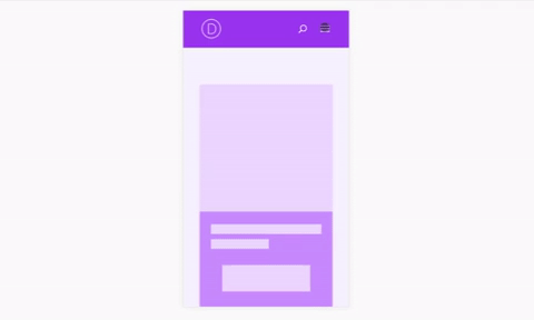
Demo
Implementation
If you don’t need the implementation explanations then just skip directly to the final CSS to copy and use it immediately.
Otherwise, let’s examine the Default header CSS snippet chunk by chunk to help you understand what we are doing.
The header bar on mobile devices has absolute positioning and Divi adds some padding-top to page container by default to prevent the page content from being overlapped by the header. We need to remove this padding since we are going to change the positioning of header bar to relative and there will be no need for it anymore.
/* remove page container padding-top */
.et_header_style_left #page-container {
  padding-top: 0 !important;
}
Next let’s set the header bar positioning to relative.
/* change main header position from absolute to relative */
.et_header_style_left #main-header {
  position: relative;
}
Then let’s remove the padding-left from the top navigation (which is being added so that the navigation does not overlap the logo) and set its width to 100%.
/* remove the top navigation left padding and set its width */
.et_header_style_left #et-top-navigation {
  padding-left: 0 !important;
  width: 100%;
}
Now, to prevent the logo from being overlapped by the top navigation we need to bring it above by setting a large z-index and decrease the width of the logo container to prevent it from overlapping the menu hamburger and search icon which would make them non clickable.
Besides that we also need to set a fixed height for the logo container which needs to be equal to the height of the header bar when the menu is closed. This will prevent the logo container from expanding when the menu is opened and thus keep the logo aligned properly.
/* align logo container properly */
.et_header_style_left .logo_container {
  width: 50%;
  height: 78px; /* adjust to your needs */
  z-index: 999;
}
Next, let’s align the search icon properly and apply a z-index to it as well.
/* align search icon to the right */
.et_header_style_left #et_top_search {
  z-index: 9999;
  float: right;
  right: 20px;
}
We also need to set a fixed height for the search form container to prevent it from expanding to full height of the opened menu. Again, just like with the logo container, this height needs to be equal to the height of the header bar when the menu is closed.
/* set a fixed height for search form container */
.et_header_style_left .et_search_form_container {
  height: 78px !important;
}
Then let’s make the dropdown menu container fullwidth.
/* set the mobile nav menu width */
.et_header_style_left #et_mobile_nav_menu {
  width: 100%;
}
And let’s align the menu hamburger icon to the right.
/* align menu hamburger to the right */
.et_header_style_left .mobile_menu_bar {
  text-align: right;
}
The cart icon alignment needs to be adjusted as well.
/* fix cart icon alignment */
#et-top-navigation .et-cart-info {
  position: absolute;
  left: 50%; /* adjust to your needs */
  z-index: 1;
}
Finally, we need to set the position of dropdown menu to relative to make the header bar expand and push the page content down when the menu is opened.
/* change the dropdown menu position from absolute to relative */
.et_header_style_left .et_mobile_menu {
  position: relative;
}
We can also apply some styling if you like.
/* apply dropdown menu styling (optional) */
.et_header_style_left .et_mobile_menu {
  margin-bottom: 35px;
  border-top: 1px solid #cea0f7;
  padding: 0;
  -webkit-box-shadow: none;
  box-shadow: none;
}
/* set border bottom color for menu item link (optional) */
.et_header_style_left .et_mobile_menu li a {
  border-bottom-color: #cea0f7;
}
Bringing all of the CSS together
Now let’s bring all of the CSS snippets above together and wrap them in a media query with max-width of 980px to make sure this CSS applies on mobile devices only.
I’ve prepared three separate CSS snippets for each header format as well as one combined snippet to optimize and reduce the size of CSS snippets.

Default Header
Your Subtitle Goes Here
/* Make Divi Mobile Menu Push the Page Content Down */
@media all and (max-width: 980px){
    /* remove page container padding-top */
    .et_header_style_left #page-container {
        padding-top: 0 !important;
    }
    /* change main header position from absolute to relative */
    .et_header_style_left #main-header {
        position: relative;
    }
    /* align logo container properly */
    .et_header_style_left .logo_container {
        width: 50%;
        height: 78px;
        z-index: 999;
    }
    /* remove top navigation left padding and set width to 100% */
    .et_header_style_left #et-top-navigation {
        padding-left: 0 !important;
        width: 100%;
    }
    /* align search icon to the right */
    .et_header_style_left #et_top_search {
        z-index: 9999;
        float: right;
        right: 20px;
    }
    /* set a fixed height for search form container */
    .et_header_style_left .et_search_form_container {
        height: 78px !important;
    }
    /* set the mobile nav menu width */
    .et_header_style_left #et_mobile_nav_menu {
        width: 100%;
    }
    /* align menu hamburger to the right */
    .et_header_style_left .mobile_menu_bar {
        text-align: right;
    }
    /* fix cart icon alignment */
    .et_header_style_left #et-top-navigation .et-cart-info {
        position: absolute;
        left: 50%; /* adjust to your needs */
        z-index: 1;
    }
    /* change the dropdown menu position from absolute to relative */
    .et_header_style_left .et_mobile_menu {
        position: relative;
    }
    /* apply dropdown menu styling (optional) */
    .et_header_style_left .et_mobile_menu {
        margin-bottom: 35px;
        border-top: 1px solid #cea0f7;
        padding: 0;
        -webkit-box-shadow: none;
        box-shadow: none;
    }
    /* set border bottom color for menu item link (optional) */
    .et_header_style_left .et_mobile_menu li a {
        border-bottom-color: #cea0f7;
    }
}
Centered Header
Your Subtitle Goes Here
/* Make Divi Mobile Menu Push the Page Content Down */
@media all and (max-width: 980px){
    /* remove page container padding-top */
    .et_header_style_centered #page-container {
        padding-top: 0 !important;
    }
    /* change main header position from absolute to relative */
    .et_header_style_centered #main-header {
        position: relative;
    }
    /* change the dropdown menu position from absolute to relative */
    .et_header_style_centered .et_mobile_menu {
        position: relative;
    }
    /* apply dropdown menu styling (optional) */
    .et_header_style_centered .et_mobile_menu {
        margin-bottom: 35px;
        border-top: 1px solid #cea0f7;
        padding: 0;
        -webkit-box-shadow: none;
        box-shadow: none;
    }
    /* set border bottom color for menu item link (optional) */
    .et_header_style_centered .et_mobile_menu li a {
        border-bottom-color: #cea0f7;
    }
    /* positioning and styling the Select Page container */
    .et_header_style_centered .select_page {
        position: absolute;
        width: 100%;
        left: 0;
        right: 0;
        top: 0;
        border-radius: 5px;
        background-color: rgba(0,0,0,.05);
    }
    .et_header_style_centered .select_page {
        padding: 5px 10px;
    }
    /* set transparent bg color and min-height for .mobile_nav */
    .et_header_style_centered #main-header .mobile_nav {
        background-color: transparent;
        min-height: 32px;
    }
    /* decrese dropdown menu top offset */
    .et_header_style_centered .et_mobile_menu {
        top: 32px;
    }
}
Centered Inline Logo Header
Your Subtitle Goes Here
/* Make Divi Mobile Menu Push the Page Content Down */
@media all and (max-width: 980px){
    /* remove page container padding-top */
    .et_header_style_split #page-container {
        padding-top: 0 !important;
    }
    /* change main header position from absolute to relative */
    .et_header_style_split #main-header {
        position: relative;
    }
    /* change the dropdown menu position from absolute to relative */
    .et_header_style_split .et_mobile_menu {
        position: relative;
    }
    /* apply dropdown menu styling (optional) */
    .et_header_style_split .et_mobile_menu {
        margin-bottom: 35px;
        border-top: 1px solid #cea0f7;
        padding: 0;
        -webkit-box-shadow: none;
        box-shadow: none;
    }
    /* set border bottom color for menu item link (optional) */
    .et_header_style_split .et_mobile_menu li a {
        border-bottom-color: #cea0f7;
    }
    /* positioning and styling the Select Page container */
    .et_header_style_split .select_page {
        position: absolute;
        width: 100%;
        left: 0;
        right: 0;
        top: 0;
        border-radius: 5px;
        background-color: rgba(0,0,0,.05);
    }
    .et_header_style_split .select_page {
        padding: 9px 10px;
    }
    /* set transparent bg color and min-height for .mobile_nav */
    .et_header_style_split #main-header .mobile_nav {
        background-color: transparent;
        min-height: 32px;
    }
    /* decrese dropdown menu top offset */
    .et_header_style_split .et_mobile_menu {
        top: 32px;
    }
}
All three headers combined
Your Subtitle Goes Here
/* Make Divi Mobile Menu Push the Page Content Down */
@media all and (max-width: 980px){
    /* remove page container padding-top */
    .et_header_style_left #page-container,
    .et_header_style_centered #page-container,
    .et_header_style_split #page-container {
        padding-top: 0 !important;
    }
    /* change main header position from absolute to relative */
    .et_header_style_left #main-header,
    .et_header_style_centered #main-header,
    .et_header_style_split #main-header {
        position: relative;
    }
    /* align logo container properly */
    .et_header_style_left .logo_container {
        width: 50%;
        height: 78px;
        z-index: 999;
    }
    /* remove top navigation left padding and set width to 100% */
    .et_header_style_left #et-top-navigation {
        padding-left: 0 !important;
        width: 100%;
    }
    /* align search icon to the right */
    .et_header_style_left #et_top_search {
        z-index: 9999;
        float: right;
        right: 20px;
    }
    /* set a fixed height for search form container */
    .et_header_style_left .et_search_form_container {
        height: 78px !important;
    }
    /* set the mobile nav menu width */
    .et_header_style_left #et_mobile_nav_menu {
        width: 100%;
    }
    /* align menu hamburger to the right */
    .et_header_style_left .mobile_menu_bar {
        text-align: right;
    }
    /* fix cart icon alignment */
    #et-top-navigation .et-cart-info {
        position: absolute;
        left: 50%; /* adjust to your needs */
        z-index: 1;
    }
    /* change the dropdown menu position from absolute to relative */
    .et_header_style_left .et_mobile_menu,
    .et_header_style_centered .et_mobile_menu,
    .et_header_style_split .et_mobile_menu {
        position: relative;
    }
    /* apply dropdown menu styling (optional) */
    .et_header_style_left .et_mobile_menu,
    .et_header_style_centered .et_mobile_menu,
    .et_header_style_split .et_mobile_menu {
        margin-bottom: 35px;
        border-top: 1px solid #cea0f7;
        padding: 0;
        -webkit-box-shadow: none;
        box-shadow: none;
    }
    /* set border bottom color for menu item link (optional) */
    .et_header_style_left .et_mobile_menu li a,
    .et_header_style_centered .et_mobile_menu li a,
    .et_header_style_split .et_mobile_menu li a {
        border-bottom-color: #cea0f7;
    }
    /* positioning and styling the Select Page container */
    .et_header_style_centered .select_page,
    .et_header_style_split .select_page {
        position: absolute;
        width: 100%;
        left: 0;
        right: 0;
        top: 0;
        border-radius: 5px;
        background-color: rgba(0,0,0,.05);
    }
    .et_header_style_centered .select_page {
        padding: 5px 10px;
    }
    .et_header_style_split .select_page {
        padding: 9px 10px;
    }
    /* set transparent bg color and min-height for .mobile_nav */
    .et_header_style_centered #main-header .mobile_nav,
    .et_header_style_split #main-header .mobile_nav {
        background-color: transparent;
        min-height: 32px;
    }
    /* decrese dropdown menu top offset */
    .et_header_style_centered .et_mobile_menu,
    .et_header_style_split .et_mobile_menu {
        top: 32px;
    }
}
Add the CSS either into the Custom CSS field on Divi -> Theme Options page or into the Divi -> Theme Customizer -> Additional CSS field or add it to you child theme style.css file. Save it and all done!
Adjustments for the Divi Mobile Menu Customizer plugin
If you are using the Divi Mobile Menu Customizer plugin, the CSS provided above will cause a few minor layout issues which can be fixed using the following CSS:
/* Adjustments for MMC plugin */
@media all and (max-width: 980px){
  /* set main header positioning */
  body.chi_dmm_styles.et_header_style_left #main-header {
    position: relative !important;
  }
  /* align the menu hamburger icon properly */
  .chi_dmm_styles.et_header_style_left .mobile_menu_bar {
    -webkit-box-pack: end;
    -ms-flex-pack: end;
    justify-content: flex-end;
  }
}
That’s all, hope you’ll find this tutorial useful. Share it with your friends and feel free to leave your thoughts and suggestions in the comments section below and subscribe to stay updated ;)
Love this BUT… Do you have a solution for this to work with the DIVI “Theme Builder” “Global Header” “Menu Module”? The Class Names and are different and some elements don’t exist in this new area.
I tried to adjust your code but the shopping cart icon and logo were messing everything up. Also some of the woo default pages were not acting/responding the same.
I’d really like to get this working because this functionality is way better than the default.
Any help would be hugely appreciated
Cheers
It’s perfect.
I followed your recommendation I changed selector.
Thank you so much.
You are most welcome :)
Hello,
Thank you for this improvement is great.
However I have a problem the logo is hidden below the menu when I open it.
An idea?
https://www.tmtpwp.eu/
Thanks for your help.
thierry
Hi Thierry,
this is happening because the logo container height is set to
100%for vertical navigation on mobile, to overwrite it change the selector to target the vertical navigation logo container in the following snippet of the CSS provided in this tutorial:/* align logo container properly */
.et_vertical_nav.et_header_style_left .logo_container {
width: 50%;
height: 78px;
z-index: 999;
}
or add the
!importantto theheightproperty as indicated below:/* align logo container properly */
.et_header_style_left .logo_container {
width: 50%;
height: 78px !important;
z-index: 999;
}
I would recommend you to change the selector rather than use the
!important. You may also need to adjust the logo container height as per your needs.Hey nice stuff. Seems to work fine on chrome and Firefox… but not safari… Any idea why? I’ve been trying to track it down.
Hi, this looks great. I’ve applied all of the CSS mentioned but sometimes when I click on the hamburger icon I see the text ‘search…’ (which appears to the left of the hamburger).
Any suggestions?
Hi Lee,
it’s hard to tell the exact reason without a url. The search form might be covering the hamburger icon for some reason, try to solve by applying a larger
z-indexvalue to the menu hamburger.Really like this. Will it work on the centered header?
Hi Richard,
this approach will work for both Centered and Centered Inline Logo header formats too but needs some minor adjustments, I’ll update the tutorial for these headers later on.
hello…its not working centered inline logo header…could you please provide css code
Hi aran,
I’va updated the post, now it works for all three header formats: Default, Centered and Centered Inline Logo.
hello ivan
thanks for post update….
i he update my link…dnt think its working…
Hi aran,
make sure you use the right CSS snippet depending on which header format is enabled on your site. Also if you have already applied other CSS customizations to your site mobile menu then you need to make sure they do not conflict with the CSS from this tutorial.
This is great. Thank you! I do have one question though: How can I use the push effect with a sticky mobile menu?
@media(max-width:980px){
.et_fixed_nav .et-fixed-header#main-header {
position: fixed!important;
}
}
Hi Tobias.
One of the ways to achieve the same effect with the fixed header is to increase/decrease the page container padding-top dynamically each time the menu is clicked to open/close, and you’ll need JavaScript for that since it can’t be done with CSS. The JS would calculate the height of the menu each time it changes when opening/closing (and if you have collapsed submenus then expanding/collapsing submenus should be taken into consideration as well) and update the padding-top of the page container accordingly. Another way would be by cloning your menu, again using JS. So, fixed header requires a bit more complex implementation.