Show/Hide Divi Header Depending on Page Scroll Direction
In this tutorial we’ll learn how to show/hide Divi header depending on page scroll direction. The goal is to hide the header while the page is being scrolled down and reveal it only when the page starts scrolling up.
“Traditional” headers move out of the viewport when the page is scrolled down and in order to navigate to other pages you have to scroll all the way up to click the other menu links.
This is probably not the best user experience and one of the solutions to overcome this is to make the header fixed so that it always stays in the viewport allowing the visitor to navigate through website without having to scroll the page up in order to access the menu.
But a fixed menu comes with its own disatvantage too – it covers a portion of the page content which may be a considerable issue for small mobile devices screens, especially if the header bar is thick(like the Divi Centered header).
To prevent this there is a need for a “hybrid” header which would be fixed but move out of the viewport while the page is being scrolled down and appear only when the visitor starts scrolling the page up. This is what we are going to implement now.
DEMO
To implement this functionality we will use quite a bit of CSS to make the header fixed on mobile devices and also make it show/hide smoothly.
The scroll direction detection and showing/hiding the header will be implemented using jQuery.
Adding Custom CSS
We need the header to be fixed, so, enable the Fixed Navigation Bar option in Divi Theme Options.
However, this will make fixed only the desktop menu but we need the mobile menu to be fixed as well.
Also, the header should appear/disappear smoothly.
To do that let’s add the following CSS into Divi Theme Options -> Custom CSS field ( or into the child theme style.css file):
/* Show / Hide Divi Header Depending On Page Scroll Direction */

@media all and (max-width: 980px){
  /* make mobile header fixed */
  #main-header,
  #top-header {
    position: fixed !important;
  }
}
/* show/hide the main and top header smoothly */
#main-header,
#top-header {
  transition: top .3s ease !important;
}

/* Show / Hide Divi Header Depending On Page Scroll Direction */
Adding JS
Next add the JS code in Divi Theme Options -> Integration.
The JS code calculates the scrolling direction and shows/hides the header depending on the configuration.
If the dropdown menu is open and the page is scrolled up, it will close the dropdown menu so that the user could view the page content without having to close the dropdown menu manually. And if the pages is scrolled down the dropdown menu will again be closed and the header will move out of the viewport.
<script type="text/javascript">
(function($){
    $(window).load(function(){
        let minScroll = 5,
            interval = 0,
            closeDropdownOnScroll = true,
            didScroll,
            lastScrollTop = $(document).scrollTop(),
            topHeader = $('#top-header'),
            mainHeaderHeight = $('#main-header').outerHeight(),
            topHeaderHeight = topHeader.length ? $('#top-header').outerHeight() : 0,
            mainHeaderTopOffset = mainHeaderHeight + topHeaderHeight;

        $(window).scroll(function(e){
            didScroll = true;
            if(closeDropdownOnScroll){
                closeDropdownMenu();
            }
        });

        setInterval(function(){
            if (didScroll){
                hasScrolled();
                didScroll = false;
            }
        }, interval);

        /**
         * Close dropdown menu
         */
        function closeDropdownMenu(){
            $("#main-header .mobile_nav.opened .mobile_menu_bar_toggle").trigger("click");
        }

        /**
         * Show/hide header
         */
        function hasScrolled(){
            let scrollTop = $(this).scrollTop();

            // Make sure the scrolled amount is more than minScroll
            if(Math.abs(lastScrollTop - scrollTop) <= minScroll)
                return;

            // If the page's been scrolled down by more than the header height - hide the header.
            if (scrollTop > lastScrollTop && scrollTop > mainHeaderTopOffset){
                // Hide the main header
                $('#main-header').removeClass('nav-down').addClass('nav-up');
                $('#main-header.nav-up').css({'top' : `-${mainHeaderTopOffset}px`});

                // Hide the top header (if exists)
                if(topHeader.length){
                    $('#top-header').removeClass('nav-down').addClass('nav-up');
                    $('#top-header.nav-up').css({'top' : `-${topHeaderHeight}px`});
                }

            } else {
                // Show the header when scrolling up
                if(scrollTop + $(window).height() < $(document).height()){
                    // Show the main header
                    $('#main-header').removeClass('nav-up').addClass('nav-down');
                    $('#main-header.nav-down').css({'top' : `${topHeaderHeight}px`});

                    // Show the top header (if exists)
                    if(topHeader.length){
                        $('#top-header').removeClass('nav-up').addClass('nav-down');
                        $('#top-header.nav-down').css({'top' : `0px`});
                    }
                }
            }

            // Update the last scroll position
            lastScrollTop = scrollTop;
        }
    });
})(jQuery);
</script>
How To Configure
There are three variables that you might want to configure: minScroll, interval, closeDropdownOnScroll.
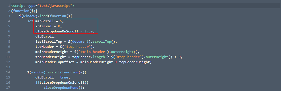
– minScroll : sets the minimum amount to be scrolled before the effect takes place. For example, if it is set to 250 then the header will be hidden only after the page has been scrolled down by at least 250px (default: 5)
– interval : delays the effect by the set amount of time (in ms) after the scrolling starts (default: 0)
– closeDropdownOnScroll : set to true if you want the open dropdown menu to close automatically when the page starts scrolling, otherwise set to false (default: true)
Works all fine. Thank You. One question: How can i manage that the menu is showing in the beginning when the page is loaded and disappears when first time scrolling?
Hi there.
What a great header! I have an issue though. My DIVI header is made up of a section containing rows and it only seems to apply the effect to the top row rather than to both. Is there any way round this?
I made my header on the Divi Theme Builder and it seems the code is not working in this case.
Any tip?
Thanks!!
This looks great, but I’ve got a problem. Everything works until I scroll back to the top of the page. When I return to the top, the Primary Menu Bar, on desktop I can only see the bottom half of my logo, and a bit of the top of my main menu is cut off. On mobile, more than 95% of the logo is cut off (I can see a little bit of the bottom of it), and the hamburger menu is not visible. Can I force a certain height when I get all the way back to the top of the Primary Menu Bar?
Hi Sue.
Most probably the header is being applied some negative top offset or negative margin-top for some reason, please use the browser dev tools to inspect the header and find out what is making it move out of the viewport.
Thanks a lot for sharing this, it worked for me perfectly.
Works great – btw the addon you mentioned above to disable it on desktop (mobile only) works like a charm:
/* disable the effect on desktop */
@media all and (min-width: 981px){
#main-header {
top: 31px !important;
}
#top-header {
top: 0 !important;
}
}
Howdy Ivan.
Can you also implement this on the Global Header??
Cheers.
Wow, it’s working perfectly on my blog how2wp.com
Thank you so much, Ivan, for creating such an awesome tutorial.
Just Wow. I was looking for it a long time ago. By the way, thank you for your great tutorial and thanks again to suggest me to visit this group.
I got it working on mobile but after I added the JS the desktop fix nav doesn’t work anymore.
Check the console if there are any errors.
No errors in console. I noticed the desktop is trying to do the same as the mobile is suppose to.
Yes, it works for desktop header too, not just for the mobile header, it is supposed to be so.
If you don’t want the desktop header to be affected then try setting the header
topoffset to 0(zero) so that it overrides thetopoffset value set by JS (you’ll probably have to use!importantfor that) inside the desktop@mediaquery.If you have the Secondary header enabled then set the secondary header
topoffset to 0(zero) but the Primary headertopoffset should be the same as the height of the Secondary header.I can’t seem to work out where to make those changes. I couldn’t see offset in css and I did find offset in js but there was no value there. How do I –
set the header top offset to 0(zero) so that it overrides the top offset value set by JS (you’ll probably have to use !important for that) inside the desktop @media query.
Try this:
/* disable the effect on desktop */
@media all and (min-width: 981px){
#main-header {
top: 31px !important;
}
#top-header {
top: 0 !important;
}
}
Awesome tutorial.
Thanks :)
Great tip. The only issue is that if I have my secondary menu turned on, it disappears after the initial scroll.
Does it happen to the secondary menu only or both? Tested again with the secondary menu enabled and seems to work just fine, no issues.