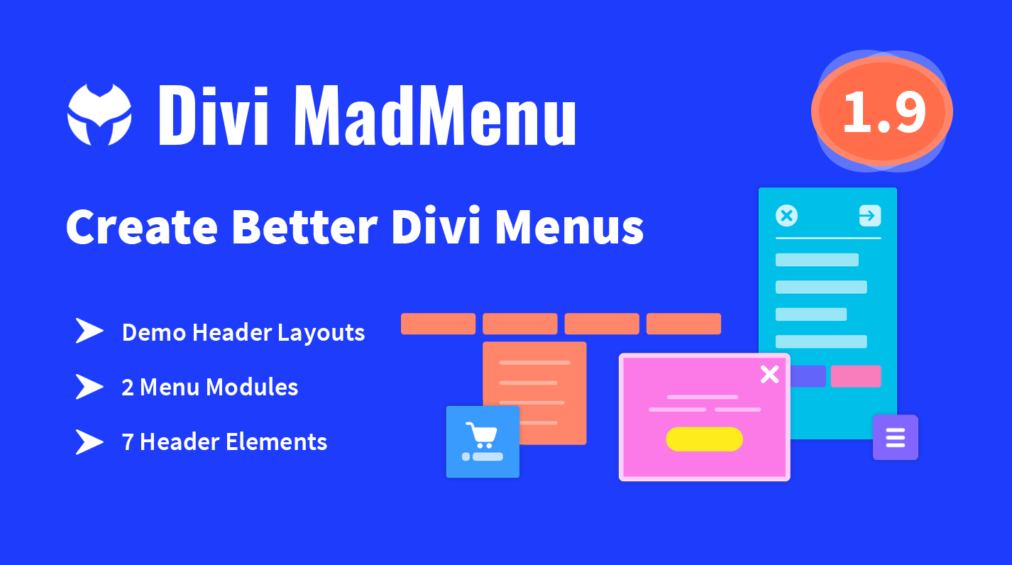
4 Effects for Divi Slider Module Dot Navigation
In this post I am sharing 4 creative effects for Divi Slider Module dot navigation. These are cool effects, the implementation is super easy, so, feel free to grab the CSS code and use in your projects.
Demo
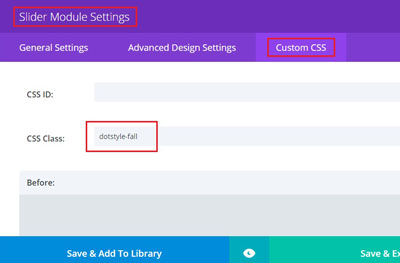
To get these effects work you will need to copy CSS code snippets and paste them into Divi -> Theme Options -> General -> Custom CSS or into child theme style.css file.
Then add the CSS class indicated for each effect below to Slider Module Settings -> Custom CSS -> CSS Class.
Apply general styles
/*** General styles ***/
.dotstyle-smalldotstroke .et-pb-controllers a,
.dotstyle-flip .et-pb-controllers a,
.dotstyle-puff .et-pb-controllers a,
.dotstyle-fall .et-pb-controllers a {
    width: 15px;
    height: 15px;
    border-radius: 50%;
}
/*** General styles ***/
Dot navigation effects CSS snippets
These are the dot navigation effects CSS snippets, copy and paste them into Divi -> Theme Options -> Custom CSS field or style.css file.

Fall Effect
CSS Class: dotstyle-fall
/*** Fall Effect ***/
.dotstyle-fall .et-pb-controllers a::after {
    content: '';
    position: absolute;
    width: 100%;
    height: 100%;
    visibility: hidden;
    opacity: 0;
    left: 0;
    background-color: #c44d48 !important;
    border-radius: 50%;
    -webkit-transform: translateY(20px);
    -ms-transform: translateY(20px);
    transform: translateY(20px);
    -webkit-transition: opacity 0.3s ease, visibility 0s 0.3s, -webkit-transform 0.3s ease;
    -o-transition: transform 0.3s ease, opacity 0.3s ease, visibility 0s 0.3s;
    transition: transform 0.3s ease, opacity 0.3s ease, visibility 0s 0.3s, -webkit-transform 0.3s ease;
}
.dotstyle-fall .et-pb-controllers a {
    -webkit-transition: opacity 0.3s ease, background-color 0.3s ease, -webkit-transform 0.3s ease;
    -o-transition: transform 0.3s ease, opacity 0.3s ease, background-color 0.3s ease;
    transition: transform 0.3s ease, opacity 0.3s ease, background-color 0.3s ease, -webkit-transform 0.3s ease;
}

.dotstyle-fall .et-pb-controllers a:hover,
.dotstyle-fall .et-pb-controllers a:focus,
.dotstyle-fall .et-pb-controllers a.et-pb-active-control {
    background-color: #fff !important;
}

.dotstyle-fall .et-pb-controllers a.et-pb-active-control::after {
    opacity: 1;
    visibility: visible;
    -webkit-transition: opacity 0.3s ease, -webkit-transform 0.3s ease;
    -o-transition: transform 0.3s ease, opacity 0.3s ease;
    transition: transform 0.3s ease, opacity 0.3s ease, -webkit-transform 0.3s ease;
    -webkit-transform: translateY(0px);
    -ms-transform: translateY(0px);
    transform: translateY(0px);
}
.dotstyle-fall .et-pb-controllers a.et-pb-active-control {
    opacity: 1;
    -webkit-transform: translateY(0px);
    -ms-transform: translateY(0px);
    transform: translateY(0px);
}
/*** END Fall Effect ***/
Puff Effect
CSS Class: dotstyle-puff
/*** Puff Effect ***/
.dotstyle-puff .et-pb-controllers a {
    position: relative !important;
    border: 2px solid #fff;
    -webkit-transition: border-color 0.3s ease;
    -o-transition: border-color 0.3s ease;
    transition: border-color 0.3s ease;
}

.dotstyle-puff .et-pb-controllers a::after {
    content: '';
    position: absolute;
    top: 0;
    left: 0;
    width: 100%;
    height: 100%;
    visibility: hidden;
    background: #c44d48;
    border-radius: 50%;
    -webkit-box-shadow: 0 0 1px #c44d48;
    box-shadow: 0 0 1px #c44d48;
    opacity: 0;
    -webkit-transform: scale(3);
    -ms-transform: scale(3);
    transform: scale(3);
    -webkit-transition: opacity 0.3s ease, -webkit-transform 0.3s ease, visibility 0s 0.3s;
    -o-transition: opacity 0.3s ease, transform 0.3s ease, visibility 0s 0.3s;
    transition: opacity 0.3s ease, transform 0.3s ease, visibility 0s 0.3s, -webkit-transform 0.3s ease;
}

.dotstyle-puff .et-pb-controllers a:hover,
.dotstyle-puff .et-pb-controllers a:focus,
.dotstyle-puff .et-pb-controllers a.et-pb-active-control {
    border-color: #c44d48;
}

.dotstyle-puff .et-pb-controllers a.et-pb-active-control:after {
    visibility: visible;
    opacity: 1;
    -webkit-transform: scale(1);
    -ms-transform: scale(1);
    transform: scale(1);
    -webkit-transition: opacity 0.3s ease, -webkit-transform 0.3s ease;
    -o-transition: opacity 0.3s ease, transform 0.3s ease;
    transition: opacity 0.3s ease, transform 0.3s ease, -webkit-transform 0.3s ease;
}
/*** END Puff Effect ***/
3D Flip Effect
CSS Class: dotstyle-flip
/*** 3D Flip Effect ***/
.dotstyle-flip .et-pb-controllers a {
    -webkit-perspective: 1000px;
    perspective: 1000px;
}

.dotstyle-flip  .et-pb-controllers a {
    background-color: transparent;
    -webkit-transform-style: preserve-3d;
    transform-style: preserve-3d;
    -webkit-transition: opacity 0.3s ease, -webkit-transform 0.3s ease;
    -o-transition: transform 0.3s ease, opacity 0.3s ease;
    transition: transform 0.3s ease, opacity 0.3s ease, -webkit-transform 0.3s ease;
}

.dotstyle-flip .et-pb-controllers a::before,
.dotstyle-flip .et-pb-controllers a::after {
    position: absolute;
    top: 0;
    left: 0;
    width: 100%;
    height: 100%;
    border-radius: 50%;
    background-color: white;
    content: '';
    text-indent: 0;
    -webkit-backface-visibility: hidden;
    backface-visibility: hidden;
}

.dotstyle-flip .et-pb-controllers a::after {
    background-color: #c44d48;
    -webkit-transform: rotateY(180deg);
    transform: rotateY(180deg);
}

.dotstyle-flip .et-pb-controllers a:hover,
.dotstyle-flip .et-pb-controllers a:focus {
    opacity: 0.8;
}

.dotstyle-flip .et-pb-controllers a.et-pb-active-control {
    -webkit-transform: rotateY(180deg);
    transform: rotateY(180deg);
}
/*** END 3D Flip Effect ***/
Small Dot with Stroke Effect
CSS Class: dotstyle-smalldotstroke
/*** Small Dot with Stroke Effect ***/
.dotstyle-smalldotstroke a.et-pb-active-control:before {
    content: "" !important;
    position: absolute;
    visibility: visible;
    opacity: 1;
    border: 2px solid rgba(233,109,104,1);
    width: 100%;
    height: 100%;
    display: block;
    border-radius: 50%;
    top: -9px;
    left: -9px;
    padding: 7px;
    -webkit-box-shadow: 0 0 0 2px rgba(255, 255, 255, 0);
    box-shadow: 0 0 0 2px rgba(255, 255, 255, 0);
    -webkit-transition: -webkit-box-shadow 0.3s ease;
    -o-transition: box-shadow 0.3s ease;
    transition: box-shadow 0.3s ease, -webkit-box-shadow 0.3s ease;
}

.dotstyle-smalldotstroke .et-pb-controllers a {
    background-color: #fff !important;
    -webkit-transition: background-color 0.3s ease, -webkit-transform 0.3s ease;
    -o-transition: background-color 0.3s ease, transform 0.3s ease;
    transition: background-color 0.3s ease, transform 0.3s ease, -webkit-transform 0.3s ease;
}
.dotstyle-smalldotstroke .et-pb-controllers a:hover,
.dotstyle-smalldotstroke .et-pb-controllers a:focus,
.dotstyle-smalldotstroke .et-pb-controllers a.et-pb-active-control {
    background-color: #fff !important;
}
.dotstyle-smalldotstroke .et-pb-controllers a.et-pb-active-control {
    -webkit-transform: scale(0.5);
    -ms-transform: scale(0.5);
    transform: scale(0.5);
}
.dotstyle-smalldotstroke a.et-pb-active-control:before {
    -webkit-box-shadow: 0 0 0 2px rgba(233,109,104,1);
    box-shadow: 0 0 0 2px rgba(233,109,104,1);
}
/*** END Small Dot with Stroke Effect ***/
Hope you’ll find these snippets useful. Feel free to share your thoughts and suggestions below and don’t forget to share this post with your friends! ;)