Apply the Blip Effect To Divi Button Module
Button-1
(no icon)
Button-2
(icon shows on hover)
Button-3
(with icon)
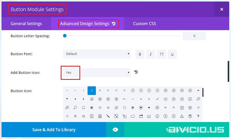
For this effect to work you will need to enable the button icon first.
Button-1
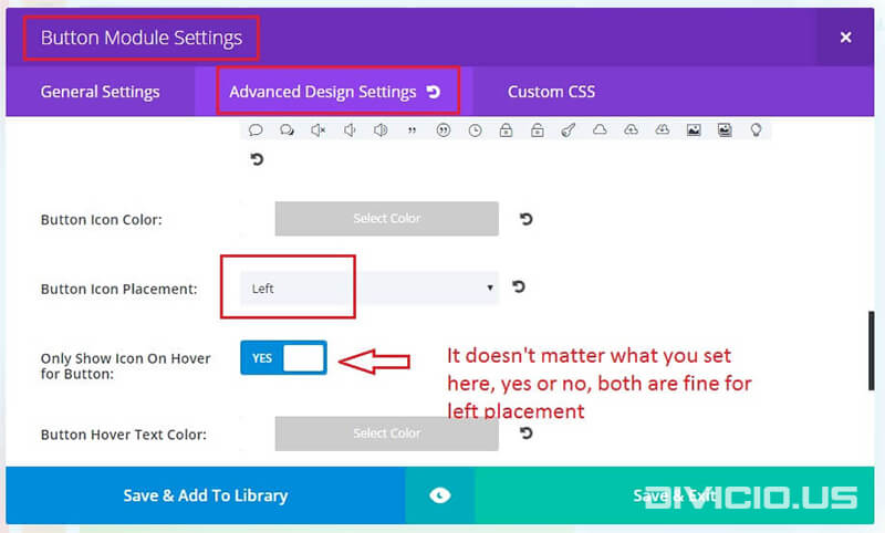
Despite the fact that this button does not have icon we have to enable it in settings anyway and set its placement to Left . Normally if it is set to Left, then the ::before pseudo-element is used to display the icon, but because we’ve already reserved the ::before pseudo-element for our blip effect the icon will never show on the left side of the button leaving us the only option to show it on the right side of the button, in this case the ::after pseudo-element being used.
This button has the icon which is shown on hover only. Set the Button Icon Placement to Right and Only Show Icon On Hover for Button option to Yes.
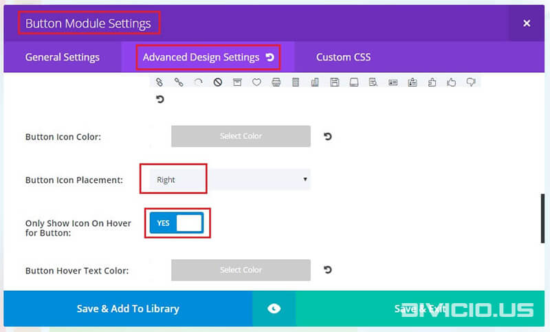
This button has the icon which is shown always, not only on hover. Set the Button Icon Placement to Right and Only Show Icon On Hover for Button option to No.

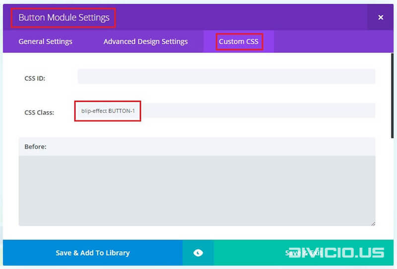
Add the blip-effect CSS class and the CSS class provided for each button to Button Module Settings -> Custom CSS -> CSS Class field like it is indicated in the image below.
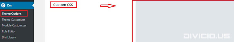
Copy the blip effect CSS code snippets below and add them into Divi -> Theme Options -> General -> Custom CSS field.
CSS code snippets for blip effect
First copy this CSS code, it is used for all 3 buttons:
/* General CSS */
.et_pb_button.blip-effect {
    -webkit-animation: button-bounce 2200ms forwards infinite cubic-bezier(0.165, 0.84, 0.44, 1);
    animation: button-bounce 2200ms forwards infinite cubic-bezier(0.165, 0.84, 0.44, 1);
    -webkit-transition: all 0.3s ease;
    transition: all 0.3s ease;
}
.et_pb_button.blip-effect:before {
    background-color: #f48969 !important; /* define your color here */
    content: "" !important;
    display: block !important;
    top: 0px !important;
    height: 100% !important;
    border-radius: 5px;
    -webkit-animation: button-blip 2200ms forwards infinite cubic-bezier(0.215, 0.61, 0.355, 1);
    animation: button-blip 2200ms forwards infinite cubic-bezier(0.215, 0.61, 0.355, 1);
}

@-webkit-keyframes button-bounce {
    0% {
        transform: scale(1);
    }
    10% {
        transform: scale(0.96);
    }
    20% {
        transform: scale(1.04);
    }
    52%,
    100% {
        transform: scale(1);
    }
}
@keyframes button-bounce {
    0% {
        transform: scale(1);
    }
    10% {
        transform: scale(0.96);
    }
    20% {
        transform: scale(1.04);
    }
    52%,
    100% {
        transform: scale(1);
    }
}
@-webkit-keyframes button-blip {
    0% {
        transform: scaleX(1) scaleY(1);
        opacity: 0;
    }
    10% {
        transform: scaleX(1) scaleY(1);
        opacity: 0.7;
    }
    30%,
    99% {
        transform: scaleX(1.15) scaleY(1.35);
        opacity: 0;
    }
    100% {
        transform: scaleX(1) scaleY(1);
        opacity: 0;
    }
}
@keyframes button-blip {
    0% {
        transform: scaleX(1) scaleY(1);
        opacity: 0;
    }
    10% {
        transform: scaleX(1) scaleY(1);
        opacity: 0.7;
    }
    30%,
    99% {
        transform: scaleX(1.15) scaleY(1.35);
        opacity: 0;
    }
    100% {
        transform: scaleX(1) scaleY(1);
        opacity: 0;
    }
}
/* End General CSS */
Then copy the CSS code snippets for each button below and add them into Divi -> Theme Options -> General -> Custom CSS field.

Button-1
CSS Class: BUTTON-1
/******************** Button-1 ********************/
.et_pb_button.blip-effect.BUTTON-1 {
    padding-left: 1em !important;
}
body #page-container .et_pb_button.blip-effect.BUTTON-1,
body #page-container .et_pb_button.blip-effect.BUTTON-1:hover {
    padding-right: 1em !important;
}
.et_pb_button.blip-effect.BUTTON-1:before {
    margin-left: -1em !important;
    width: 100% !important;
}
Button-2
CSS Class: BUTTON-2
/******************** Button-2 ********************/
.et_pb_button.blip-effect.BUTTON-2:before {
    margin-left: -0.5em !important;
    width: 100% !important;
}
.et_pb_button.blip-effect.BUTTON-2:hover:before {
    margin-left: -0.5em !important;
    width: 104% !important;
}
.et_pb_button.blip-effect.BUTTON-2:after {
    margin-left: 0px !important;
}
Button-3
CSS Class: BUTTON-3
/******************** Button-3 ********************/
.et_pb_button.blip-effect.BUTTON-3:before {
    margin-left: -0.4em !important;
    width: 104% !important;
}
Is there a way to add this effect to caldera forms button here vervetex.com/contact-us
Wooooow this is the paradise of the beautiful buttons. Thank you so much!
You are welcome, Razvan, more cool stuff coming soon :).