Apply Layered Hover Effect To Divi Person Module
It has been quite a while since I last shared CSS snippets on my blog, so I thought it is time to do it again today. In this quick 2-step tutorial I will show how to implement a nice layered hover effect for Divi Person Module.

John Doe
Lead Developer
Lorem ipsum dolor sit amet, consectetur adipiscing elit, sed do eiusmod tempor incididunt ut …
John Doe
Lead Developer
Lorem ipsum dolor sit amet, consectetur adipiscing elit, sed do eiusmod tempor incididunt ut …
To implement this effect we’ll assign the layered-effect CSS class to the Person Module and use the CSS snippet provided below. No any special settings need to be applied in the Person Module Settings, all you need is to make sure you don’t add too much text to the module, otherwise it will be cut because we will apply the overflow: hidden rule to the module container (the content should not occupy more space than the image). If your text is too long and you cannot shorten it, try to experiment with font size and line height until you achieve your desired result.
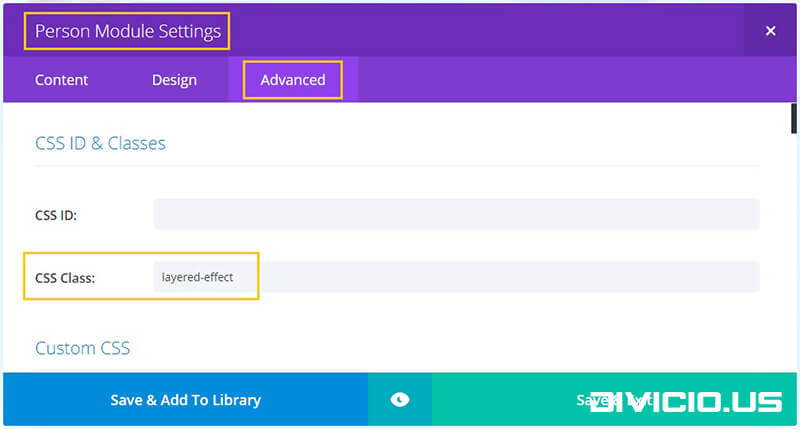
Step 1: Add the layered-effect CSS class to Person Module Settings -> Advanced -> CSS Class field.
Step 2: We will use the Person module container and its description container :before and :after pseudo elements as “layers”. You can change their background colors on the highlighted lines of the code below.
/* Person Module Layered Hover Effect */
.et_pb_team_member.layered-effect {
  overflow: hidden;
  position: relative;
  text-align: right;
  width: 320px;
}
.et_pb_team_member.layered-effect .et_pb_team_member_image {
  margin: 0;
}
.layered-effect *,
.layered-effect *:before,
.layered-effect *:after {
  -webkit-box-sizing: border-box;
  box-sizing: border-box;
  -webkit-transition: all 0.45s ease;
  transition: all 0.45s ease;
}
.et_pb_team_member.layered-effect img {
  backface-visibility: hidden;
}
.layered-effect:before {
  position: absolute;
  top: 0;
  bottom: 0;
  left: 0;
  right: 0;
  content: '';
  background-color: #ffcc00;
  opacity: 0.7;
  z-index: 9;
  -webkit-transition: all 0.45s ease;
  transition: all 0.45s ease;
}
.layered-effect:before {
  -webkit-transform: skew(30deg) translateX(80%);
  transform: skew(30deg) translateX(80%);
}
.layered-effect .et_pb_team_member_description {
  position: absolute;
  top: 0px;
  bottom: 0px;
  left: 0px;
  right: 0px;
  z-index: 10;
  padding: 20px 20px 20px 40%;
}
.layered-effect .et_pb_team_member_description:before,
.layered-effect .et_pb_team_member_description:after {
  position: absolute;
  top: 0;
  bottom: 0;
  left: 0;
  right: 0;
  background-color: #ffcc00;
  box-shadow: 0 0 20px rgba(0, 0, 0, 0.7);
  content: '';
  opacity: 0.5;
  z-index: 8;
}
.layered-effect .et_pb_team_member_description:before {
  -webkit-transform: skew(30deg) translateX(100%);
  transform: skew(30deg) translateX(100%);
}
.layered-effect .et_pb_team_member_description:after {
  -webkit-transform: skew(-30deg) translateX(90%);
  transform: skew(-30deg) translateX(90%);
}
.layered-effect p.et_pb_member_position {
  font-weight: bold;
}
.layered-effect h4,
.layered-effect p,
.layered-effect ul {
  position: relative;
  margin: 0;
  opacity: 0;
  z-index: 11;
}
.layered-effect:hover h4,
.layered-effect:hover p,
.layered-effect:hover ul {
  opacity: 1;
}
.layered-effect:hover:before {
  -webkit-transform: skew(30deg) translateX(30%);
  transform: skew(30deg) translateX(30%);
  -webkit-transition-delay: 0.05s;
  transition-delay: 0.05s;
}
.layered-effect:hover .et_pb_team_member_description:before {
  -webkit-transform: skew(30deg) translateX(50%);
  transform: skew(30deg) translateX(50%);
  -webkit-transition-delay: 0.15s;
  transition-delay: 0.15s;
}
.layered-effect:hover .et_pb_team_member_description:after {
  -webkit-transform: skew(-30deg) translateX(40%);
  transform: skew(-30deg) translateX(40%);
  -webkit-transition-delay: 0.1s;
  transition-delay: 0.1s;
}
/* End Person Module Layered Hover Effect */
Copy the CSS snippet above and add it into the Divi -> Theme Options -> General -> Custom CSS field.
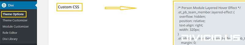
Alternatively, you can add this code into your child theme style.css file.
Save everything and enjoy the effect. Subscribe to stay updated and feel free to share your thoughts and suggestions below! ;)
Very Nice Ivan!
Hey Ivan this is great – thank you! Is there a way to make the animation go top to bottom instead of right to left?
Hi Ivan,
Currently, we are working on a new leadership page, where we are using rectangular images, instead of that, we wanted to use a circular image.
It would be helpful if you can provide the css for circular images.
Thanks in advance
Hi saikiran,
this effect will work for circular image as well, just apply
border-radius: 50%to the Person module.Hi Ivan,
could this hover on be change in a pop-up window , so i can bring in the bio en social icons of the person in a sperate text flied, so when you hover over the image a pop-up window will appear on screen.
thxs in advanced
Hi percy s robles,
I think it could be done but I’m not sure if CSS only would be sufficient, might require some jQuery as well. An interesting idea, btw.
Hi
could this CSS work for any module?
Say I wanted to create a image grid on the frontpage, Could I have it on the image module?
Thx
John
Hi John.
No, this CSS will work for the Person Module only. Haven’t tried to implement it for the Image Module, but it could be adjusted for it too.
This would be very useful if it worked on the image modules.
Wow, that’s such a beautiful, creative and elegant effect! Thanks a lot for sharing!
You’re welcome Tom, glad you like it.
Thanks, excelent articles, cheers ? from Madrid.
Thank you, Louis :)