Enable Search on Mobile for Divi Centered and Centered Inline Logo Headers
Just like other WordPress themes, Divi has the search functionality integrated into its header. Search is available for all five of its header formats except for the Centered and Centered Inline Logo headers for which the search functionality is disabled on mobile devices.
Since currently there is no any options provided within Divi theme which would allow enabling search on mobile devices for these headers too, this needs a custom solution.
In this post I am going to show you how to do it manually using only CSS and also using a plugin.
Here is the result we will get:
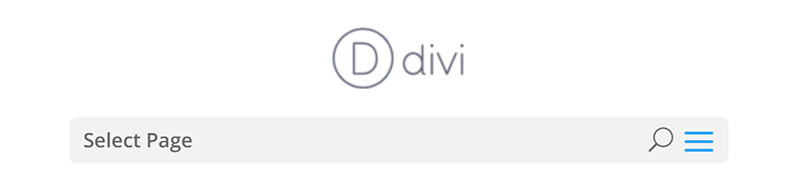
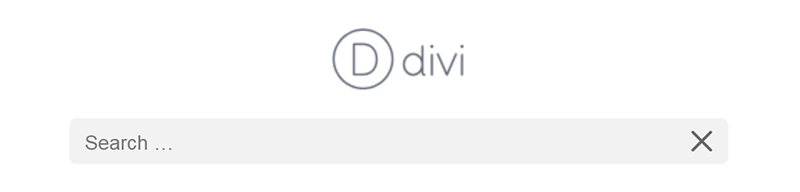
Let’s start with the manual solution which lets you display search icon and search form on mobile devices using CSS only. I’ve prepared the CSS snippet and provide it below, so, all you need to do is to copy it and paste into the Divi -> Theme Customizer -> Additional CSS section (or alternatively go to Divi -> Theme Options and paste this snippet into Custom CSS field) or into your child theme style.css file. I’ve included comments for each part of it expalining what it does to make it easier to understand.
/* Enable Search on Mobile for Divi Centered and Centered Inline Logo Headers */

@media (max-width: 980px) {

    /* make search icon visible */
    .et_header_style_centered #et_top_search,
    .et_vertical_nav.et_header_style_centered #main-header #et_top_search,
    .et_header_style_split #et_top_search,
    .et_vertical_nav.et_header_style_split #main-header #et_top_search {
        display: block !important;
        float: right;
        z-index: 99999;
    }

    /* align search icon for Centered header */
    .et_header_style_centered #et_search_icon:before {
        top: 7px;
        left: -3px;
    }

    /* align search icon for Centered Inline Logo header*/
    .et_header_style_split #et_search_icon:before {
        margin-top: 0;
        left: -3px;
    }

    /* make search field visible */
    .et_header_style_centered .et_search_outer,
    .et_header_style_split .et_search_outer {
        display: block;
    }

    /* set max-width for search form container */
    .et_header_style_centered .container.et_search_form_container,
    .et_header_style_split .container.et_search_form_container.et_pb_search_visible,
    .et_header_style_split .container.et_search_form_container.et_pb_search_form_hidden {
        max-width: 100% !important;
    }

    /* apply in-animation for search form container */
    .et_header_style_centered .container.et_search_form_container.et_pb_search_visible,
    .et_header_style_split .container.et_search_form_container.et_pb_search_visible {
        z-index: 999;
        -webkit-animation: fadeInTop 1s 1 cubic-bezier(.77,0,.175,1);
        -moz-animation: fadeInTop 1s 1 cubic-bezier(.77,0,.175,1);
        -o-animation: fadeInTop 1s 1 cubic-bezier(.77,0,.175,1);
        animation: fadeInTop 1s 1 cubic-bezier(.77,0,.175,1);
    }

    /* apply out-animation for menu bar elements */
    .et_header_style_centered .et_pb_menu_hidden #et_search_icon:before,
    .et_header_style_centered .et_pb_menu_hidden .mobile_menu_bar,
    .et_header_style_centered .et_pb_menu_hidden .select_page,
    .et_header_style_split .et_pb_menu_hidden #et_search_icon:before,
    .et_header_style_split .et_pb_menu_hidden .mobile_menu_bar,
    .et_header_style_split .et_pb_menu_hidden .select_page {
        opacity: 0;
        -webkit-animation: fadeOutBottom 1s 1 cubic-bezier(.77,0,.175,1);
        -moz-animation: fadeOutBottom 1s 1 cubic-bezier(.77,0,.175,1);
        -o-animation: fadeOutBottom 1s 1 cubic-bezier(.77,0,.175,1);
        animation: fadeOutBottom 1s 1 cubic-bezier(.77,0,.175,1);
    }

    /* apply in-animation for "Select Page" container */
    .et_header_style_centered .et_pb_menu_visible .select_page,
    .et_header_style_split .et_pb_menu_visible .select_page {
        opacity: 1;
        -webkit-animation: fadeInBottom 1s 1 cubic-bezier(.77,0,.175,1);
        -moz-animation: fadeInBottom 1s 1 cubic-bezier(.77,0,.175,1);
        -o-animation: fadeInBottom 1s 1 cubic-bezier(.77,0,.175,1);
        animation: fadeInBottom 1s 1 cubic-bezier(.77,0,.175,1);
    }

    /* adjust close search icon horizontal positioning */
    .et_header_style_centered span.et_close_search_field,
    .et_header_style_split span.et_close_search_field {
        right: 5px;
    }

    /* adjust search form input horizontal positioning */
    .et_header_style_centered .et-search-form input,
    .et_header_style_split .et-search-form input {
       left: 10px;
       right: auto;
    }

    /* adjust search form input and close icon vertical positioning */
    .et_header_style_centered .et-search-form input,
    .et_header_style_centered span.et_close_search_field,
    .et_vertical_nav.et_header_style_centered .et-search-form input,
    .et_vertical_nav.et_header_style_centered span.et_close_search_field,
    .et_header_style_split .et-search-form input,
    .et_header_style_split span.et_close_search_field  {
        top: unset !important;
        line-height: 2em;
    }

    .et_header_style_centered span.et_close_search_field,
    .et_header_style_split span.et_close_search_field  {
        bottom: 20px;
    }

    /* set width values for search form */
    .et_header_style_centered .et-search-form,
    .et_header_style_split .et-search-form {
        width: 100% !important;
        max-width: 100% !important;
        bottom: 20px;
    }

    /* adjust close search icon top margin */
    .et_header_style_centered .et_close_search_field:after,
    .et_header_style_split .et_close_search_field:after {
        margin-top: -2px;
    }

}

/* END */
There is one important requirement however – for this snippet to work you have to have the search icon enabled in Theme Customizer settings. Make sure it is enabled by going to Divi -> Theme Customizer -> Header & Navigation -> Header Elements and check the “Show search icon” checkbox.
Enable search using Mobile Menu Customizer plugin
If you don’t like manual solutions and prefer to use plugins instead then I have good news for you – this feature is available in the Mobile Menu Customizer plugin since v2.1. This is how it works:

The “Show search icon” option is located in Divi -> Theme Customizer -> Mobile Menu Customizer -> Menu Header Settings :
Unlike the CSS-only solution, the “Show search icon” feature of MMC plugin allows you to control search icon visibility independently from Divi core “Show search icon” feature and currently it is available for the Default, Centered and Centered Inline Logo header formats.
That’s all, hope you enjoyed this tutorial. Feel free to share your thoughts and suggestions in the comments section below and subscribe to stay updated ;)
I only did this:
@media screen and (max-width: 981px){
#et_top_search{
display: block !important
right: -23px}
}
Beautiful, thanks for sharing
Nevermind! Found it!
Hi Ivan, thanks for the css!
Just one thing though… How would I move the search icon a bit more apart (say 5-10 px left) from the menu icon?
Cheers!
Worked flawlessly. Thank you so much!
Does this code still work with Divi 4.0? I’ve just added it to the custom CSS and I’ve lost all styling on mobile and not added a search box. My knowledge of CSS isn’t good enough to work out how to edit your code to make it work (although I will have a try)
Hi Emma.
It works for Divi default header, I didn’t update it for the Menu Module yet, so, it won’t work for the menu created with theme builder (Divi v4.0).
Thank you so much! I wasn’t looking forward to writing all that CSS myself and was really happy to come across your post. Appreciate the effort!
Thanks. Glad it helped.
Great man , It was really helpful .
Glad to hear that :)
Thank you thank you for this post. This has been driving me nuts for months. I so appreciate your sharing!
Hi Joanna.
Thanks for stopping by, I am glad the post was helpful :).