Position Aware Hover Effect for Divi Button
In this tutorial we are going to implement a position aware hover effect to Divi button module which takes effect depending on the position of coursor when hovering over the button. Hover over the demo button below from different sides to understand what I mean.
Demo:
To achieve this effect first apply the following advanced design settings and then use the CSS and JS code snippets provided below.
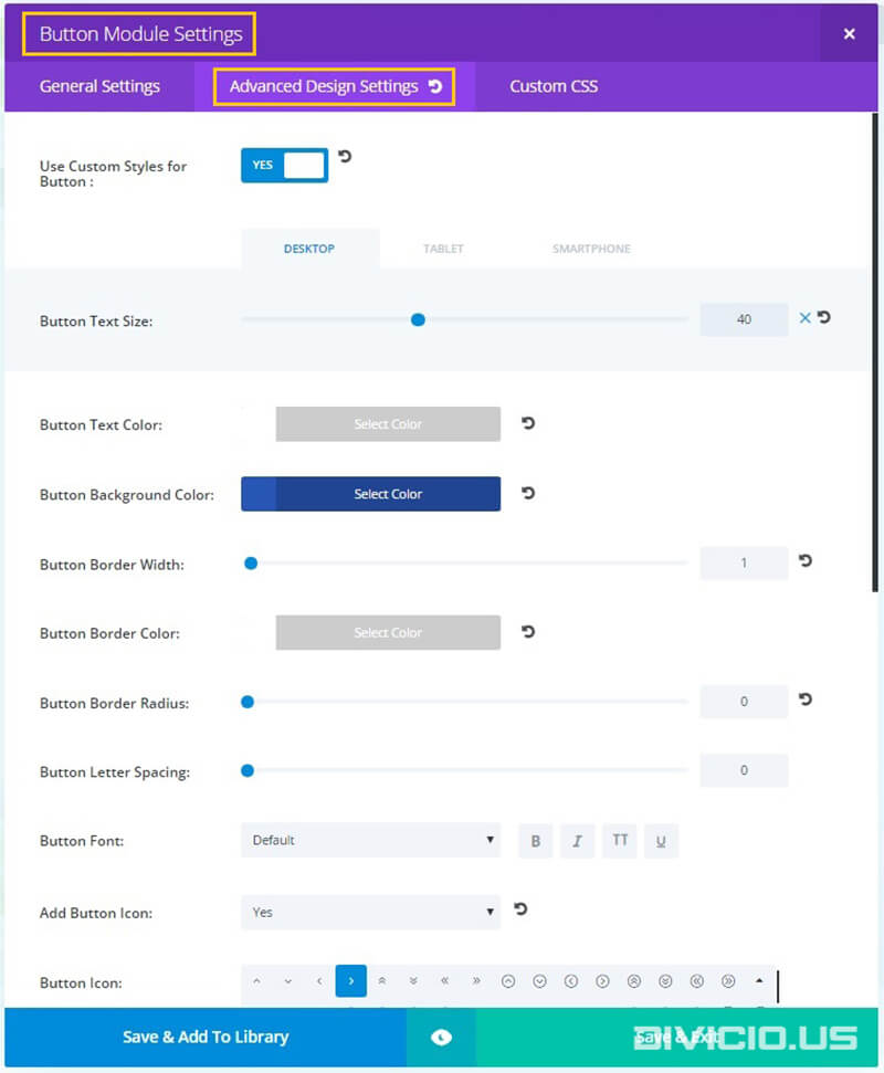
Step 1:
Apply button module advanced design settings

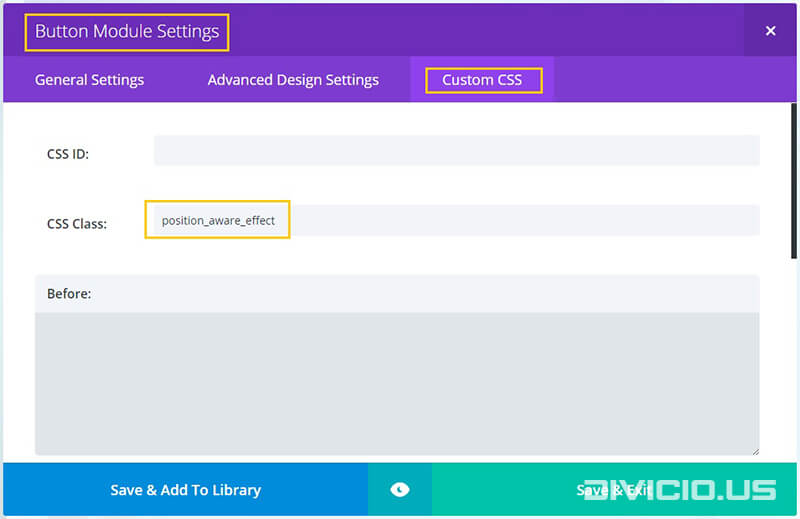
Step 2:
Add the position_aware_effect CSS class to Button Module Settings -> Custom CSS -> CSS Class field like it is indicated in the image below.
Step 3:
Copy the position aware hover effect CSS code snippet below and add it into the Divi -> Theme Options -> General -> Custom CSS field.

CSS code snippet for position aware hover effect
/* Position Aware Hover Effect */
.et_pb_button.position_aware_effect {
    text-shadow:1px 1px rgba(13, 12, 12, 0.3), 2px 2px rgba(13, 12, 12, 0.3);
    box-shadow: 0px 2px 6px 2px rgba(0,0,0,0.2);
    overflow:hidden;
    -webkit-transition: all 0.3s ease-in;
    transition: all 0.3s ease-in;
    z-index: 1 !important;
}
.et_pb_button.position_aware_effect:hover{
    color: rgba(38, 38, 38, 0.5) !important;
    box-shadow: 0px 6px 14px 1px rgba(0,0,0,0.2);
    -webkit-transform: translateY(-3px);
    transform: translateY(-3px);
    -webkit-transition: all 0.3s ease-in;
    transition: all 0.3s ease-in;
}
.et_pb_button.position_aware_effect:focus{
    color: rgba(13, 13, 13, 1) !important;
}
@media all and (min-width: 981px) {
    .et_pb_button.position_aware_effect:after {
        margin-left: 0em !important;
    }
}
@media all and (max-width: 980px) {
    .et_pb_button.position_aware_effect:after {
        line-height: 1.7em !important;
    }
}
.blob {
    z-index: -1;
    position:absolute;
    width:2px;
    height:2px;
    margin-left: 0;
    margin-top: 0;
    background: #ff4466 !important; /* set your color here */
    border-radius: 50%;
    border-color: #ff4466 !important; /* set your color here */
    border-width: 1px;
    border-style: solid;
    -webkit-transition: border-width 0.7s ease-in-out,margin-left 0.7s ease-in-out,margin-top 0.7s ease-in-out;
    transition: border-width 0.7s ease-in-out,margin-left 0.7s ease-in-out,margin-top 0.7s ease-in-out;
}
.expand {
    border-color: #ff4466 !important; /* set your color here */
    border-width: 500px;
    border-style: solid;
    -webkit-transition: border-width 0.7s ease-in-out,margin-left 0.7s ease-in-out,margin-top 0.7s ease-in-out;
    transition: border-width 0.7s ease-in-out,margin-left 0.7s ease-in-out,margin-top 0.7s ease-in-out;
    margin-left:-500px;
    margin-top:-500px;
}
/* End Position Aware Hover Effect */
Step 4:
Copy the position aware hover effect JS code snippet below and add it into the Divi -> Theme Options -> Integration -> Add code to the < body > field.

JS code snippet for position aware hover effect
<script type="text/javascript">
(function($) {
/* Position aware hover effect */
var ofs, x, y;
$('.et_pb_button.position_aware_effect').on('mouseenter', function(e){
  ofs = $(this).offset();
  x = (e.pageX - ofs.left);
  y = (e.pageY - ofs.top);
var name = $(this).text().toLowerCase().split(' ')[0];

$(this).append('<div class="blob ' + name + '" style="left:' + x + 'px; top: ' + y + 'px;"></div>');

var blob = $(this).find('.blob');
setTimeout(function(){
    blob.addClass("expand");
},20);
});

$('.et_pb_button.position_aware_effect').on('mouseleave', function(e){
  ofs = $(this).offset();
  x = (e.pageX - ofs.left);
  y = (e.pageY - ofs.top);
  var blob = $(this).find('.blob');
  blob.css({'left':x, 'top':y});
  blob.removeClass("expand");
  setTimeout(function(){
      blob.remove();
},800);
});

})(jQuery);
</script>
That’s all, hope you’ll find this effect useful. Feel free to share your thoughts and suggestions below and don’t forget to share this post with your friends! ;)
Inspired by: In&&Out
THANKS Ivan. Very cool effect!! AND easy to implement!!
Hi DAN. Glad you like it, thanks for stopping by.
Spoke too soon. Please disregard my first comment^^ Something must have gotten held up in a cache – worked after 5 minutes :)
Thanks for your comment, Valerie. Glad to know it finally worked :)
Oh no! I tried using this and I’m not sure if a divi update may have outdated this blog post. I tried applying it to the ‘Join Now!’ button on my site.
Just wanted to say thank you to you, Ivan. I love your site and love it that you share your great examples to inspire the community. This position aware example is really awesome, again thanks. Jason
Thanks for your kind words, Jason. I really appreciate that :) Glad you like what I am doing for the community.