How To Make Divi Mobile Menu Scrollable
by Ivan Chiurcci | Sep 4, 2023 | 2 comments
In this tutorial you’ll learn how to make Divi mobile menu scrollable to ensure that all mobile menu items remain accessible to users on smaller screens.
If you’ve faced the issue with the fixed (or sticky) Divi mobile menu overflowing the viewport at the bottom on mobile devices when expanded then this solution is for you.
Table of Contents
Demo
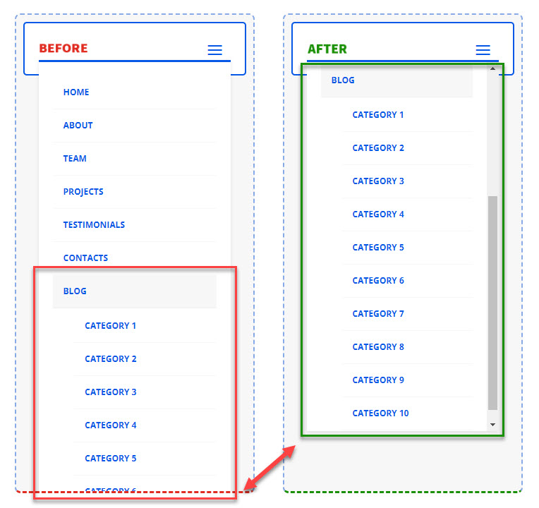
Click the mobile menu toggles (aka the hamburger menu icons) to see the mobile menu before and after making it scrollable.
The Problem
As you can see from the live demo above, the default mobile menu having lots of menu items is overflowing the bottom edge of the viewport (the BEFORE menu). This makes some of the menu items at the bottom of the dropdown menu inaccessible for users.

Overflowing mobile dropdown menu hinders navigation. It is a huge UX issue because if users can’t access all the menu items this can lead to frustration which can further lead to higher bounce rates and site abandonment.
Make Divi mobile menu scrollable
To avoid this issue we need to prevent the long mobile menu from overflowing the viewport by setting a maximum height it can expand to, and make it scrollable vertically if the menu items do not fit in so that users can scroll the menu up and down.
This simple CSS snippet will be responsible for that:
/**
 * Make Divi mobile menu scrollable.
 * @source  https://divicio.us
 */
@media (max-width: 980px) {
    #et_mobile_nav_menu .et_mobile_menu,
    .dvcs_scrollable_mobile_menu.et_pb_menu .et_mobile_menu,
    .dvcs_scrollable_mobile_menu.et_pb_fullwidth_menu .et_mobile_menu {
        max-height: 65vh; /* Adjust this value as needed */
        overflow-y: auto;
    }
}
It works with the default mobile menu of Divi theme, as well as with the menus created using the Menu and Fullwidth Menu modules, you just need to add the dvcs_scrollable_mobile_menu CSS class in the module settings Advanced -> CSS ID & Classes -> CSS Class field.
In the custom CSS, first we restrict the maximum height of the mobile dropdown menu using the max-height property.
You can set the max-height value in any unit you want, however, I’d recommend using the vh unit. This will make the mobile dropdown menu height adapt to different screen/viewport sizes and orientations, ensuring that the menu won’t overflow the viewport.
For example, setting the max-height to 65vh will only allow the mobile menu occupy not more than 65% of the viewport height, no matter the size and orientation of the screen.
And by setting the overflow-y property value to auto we make mobile dropdown menu scrollable vertically.
Collapse Divi mobile menu submenus
Additionally, we could also collapse the mobile menu submenus to make the mobile dropdown menu even more compact initially.
However, this may be insufficient if the submenus have lots of menu items, which will still make the mobile menu overflow the viewport when submenus are expanded.
So, in such a case there is still a need to restrict the maximum height of the mobile dropdown menu and make it’s content scrollable.
Make Divi MadMenu mobile menu scrollable
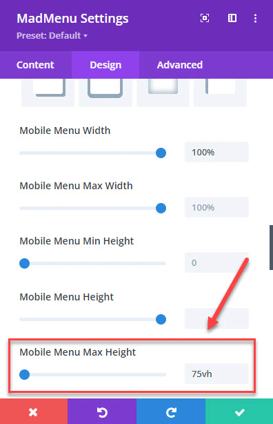
Divi MadMenu allows you to make the mobile menu scrollable without the need to use any custom CSS.
All you need to do is to set a max-height for the mobile menu in MadMenu Settings -> Design -> Mobile Menu -> Mobile Menu Max Height field.
Click the mobile menu toggle button to open the mobile menu, then click the parent item to expand the submenu and see the mobile menu become scrollable:
Conclusion
Mobile screens have limited space, and a scrollable menu allows you to organize a large number of menu items without compromising the layout. This can improve the overall navigation experience.
If users can’t easily find what they’re looking for in your mobile menu they may leave your site quickly thus increasing the bounce rate. A scrollable menu helps avoid users frustration and encourages them to explore your content further and to return to your site later again.
So, make sure users don’t miss out on important navigation link on your site mobile menu, apply the little tweak suggested in this tutorial to make your long Divi mobile menus scrollable.
This will ensure that your site remains accessible, organized, and easy to navigate on mobile devices, which are increasingly the primary means through which users access the web.
View Live Demos & Get Divi MadMenu
Download Divi Freebies!
Join our mailing list to receive exclusive FREE file downloads, news and updates right in your inbox.
Please confirm your email address to complete your subscription. Thank you!
Unsubscribe at any moment. No spam, ever!


A problem that I can see with this particular menu is that the item you are demonstrating is the last item and there is no indication that there are further categories below the three that are shown. This would work in any item above blog because people will be aware that there were further items below, I think this menu needs a further indicator that there are more items below what can be seen .
That’s a great point, Aitch. Normally, setting the “overflow” property to “auto” would show the scrollbar when the container’s content becomes scrollable, however, while this works on desktop it is not always working on mobile devices. So, having an alternative indicator that the menu is scrollable would be a handy addition indeed, would love to hear your suggestions if you have any :)