Divi MadMenu Header Templates #14, #15 and #16
I’ve recently added three new header templates to Divi MadMenu demos pack: a Fullscreen header template (#14), a Vertical header template (#15), and a Horizontal header template (#16).
These new header templates are available for download for all our customers that have purchased Divi MadMenu.
Header Template #14: Fullscreen Header
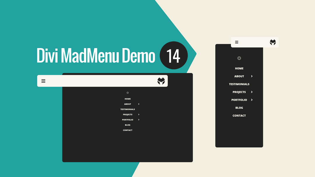
Divi MadMenu Header Template #14 is a fullscreen header with a simple header bar design having only a hamburger menu icon on the left and the logo on the right.
The fullscreen menu is created using the Divi MadMenu header popups feature, and has a simple vertical menu with the Close button placed above it.
The vertical menu is added using the MadMenu Vertical Menu module. The menu items are centered, with collapsed sliding-in submenus.

Main Features
Fullscreen Menu
The menu is fullscreen on all devices.
Fixed Header Enabled
Fixed header is enabled on all devices.
Responsive Design
The header template is designed with responsiveness in mind, it looks great on any screen width.
Hamburger Menu
Hamburger menu used on all devices.
Collapsed Submenus
The submenus are collapsed and can be revealed by clicking the parent menu item/arrow.
Slide-In Submenus Style
The Slide-In submenus style used for the collapsed submenus.
Header Template #15: Vertical Header
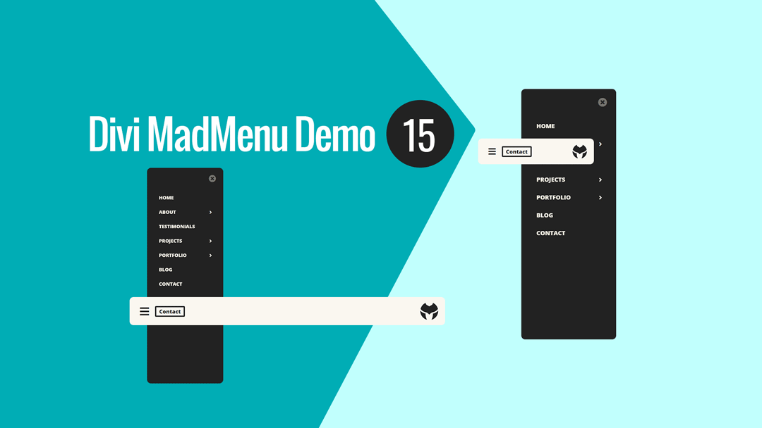
Divi MadMenu Header Template #15 is a vertical header with the menu positioned on the left side of the screen sliding in from left when users click the menu icon.
The header bar has the menu icon and a CTA button on the left, and logo on the right. A fullscreen overlay covers the page when the menu is open.
To close the menu users can click either the Close button of the menu on top right, or click anywhere outside of the menu which will make the menu close automatically.
The vertical menu with collapsed sliding-in submenus is added using the MadMenu Vertical Menu module.

Main Features
Vertical Slide-In Menu
The menu is vertical on all devices sliding in from left on hamburger menu icon click.
Fixed Header Enabled
Fixed header is enabled on all devices.
Responsive Design
The header template is designed with responsiveness in mind, it looks great on any screen width.
CTA Button
CTA button placed next to the hamburger menu icon in the header bar.
Hamburger Menu
Hamburger menu used on all devices.
Collapsed Submenus
The submenus are collapsed and can be revealed by clicking the parent menu item/arrow.
Slide-In Submenus Style
The Slide-In submenus style used for the collapsed submenus.
Close On Outside Click
Menu closes on outside click.
Header Template #16: Horizontal Header
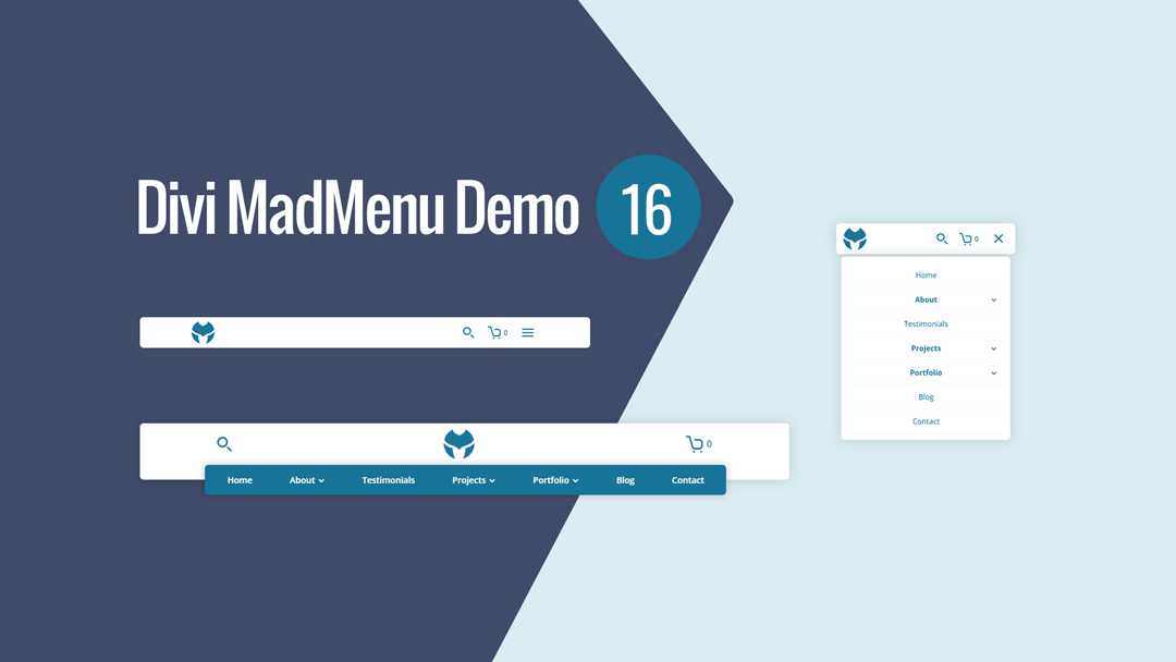
Divi MadMenu Header Template #16 is a horizontal header with two-rows layout.
The upper row contains the search icon on the left, centered logo and the cart icon on the right on desktop.
The lower row is visible on desktop only and contains the horizontal desktop menu overlapping the header bar’s bottom edge.
On mobile devices the logo is aligned to the left of the header bar, with the rest of the header elements (search, cart and menu) moved to the right.
The shopping cart is set to show the number of items added to cart.

Main Features
Horizontal Menu
The header layout is horizontal with two-rows structure.
Overlapping Menu
The horizontal menu overlaps the header bar bottom edge on desktop.
Fixed Header Enabled
Fixed header is enabled on all devices.
Responsive Design
The header template is designed with responsiveness in mind, it looks great on any screen width.
Search Enabled
Search functionality enabled for the header.
Cart
Shopping cart icon with cart contents enabled.
Collapsed Mobile Menu Submenus
The mobile menu submenus are collapsed and can be revealed by clicking the parent menu item/arrow.
Accordion Mode
Close Mobile Menu On Outside Click
Mobile menu closes when users click anywhere on the page outside the menu.
No Custom Code Used!
These header templates do not use any custom code. They’re fully customizable using the Divi MadMenu settings (and other Divi Builder elements used) in the Divi Theme Builder.
How To Download and Install
Follow this guide to learn how you can download and start using the Divi MadMenu demos, the new header templates are included in the same package with the rest of the Divi MadMenu demo headers.
These header templates are Divi Theme Builder templates, so, they should be imported into the Divi Theme Builder as new templates, please follow this guide about how to import Divi Theme Builder templates.
How To Customize
You can customize Divi MadMenu header templates like any other Divi Theme Builder template.
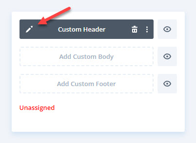
After importing the header template into the Divi Theme Builder just click the Edit icon to launch the Theme Builder and start editing the template.

Then assign it to any post, page, category, etc. that you need, or make it a Global template.
