Download 6 New Header Templates for Divi MadMenu
Exciting news for all Divi MadMenu users: you can download 6 new header templates for Divi MadMenu!
The new header templates are available with the v1.5 of the Divi MadMenu demos pack.
This demos update includes the header templates #20 – #25, and below you can find a quick overview of each of them as well as click to view the live demos.
Header Template #20: Fullscreen Header
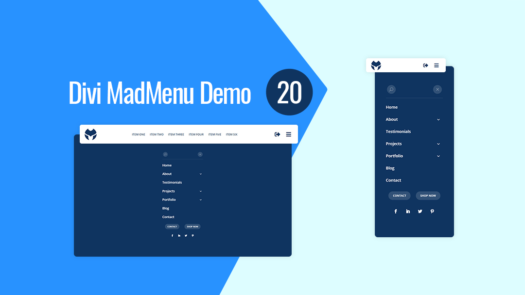
Divi MadMenu Header Template #20 is a fullscreen header with fixed header bar having logo on the left, horizontal menu in the middle on desktop, as well as the hamburger menu and login/logout buttons on the right.
The fullscreen menu is created using the Divi MadMenu header popups feature. It contains a vertical menu created using the MadMenu Vertical Menu module.
The menu has the Close button and search icon above the menu items, as well as two CTA buttons and social icons at the bottom.
Main Features
Fullscreen Menu
The menu is fullscreen on all devices.
Fullwidth Header Bar
The desktop menu header bar is fullwidth.
Fixed Header
Fixed header is enabled on all devices.
Centered Horizontal Menu
Centered horizontal menu used on desktop.
Hamburger Menu
Hamburger menu enabled on desktop, toggles the fullscreen menu.
Login/Logout Button
Login/Logout button placed on the right side of the menu bar next to the hamburger menu button.
Responsive Design
The header template is designed with responsiveness in mind, it looks great on any screen width.
Search
Search button placed above the menu items in the fullscreen menu.
Menu Close Button
Menu close button placed above the menu items.
Collapsed Submenus
The submenus of the fullscreen menu are collapsed and can be revealed by clicking the parent menu item/arrow.
Vertically Scrollable Menu
The menu is vertically scrollable, if the menu has lots of menu items users can scroll it vertically up and down.
CTA Buttons
Two CTA buttons added below the menu items in the fullscreen menu.
Social Icons
Social icons placed beneath the CTA buttons in the fullscreen menu.
Header Template #21: Vertical Header
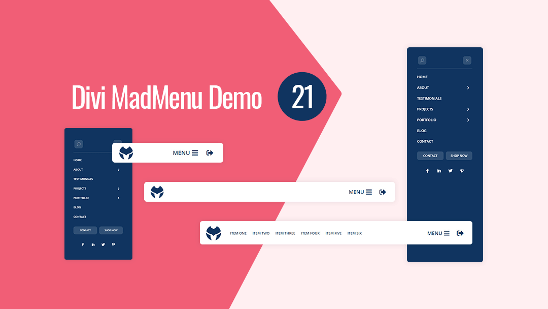
Divi MadMenu Header Template #21 is a vertical header design with the menu sliding in from right when users click the menu icon.
On desktop the logo and horizontal menu are aligned to the left, while the menu and login/logout buttons aligned to the right. On mobile the alignment of the logo and buttons remain the same.
The vertical menu with collapsed sliding-in submenus is created using the MadMenu Vertical Menu module.
It has the Close button and search icon above the menu items, and two CTA buttons and social icons at the bottom.
To close the menu users can either click the Close button on the top right of the vertical menu, or click anywhere outside of the menu.
Main Features
Vertical Slide-In Menu
The vertical menu slides in from the right on the menu icon click.
Fullwidth Header Bar
The desktop menu header bar is fullwidth.
Fixed Header
Fixed header is enabled on all devices.
Horizontal Menu
Horizontal desktop menu aligned to left.
Hamburger Menu
Hamburger menu used on all devices, toggles the vertical slide-in menu.
Login/Logout Button
Login/Logout button placed on the right side of the menu bar next to the menu button.
Responsive Design
The header template is designed with responsiveness in mind, it looks great on any screen.
Search
Search button placed above the menu items in the slide-in menu.
Menu Close Button
Menu close button placed above the menu items in the slide-in menu.
Collapsed Submenus
The submenus of the slide-in menu are collapsed and can be revealed by clicking the parent menu item/arrow.
Slide-In Submenus
The slide-in style is used for the collapsed submenus of the vertical menu, clicking the parent menu item/arrow slides the submenu in from the right.
CTA Buttons
Two CTA buttons added below the menu items in the slide-in menu.
Social Icons
Social icons placed beneath the CTA buttons in the slide-in menu.
Header Template #22: Horizontal Header
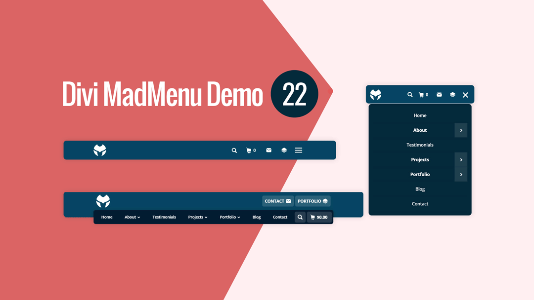
Divi MadMenu Header Template #22 is a horizontal header with dual-rows layout structure.
The upper row contains the logo on the left and two CTA buttons on the right on desktop.
The overlapping lower row is visible on desktop only and contains the horizontal desktop menu with evenly aligned menu items, as well as the search and cart elements on the right.
On mobile devices the header has a single-row structure with the logo on the left and search, cart, two CTA buttons and menu on the right. CTA buttons are icon-only buttons (without text).
Shopping cart element displays the subtotal on desktop and number of items added to cart on mobile.
Main Features
Horizontal Menu
The header layout is horizontal with two-rows structure.
Fixed Header
Fixed header is enabled on all devices.
Overlapping Menu
Horizontal menu overlaps the header bar bottom edge on desktop.
Menu Items Aligned Evenly
Desktop menu items aligned evenly.
Two CTA Buttons
Two CTA buttons available on the right side of the header bar.
Responsive Design
The header template is designed with responsiveness in mind, it looks great on any screen.
Search
Search icon placed on the right side of the menu.
Cart
Shopping cart icon with cart subtotal displayed on desktop and cart items count displayed on mobile.
Collapsed Mobile Menu Submenus
The mobile menu submenus are collapsed and can be revealed by clicking the parent menu item/arrow.
Slide-In Submenus Style
The Slide-In submenus style used for the collapsed mobile menu submenus.
Close Mobile Menu On Outside Click
Mobile menu closes when users click anywhere on the page outside the menu.
Header Template #23: Fullscreen Header
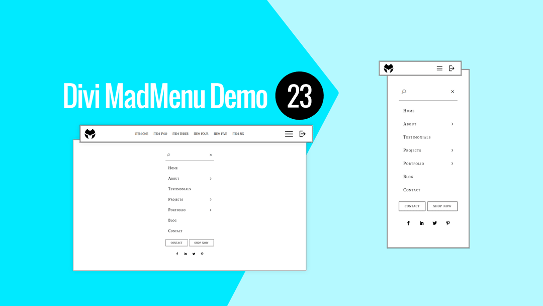
Divi MadMenu Header Template #23 takes a simplistic approach, just like the header templates #24 and #25 below.
It’s a fullscreen header template with a single-row header bar design with logo on the left, horizontal menu (on desktop) in the middle, and the hamburger menu and login/logout buttons on the right.
The fullscreen menu opens when the hamburger menu icon is clicked. It contains a vertical menu with the Close button and search icon above the menu items, and the social icons and two CTA buttons at the bottom.
The vertical menu with sliding-in submenus is created using the MadMenu Vertical Menu module.
Main Features
Fullscreen Menu
The menu is fullscreen on all devices.
Fixed Header
Fixed header is enabled on all devices.
Centered Horizontal Menu
Centered horizontal menu used on desktop.
Hamburger Menu
Hamburger menu used on all devices, toggles the fullscreen menu.
Login/Logout Button
Login/Logout button placed on the right side of the menu bar.
Social Icons
Social icons placed beneath the CTA buttons in the fullscreen menu.
Responsive Design
The header template is designed with responsiveness in mind, it looks great on all screen sizes.
Search
Search button placed above the menu items in the fullscreen menu.
Menu Close Button
Menu close button placed above the menu items in the fullscreen menu.
Collapsed Submenus
The submenus of the fullscreen menu are collapsed and can be revealed by clicking the parent menu item/arrow.
Slide-In Submenus
The slide-in style is used for the collapsed submenus of the vertical menu, clicking the parent menu item/arrow slides the submenu in from the right.
CTA Buttons
Two CTA buttons added below the menu items in the fullscreen menu.
Header Template #24: Vertical Header
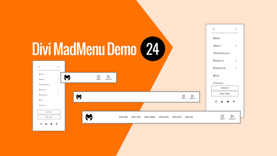
Divi MadMenu Header Template #24 is a vertical header with the menu sliding in from right when users click the menu icon.
The header bar has the logo on the left, horizontal menu in the middle on desktop, and the menu with login/logout buttons on the right. The menu and login/logout buttons use custom image icons and text.
The vertical menu with collapsed sliding-in submenus is added using the MadMenu Vertical Menu module.
To close the menu users can either click the Close button on the top right of the vertical menu, or click anywhere outside of the menu.
Two stacked CTA buttons and the social icons are placed below the menu.
Main Features
Vertical Slide-In Menu
The vertical menu slides in from the right on the menu icon click.
Fixed Header
Fixed header is enabled on all devices.
Centered Horizontal Menu
Horizontal desktop menu is centered.
Hamburger Menu
Hamburger menu used on all devices, toggles the vertical menu.
Login/Logout Button
Login/Logout button placed on the right side of the menu bar.
Social Icons
Social icons placed below the CTA buttons in the slide-in menu.
Responsive Design
The header template is designed with responsiveness in mind, it looks great on any screen.
Search
Search button placed above the menu items in the slide-in menu.
Menu Close Button
Menu close button placed above the menu items in the slide-in menu.
Collapsed Submenus
The submenus of the slide-in menu are collapsed and can be revealed by clicking the parent menu item/arrow.
Slide-In Submenus
The slide-in style is used for the collapsed submenus of the vertical menu, clicking the parent menu item/arrow slides the submenu in from the right.
CTA Buttons
Two CTA buttons added below the menu items in the slide-in menu.
Header Template #25: Horizontal Header
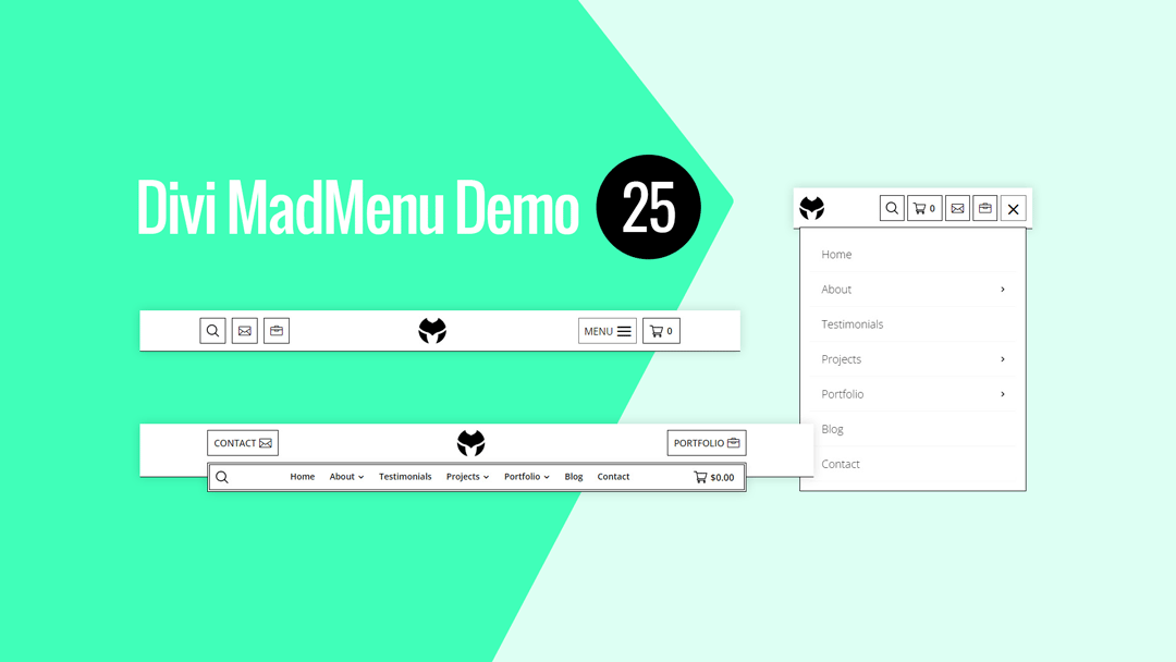
Divi MadMenu Header Template #25 is a horizontal header with dual-rows layout structure.
The upper row contains a logo in the middle and two CTA buttons, one of them on the left and the other on the right on desktop.
The overlapping lower row is visible on desktop only. It contains a horizontal desktop menu in the middle, search icon on the left and shopping cart displaying subtotal on the right.
On tablet the header bar has a single-row structure. Logo is still in the middle, however, on the left it has the search and two icon-only CTA buttons, while the menu button and cart displaying items count are aligned to the right.
On mobile devices the logo is aligned to the left, with the rest of the header elements (search, cart, CTA buttons, cart and the menu) aligned to the right.
Main Features
Horizontal Menu
The header layout is horizontal with two-rows structure.
Fixed Header
Fixed header is enabled on all devices.
Overlapping Menu
Horizontal menu overlaps the header bar bottom edge on desktop.
Logo Alignment
Logo is centered on desktop and tablet, and left aligned on phone devices.
Two CTA Buttons
Two CTA buttons available aligned differently on different devices.
Search
Search enabled both on desktop and mobile.
Cart
Shopping cart icon with cart subtotal displayed on desktop and cart items count displayed on mobile.
Collapsed Mobile Menu Submenus
The mobile menu submenus are collapsed and can be revealed by clicking the parent menu item/arrow.
Slide-In Submenus
The Slide-In submenus style used for the collapsed mobile menu submenus.
Close Mobile Menu On Outside Click
Mobile menu closes when users click anywhere on the page outside the menu.
Responsive Design
The header template is designed with responsiveness in mind, it looks great on any screen.
No Custom Code Used!
These header templates do not use any custom code. They’re fully customizable using the Divi MadMenu settings (and other Divi Builder elements used) in the Divi Theme Builder.
How To Download and Install
The new header templates come with the v1.5 of the Divi MadMenu demo headers pack.
Please follow this guide about how to download and start using the Divi MadMenu demos.
These new demo headers are Divi Theme Builder templates, you should import them directly into the Divi Theme Builder as new templates.
If you need help with adding new templates to Divi Theme Builder please follow this guide.
How To Customize
You can customize Divi MadMenu header templates like any other Divi Theme Builder template.
After importing the header template into the Divi Theme Builder click the Edit icon to launch the Theme Builder and start editing the template.
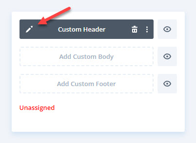
Add your content (menu, logo, social icons, etc.) and apply design changes as per your needs.
Then assign the template to a specific post, page, category, etc., or make it a Global template if you want to use it throughout your website.

Hi Ivan,
As soon as I see a post from you I know good stuff is on its way!
Divi MadMenu is my absolute favourite plugin for Divi (I have tried all the others).
I use it all the time!
In addition these templates which are superb and the growing library of templates make my header building much, much easier, so thank you for your effort.
Your membership is one of the best purchases I’ve made outside of Elegant Themes.
Keep up the great work!
Hi Hurri! Thanks a lot for your kind words, appreciate you being our valued member and using Divi MadMenu :)