Add a Shiny Hover Effect to Divi Button
In this tutorial I’ll show you how to implement a cool shiny hover effect to Divi button module. Hover over the demo button below to see this effect in action.
Demo:
To achieve this effect you’ll need to apply the following advanced design settings and use the CSS code provided below. And also please notice that this effect works best on dark background.
Step 1:
Apply button module advanced design settings


Step 2:
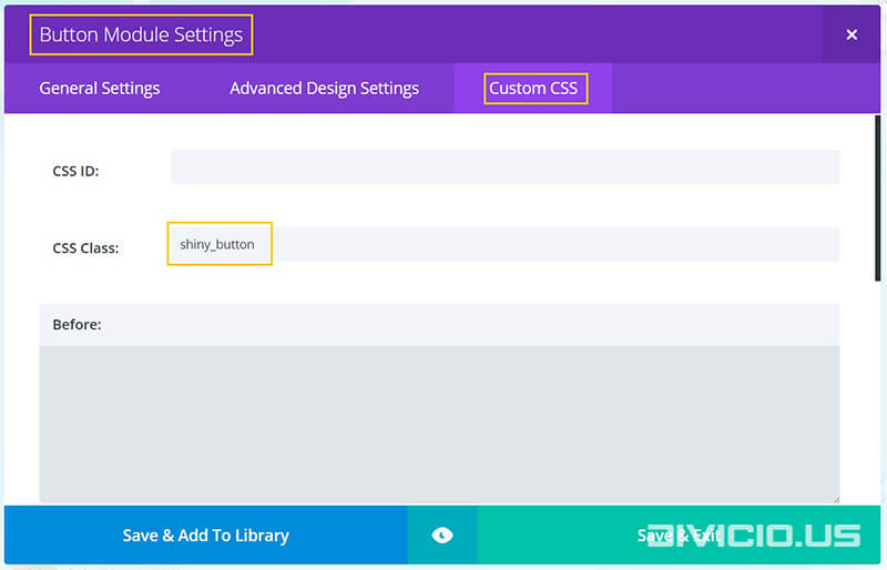
Add the shiny_button CSS class to Button Module Settings -> Custom CSS -> CSS Class field like it is indicated in the image below.
Step 3:
Copy the shiny hover effect CSS code snippet below and add it into the Divi -> Theme Options -> General -> Custom CSS field.

CCS code snippet for “shiny” hover effect
"Shiny" hover effect CSS snippet
[css]
/* Start shiny hover effect*/
.et_pb_button.shiny_button {
overflow: hidden;
box-shadow: 0 0 0 0 transparent;
-webkit-transition: all 0.2s ease-in;
-moz-transition: all 0.2s ease-in;
transition: all 0.2s ease-in;
}
.et_pb_button.shiny_button:hover {
box-shadow: 0 0 30px 5px rgba(0, 199, 236, 0.5); /* set your color here
(it should be the same as the button bg color on hover but with 0.5 opacity)
and play with 30px and 5px values to adjust box-shadow */
-webkit-transition: all 0.2s ease-out;
-moz-transition: all 0.2s ease-out;
transition: all 0.2s ease-out;
}
.et_pb_button.shiny_button:hover:before {
-webkit-animation: shine 0.5s 0s linear;
-moz-animation: shine 0.5s 0s linear;
animation: shine 0.5s 0s linear;
}
.et_pb_button.shiny_button:active {
box-shadow: 0 0 0 0 transparent;
-webkit-transition: box-shadow 0.2s ease-in;
-moz-transition: box-shadow 0.2s ease-in;
transition: box-shadow 0.2s ease-in;
}
.et_pb_button.shiny_button:before {
content: ”;
display: block;
width: 0px;
height: 86%;
position: absolute;
top: 7%;
left: 0%;
opacity: 0;
background: #ffffff;
box-shadow: 0 0 60px 20px #ffffff; /*play with 60px and 20px values to adjust box-shadow*/
-webkit-transform: skewX(-20deg);
-moz-transform: skewX(-20deg);
-ms-transform: skewX(-20deg);
-o-transform: skewX(-20deg);
transform: skewX(-20deg);
}
.et_pb_button.shiny_button:after {
line-height: inherit !important;
}
@-webkit-keyframes shine {
from {
opacity: 0;
left: 0%;
}
50% {
opacity: 1;
}
to {
opacity: 0;
left: 100%;
}
}
@-moz-keyframes shine {
from {
opacity: 0;
left: 0%;
}
50% {
opacity: 1;
}
to {
opacity: 0;
left: 100%;
}
}
@keyframes shine {
from {
opacity: 0;
left: 0%;
}
50% {
opacity: 1;
}
to {
opacity: 0;
left: 100%;
}
}
/* End shiny hover effect*/
[/css]
Hope you’ll find this effect useful. Feel free to share your thoughts and suggestions below and don’t forget to share this post with your friends! ;)
Inspired by: Flat & Shiny Button (hover effect)

Hi Ivan.
Great idea!
But for me it worked only in visaulbuilder mode. If i´m looking on page like visitor, working only box shadow, but not shining. Do you know why? -)
Hi Vojtěch. Thanks for stopping by.
If it works in Visual Builder mode then it should work on frontend as well. It’s hard to tell why it won’t work on frontend without a site url, it may be the cache or a CSS conflict or something else
Thank you Ivan!
I was able to get it working for any instance of the “Button Module” but I can’t seem to get it working for the top menu button, or any of the buttons in the “Fullwidth Header Settings”.
I tried going into the “Fullwidth Header Settings” and added the “shiny_button” css class in the Advanced Tab > Custom CSS > Button One but it didn’t seem to carry the effect over.
Do I need to alter the CSS some more to trigger this action in the top Menu & Full Width Section?
Yes, you have to change the CSS selector accordingly.
The CSS snippet from this tutorial will work for the Button Module only, if you want to apply this effect to the Fullwidth Header Module button one then try to use the
.shiny_button .et_pb_button_one(note that there is space between the classes) selector instead of the.et_pb_button.shiny_button.I haven’t tested it but I think it should work. For the menu button you’ll have to adjust the selector in a similar way, e.g. in your case if you add the
.shiny_buttonCSS class to the menu item, then use the.shiny_button .et_pb_buttonselector(again with space in between classes) instead of the.et_pb_button.shiny_buttonselector.Hope this helps.
Hi There!
I’m trying to get my homepage up and running with this cool button but I can’t seem to figure out what’s going wrong.
I want both the buttons on the page as well as the main top button working like this as well.
Can you take a look to let me know where I might be going wrong?
Thank you.
Hi Amanda.
Make sure the shiny_botton class is added to the button and the code is copied properly. It should work if you do everything as explained in the tutorial.
Hi Ivan.
I tried to apply this effect to my other site, but I haven’t had much luck.
Any idea where I might be going wrong?
Hi Frank. If you’ve followed the tutorial then try switching to raw code mode and copy CSS again (hover over the code container above and you’ll see icons on the top right corner). If this does not help share your url, I will take a look.
This is AMAZING Ivan!!
One question,
I have a button in my top menu and I’d like to use it there as well.
http://futuretechgadgets.com/home/
Any suggestions on how I might be able to make it work for this button too?
Hi Jono.
Well, you’ve added the “shiny_button” class to the menu item rather than to button, so, you’ll need to modify the CSS selector accordingly. Replace every instance of this selector
.et_pb_button.shiny_buttonwith this sector
.shiny_button .et_pb_buttonI didn’t test it but this should make it work, at least partially.
Awesome CSS shine. Gonna start using this everywhere!
Thanks Dan, I am glad you like it.