Divi MadMenu Header Templates #17, #18 and #19
I am pleased to announce that the Divi MadMenu demos pack has been updated with three new header templates, which are now available for download for all Divi MadMenu users.
These new header templates include fullscreen, vertical, and horizontal styles, each with its own design features. Take a closer look and explore the various features as well as the live demos of each template.
Header Template #17: Fullscreen Header
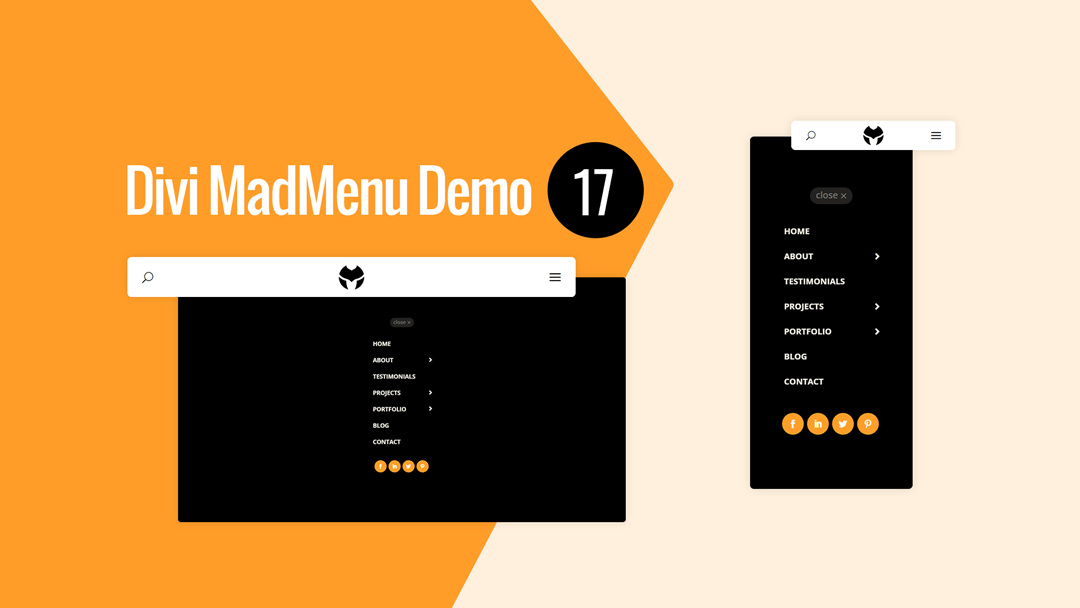
Divi MadMenu Header Template #17 is a fullscreen header with a simple header bar design with the search icon on the left, centered logo and the hamburger menu icon on the right.
The fullscreen menu is created using the Divi MadMenu header popups feature, and has a vertical menu with the Close button placed above the menu items, and the social icons at the bottom.
The vertical menu with sliding-in submenu items is created using the MadMenu Vertical Menu module.

Main Features
Fullscreen Menu
The menu is fullscreen on all devices.
Fixed Header Enabled
Fixed header is enabled on all devices.
Social Icons
Social icons placed beneath the menu items.
Menu Close Button
Menu close button placed above the menu items.
Responsive Design
The header template is designed with responsiveness in mind, it looks great on any screen width.
Hamburger Menu
Hamburger menu used on all devices.
Centered Logo
Logo is placed in the middle of the header bar.
Search
Search icon placed on the left side of the header bar.
Collapsed Submenus
The submenus are collapsed and can be revealed by clicking the parent menu item/arrow.
Slide-In Submenus Style
The Slide-In submenus style used for collapsed submenus.
Header Template #18: Vertical Header
Divi MadMenu Header Template #18 is a vertical header with the menu positioned on the right side of the screen sliding in from right when users click the menu icon.
The header bar has the search icon on the left side, centered logo and the menu icon on the right side. Custom image icons are used for the search and menu buttons.
The vertical menu with collapsed sliding-in submenus is added using the MadMenu Vertical Menu module.
To close the menu users can click either the Close button on the top left of the vertical menu, or click anywhere outside of the menu.
The social icons are placed beneath the menu items.

Main Features
Vertical Slide-In Menu
The menu is vertical on all devices sliding in from right on hamburger menu icon click.
Fixed Header Enabled
Fixed header is enabled on all devices.
Social Icons
Social icons placed beneath the menu items.
Menu Close Button
Menu close button placed above the menu items.
Close On Outside Click
Menu closes on outside click.
Responsive Design
The header template is designed with responsiveness in mind, it looks great on any screen width.
Hamburger Menu
Hamburger menu used on all devices.
Centered Logo
Logo is placed in the middle of the header bar.
Search
Search icon placed on the left side of the header bar.
Collapsed Submenus
The submenus are collapsed and can be revealed by clicking the parent menu item/arrow.
Slide-In Submenus Style
The Slide-In submenus style used for collapsed submenus.
Header Template #19: Horizontal Header
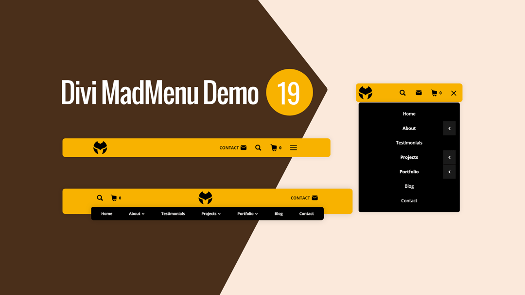
Divi MadMenu Header Template #19 is a horizontal header with two-rows layout.
The upper row contains the search and shopping cart icons on the left, centered logo and a CTA button on the right on desktop.
The overlapping lower row is visible on desktop only and contains the horizontal desktop menu.
On mobile devices the logo is aligned to the left, with the rest of the header elements (search, CTA button, cart and the menu) aligned to the right.
The shopping cart is displaying the number of items added to cart.

Main Features
Horizontal Menu
The header layout is horizontal with two-rows structure.
Fixed Header Enabled
Fixed header is enabled on all devices.
Search
Search icon placed on the left side of the header bar.
Cart
Shopping cart icon with cart contents enabled.
CTA Button
The header template has one CTA button.
Responsive Design
The header template is designed with responsiveness in mind, it looks great on any screen width.
Overlapping Menu
The horizontal menu overlaps the header bar bottom edge on desktop.
Collapsed Mobile Menu Submenus
The mobile menu submenus are collapsed and can be revealed by clicking the parent menu item/arrow.
Slide-In Submenus Style
The Slide-In submenus style used for collapsed mobile menu submenus.
Close Mobile Menu On Outside Click
Mobile menu closes when users click anywhere on the page outside the menu.
No Custom Code Used!
These header templates do not use any custom code. They’re fully customizable using the Divi MadMenu settings (and other Divi Builder elements used) in the Divi Theme Builder.
How To Download and Install
The newly released header templates are now available in the same package as the existing Divi MadMenu demo headers. To access and begin using the demos, please refer to this guide for instructions.
It is important to note that these headers are designed as Divi Theme Builder templates, and should be imported accordingly. For assistance with adding new templates to the Divi Theme Builder please follow this guide.
How To Customize
Customizing the new Divi MadMenu header templates is easy and straightforward, just like any other Divi Theme Builder template.
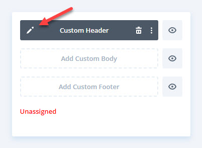
Once you’ve successfully imported your chosen header template into the Divi Theme Builder, simply click on the Edit icon to launch the Theme Builder and start customizing the template.

You can easily add your own content to the Divi MadMenu header template(s), including menus, logos, social icons, and more. If necessary, you can also make any design changes.
Once you have customized the header template to your liking, you can assign it to your desired areas of the website – assign it to a specific post, page, category, etc., or make it a Global template.
