Divi MadMenu allows changing the desktop and mobile menu animation with a click, just select any of the available cool animations!
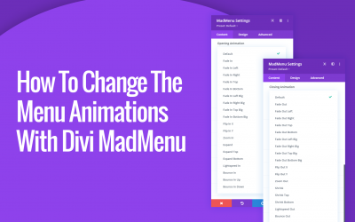
How To Change The Desktop And Mobile Menu Animations with Divi MadMenu
read more
Divi MadMenu allows changing the desktop and mobile menu animation with a click, just select any of the available cool animations!
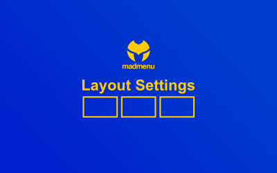
Divi MadMenu Layout Settings allow changing the elements ordering, set their column width and alignment, and align the element content both vertically and horizontally. Also you can control the visibility of both Desktop and Mobile menus by adjusting their breakpoints.
In this post I would like to present the new Divi menu module I have been working on for the last couple of months – the Divi MadMenu, which will be launching soon. This module allows creating headers using the Divi Theme Builder, and here is a brief demonstration of some of the features it comes with.
The Divi Menu and the Fullwidth Menu modules started gaining more popularity among Divi users since the release of the Divi Theme Builder which allows creating headers using the Divi Builder. Both of these menu modules provide quite a decent functionality for…
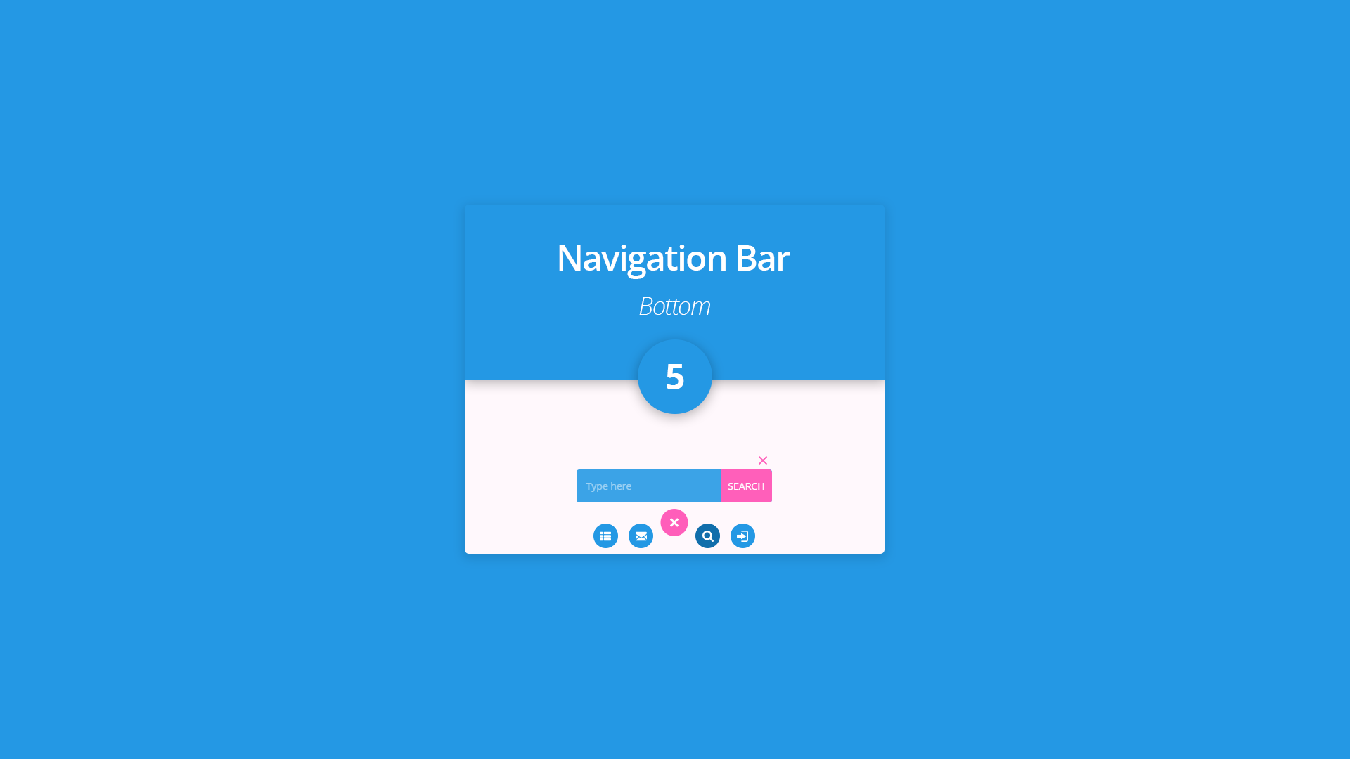
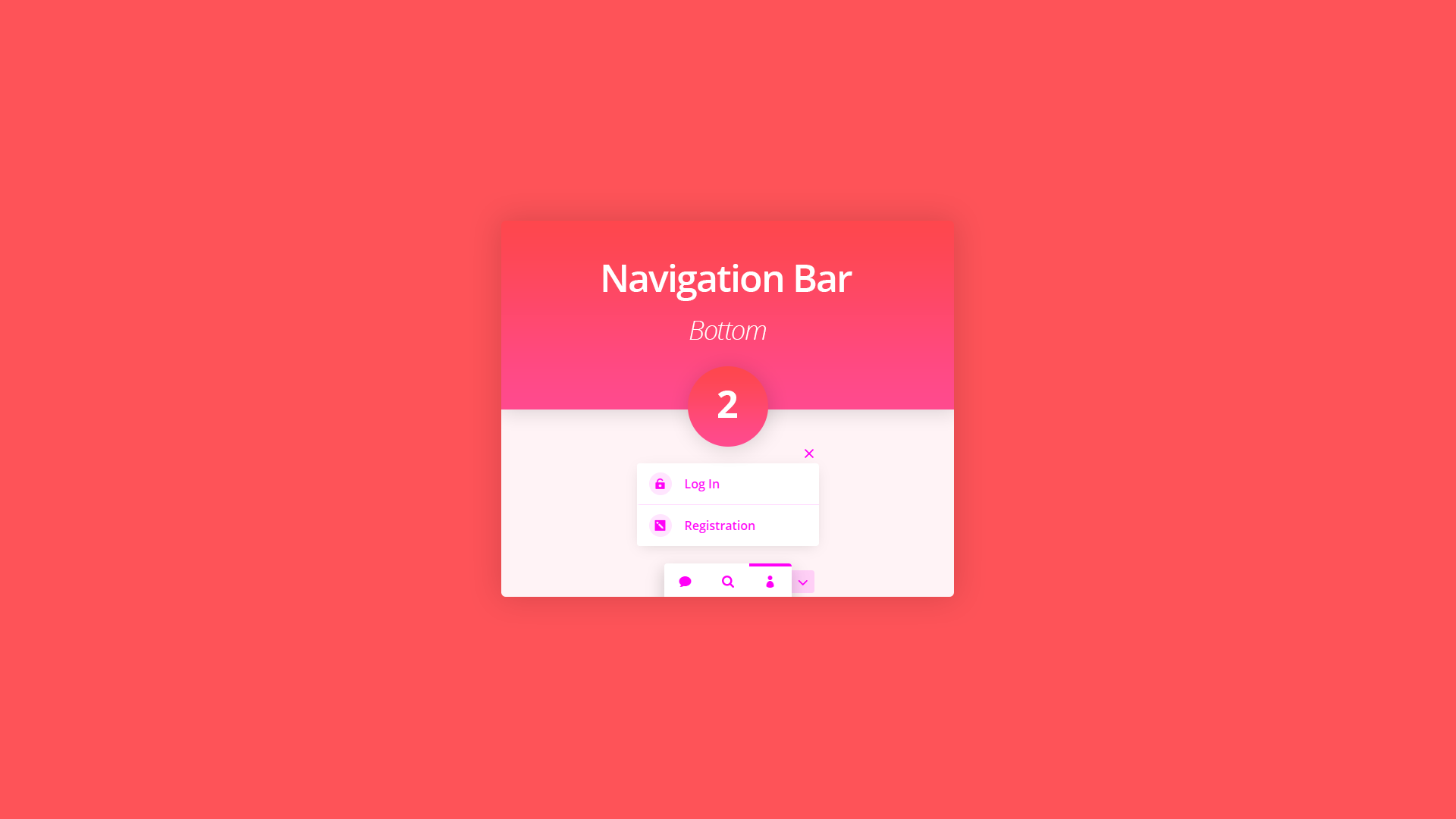
Bottom Navigation Bar 5 is a Divi section layout which adds a fixed menu bar at the bottom of the screen. This section layout can be used to provide the website visitors with a quick access to a simple menu, the contact form, search form and login form. It can be…
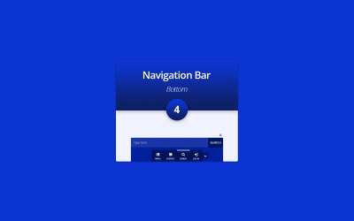
The Bottom Navigation Bar 4 is the fourth layout of the bottom navbar section layouts series. It is a Divi section layout which adds a fixed menu bar at the bottom of the screen. This section layout can be used to provide the website visitors with a quick access…
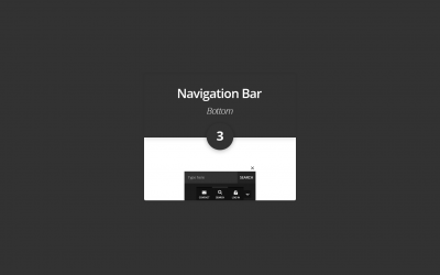
The Bottom Navigation Bar 3 is the third layout of the bottom navbar section layouts series. It is a Divi section layout which adds a fixed menu bar at the bottom of the screen which always stays in the viewport while the page content is being scrolled. This…
The Bottom Navigation Bar 2 is the second layout of the bottom navbar section layouts series. It is a Divi section layout which adds a fixed menu bar at the bottom of the screen which always stays in the viewport while the page content is being scrolled. Like the…
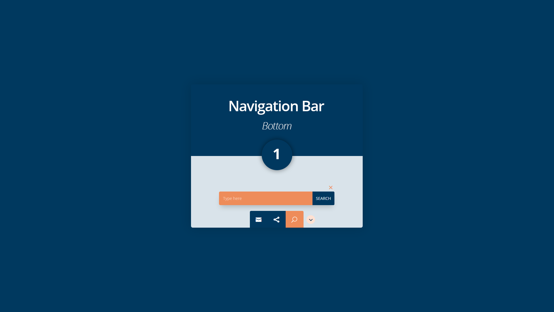
The Bottom Navigation Bar 1 layout is a Divi section layout which adds a fixed menu bar at the bottom of the screen which always stays in the viewport while the page content is being scrolled. This fixed menu bar can be used to provide the website visitor a quick…
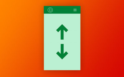
A while back I made a tutorial about how to show/hide the vertical navigation of Divi on click and people started asking me to make a similar tutorial for the normal Divi header bar (the “horizontal” one) too. So, that’s what we will be doing in this tutorial.

In this tutorial I show how to create a Divi CTA section expanding on scroll like the one on the Elegant Themes website. The JSON file of the section is available for FREE downloading.